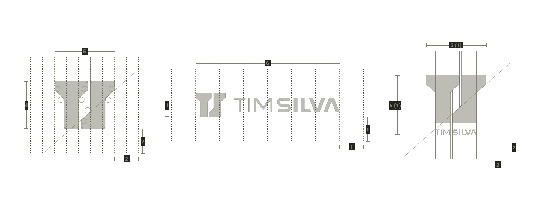


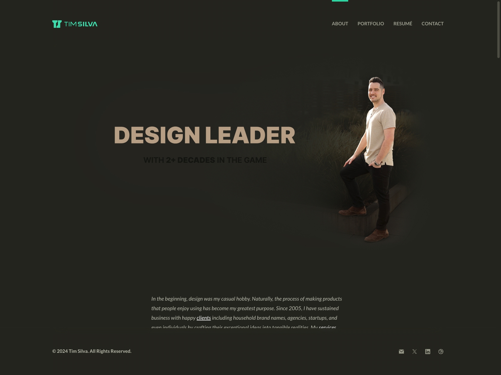
After taking a sabbatical in late 2023 to work through a mountain of personal projects, I started working on my private portfolio deck, my personal logo refresh (with color!), and of course, my website. Previously, I was iterating on a draft from 2020 through 2024, just a few hours here and there at a time. While I was happy with the approach, I decided to repurpose my v12.1 (2019) as it was rock-solid and fully-loaded, while merging some of the best part of my v13 draft into it. "If it ain't broke, don't fix it." =]
ViewScreen Recording 📺
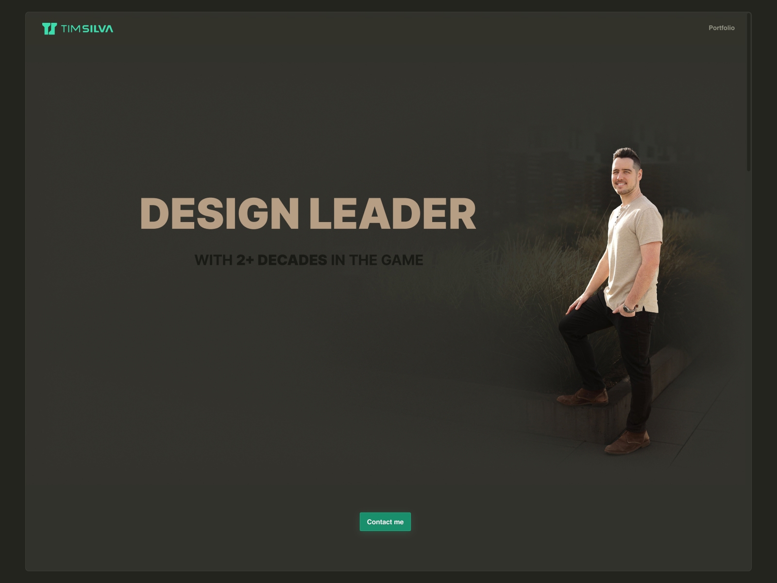
While working full-time, I was slowly working on both a rebrand and a fresh portfolio redesign, on and off for years until I ultimately decided to scrap the front-end draft and simply branch and refresh my v12.1 version. I had a fairly mature draft with draft content and basic responsive support.
ViewScreen Recording 📺
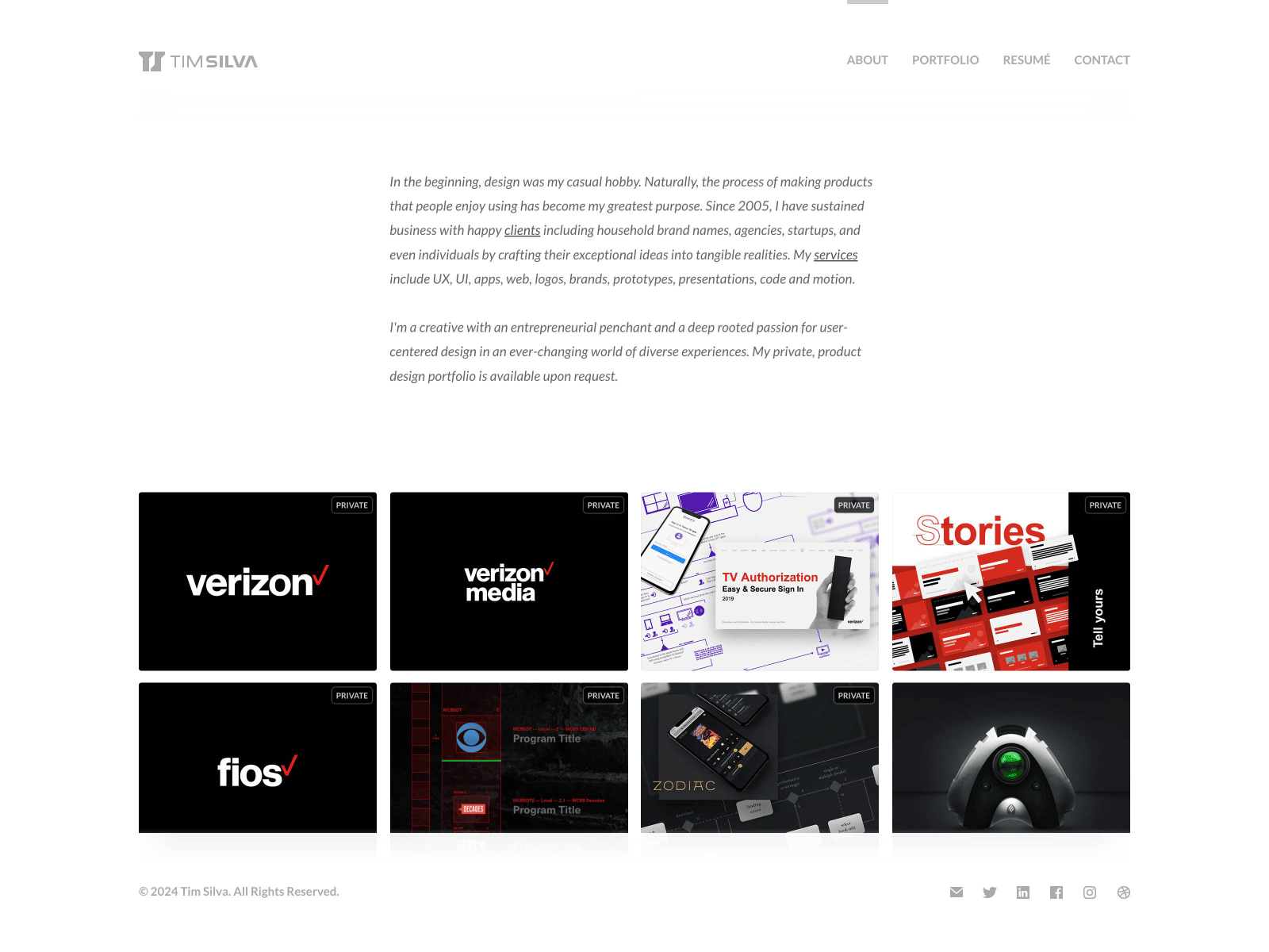
In 2019, I was on a job hunt for something better for my career. I decided refreshed my 2016 portfolio with all-new content, portfolio projects, and a private portfolio. I was able to find an amazing home at LogDNA (now Mezmo) after interating while applying and interviewing for roles.
ViewPrivateScreen Recording 📺Responsive 📺
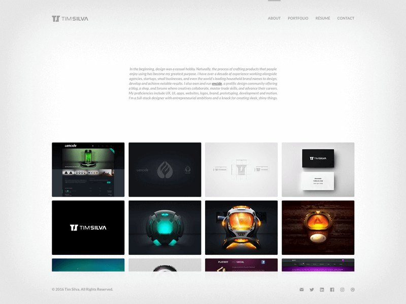
This version is the first full portfolio website since v10 back in 2010. After a few years of maturing into my career, I was able to take time away from the 9-to-5 life in order to build my vision of what Encide v2 could be. I also created proper visual identity systems for both Encide and my personal brand. v12 was the most complete website I have created to date. It includes an all-in-one portfolio page, a 404 page, a versions page, a password-protected archive, and more.
ViewScreen Recording 📺
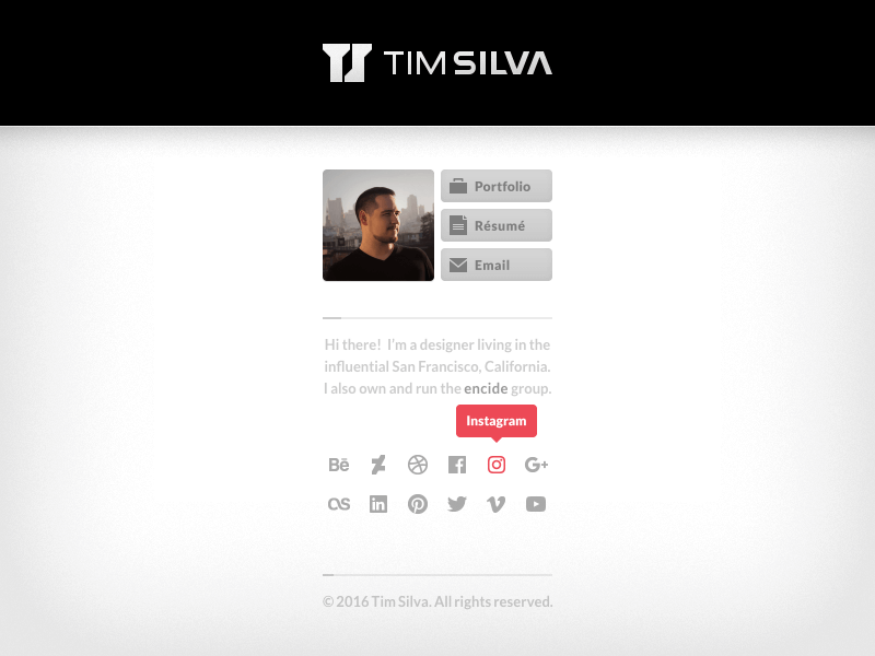
This minor update removed the loading sequence for a quicker experience. I have also made updates to little details like updated logos for the social media icons, and the mini biography.
ViewScreen Recording 📺
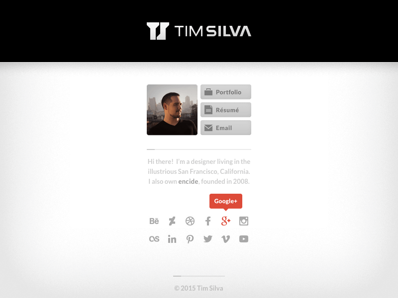
A month after the v11 launch, I decided to update my site with a lighter background.
ViewScreen Recording 📺
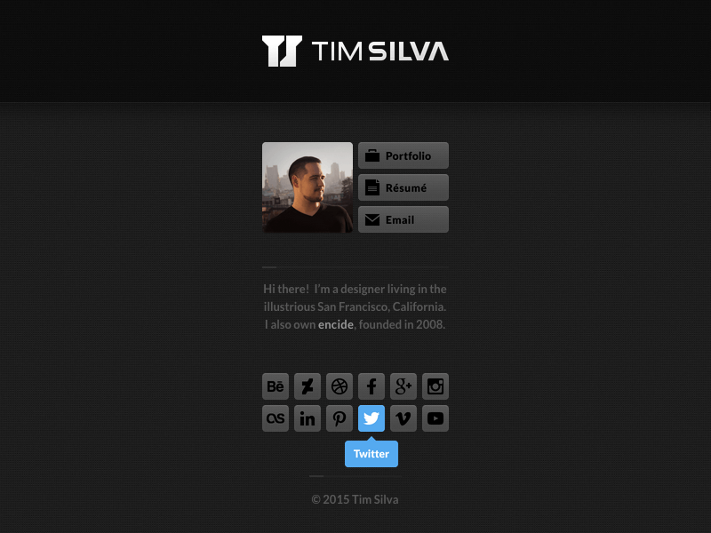
After nearly 5 years of v10/v10.5/v10.6, I decided to update both my website and personal brand. It also came a few days after leaving my job at Verizon (who acquired our team and products from Intel). The May 15th date was to celebrate the 10 year anniversary of my v1 website and my first logo from May 15th, 2005. This version was not inviting of clients since I decided to take a year off to completely rebuild the Encide brand, website, business, and community. It served as a hub with a quick bio, résumé, and my social media links.
ViewScreen Recording 📺
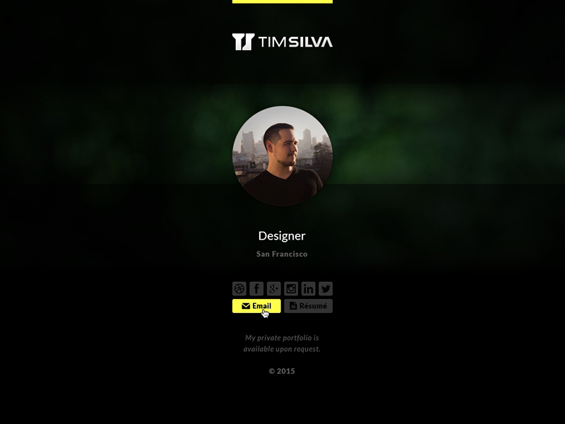
I spent a few months exploring different designs before I committed to a simple strategy as a hub for social media links and a quick bio.

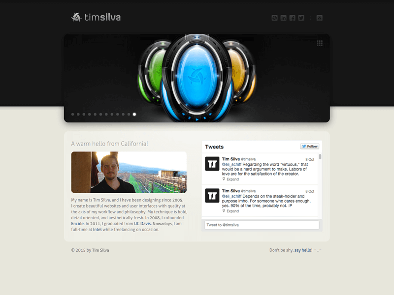
This minor version update changed the functionality of the carousel/slideshow to unveil a larger set of thumbnails. I also made a ton of visual and code improvements. This update helped to stretch my original v10 design to last for nearly 5 years.
ViewScreen Recording 📺
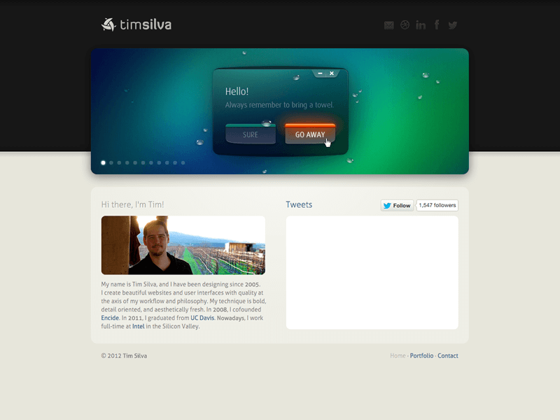
This version removed the sub-pages, and was more focused on my bio and twitter feed. At this time, I was just starting a 2-year retention contract with Intel, so I had no incentive or energy to attract new clients. I also made sure that clicking on the carousel/slideshow interface would go to the full portfolio page.
ViewScreen Recording 📺
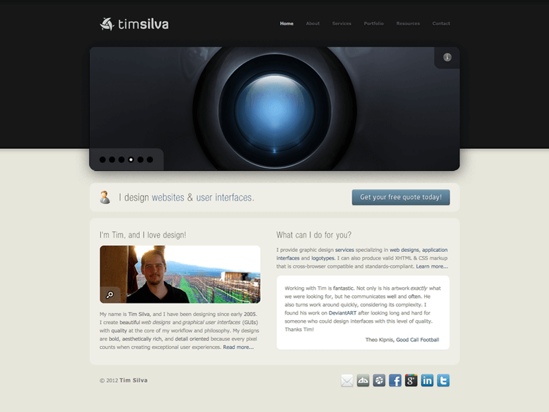
This website was after my experimental phase of using the “enimac”/“enimak” brand names. I decided to not leave my personal domain as a portal. v10, along with its sub-versions, was the longest standing version of my website. While it went through many changes, it was live for almost 5 years. Most importantly, this website landed me my first full time job at a San Francisco Bay Area agency called Archetype International Inc. While I was in my last year of college, I was contacted by their Chief Creative Officer, Guido Rosso in February, 2011. After meeting up with the founders, I started working with them once a week while I was finishing up my degree. After graduating, I started working with them fulltime. In April of 2012, we were acquired by Intel to help them build a family of TV, mobile, and web products for an upcoming OTT/STB television service similar to Netflix, Roku and Apple TV. v10 started me on an incredible roller coaster ride. It was also the website that nearly landed me a design job in Las Vegas with the legendary illusionist, David Copperfield.
ViewScreen Recording 📺
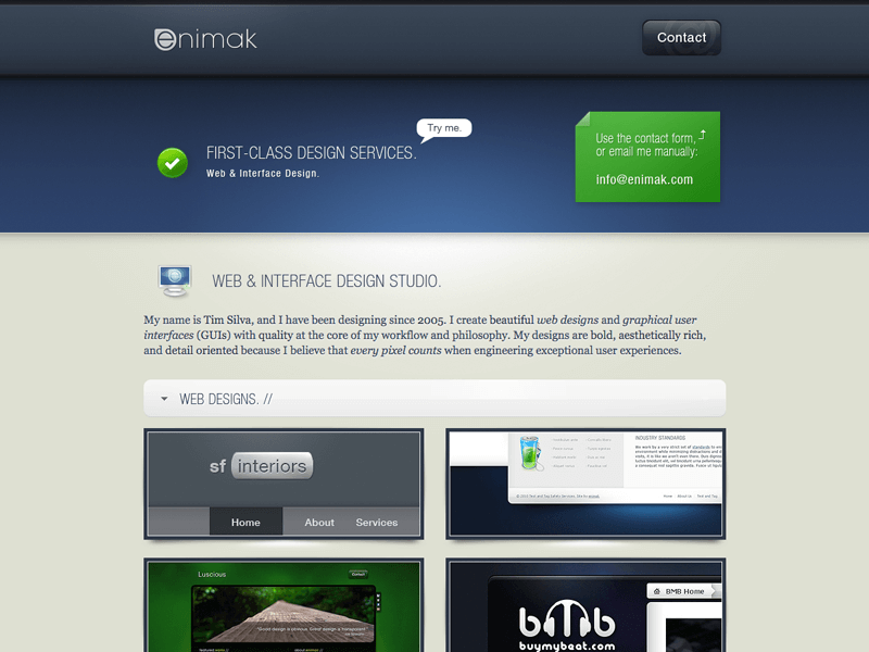
After launching enimac.net in June of 2009, I was tired of settling for a .net domain, so I went with enimak.com instead. A handful of issues around the enimac.net name/domain bugged me more as time passed, so I decided to remedy these annoyances by swapping the c with a k. While it didn't resolve all of the issues, I considered it a worthy improvement for a while. Eventually, it annoyed me that when spoken phonetically, the name enimac/enimak sounds too similar to “anemic,” the nasty medical condition where someone experiences a deficiency in red blood cells. That word doesn't feel right when a potential client is looking for someone to build them a website. I also was unable to lock down key social media accounts, and the name sounded too similar to encide (my design community) anyways. I eventually decided to keep it simple and just use my real name instead of an invented alias for my career. In August of 2010, I launched v10 on my personal domain and redirected both enimac.net and enimak.com to timsilva.com until I let the domains expire a few years later. It was an interesting experiment, and I learned that since my name is short and simple, I don't need to operate behind an alias. Unless someone picks an unbelievably cool, effective, and meaningful alias, I always recommend that new individuals with personal brands just go with their real names. In the age of usernames, it is tempting but often regretted when someone uses anything but their real name; I could list hundreds of examples of this. I am grateful that I was able to learn this lesson with first-hand experience in a way that didn't have any long-term consequences.
ViewScreen Recording 📺
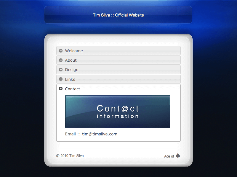
Later in the year, I wanted to keep my site as a portal, but I decided to use an accordion interface to both show and hide different content. This helped to keep the design minimal while still having lots of content a few clicks away. During this time, I was using an experimental brand name called “enimac” and later “enimak” for business. I was torn between using my domain as a personal site or strictly for business, so I wanted to try to use an alias like so many of my peers had done. I used that experimental alias through 2009 and 2010, until I decided to make v10 on my personal domain that August.
ViewScreen Recording 📺
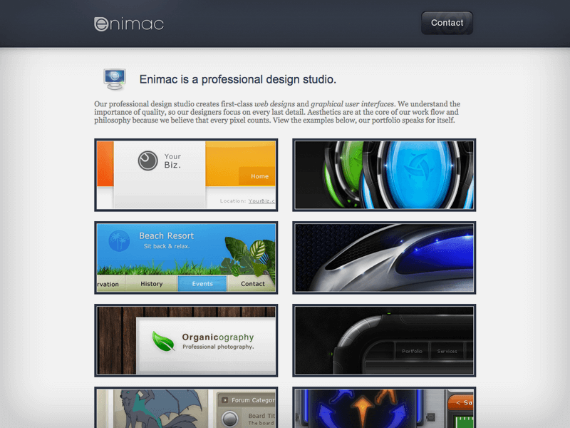
Starting in May of 2009, I briefly attempted to design using an alias instead of my name. I launched a mini splash page for it in May, then a full site in June. I have always collected unique and interesting name ideas over the years, and at the time, enimac stood out to me. I appreciated that all of the letters, except for the i, lack ascenders when written in lowercase form. This made the word look minimal which felt like a rare quality. I wasn't able to get the .com domain, so I settled for the .net instead (which was annoying, because the t in net had an ascender which wouldn't have been an issue with the .com domain). Around this time, it was becoming more common to use social media for businesses. I had trouble preserving the username across varous networks, so I ended up switching to enimak.com just nine months after launching the enimac.net website. During this time, I continued to use my personal domain, timsilva.com (v8.6 & v9.0), as a portal/hub for my own links.
ViewScreen Recording 📺
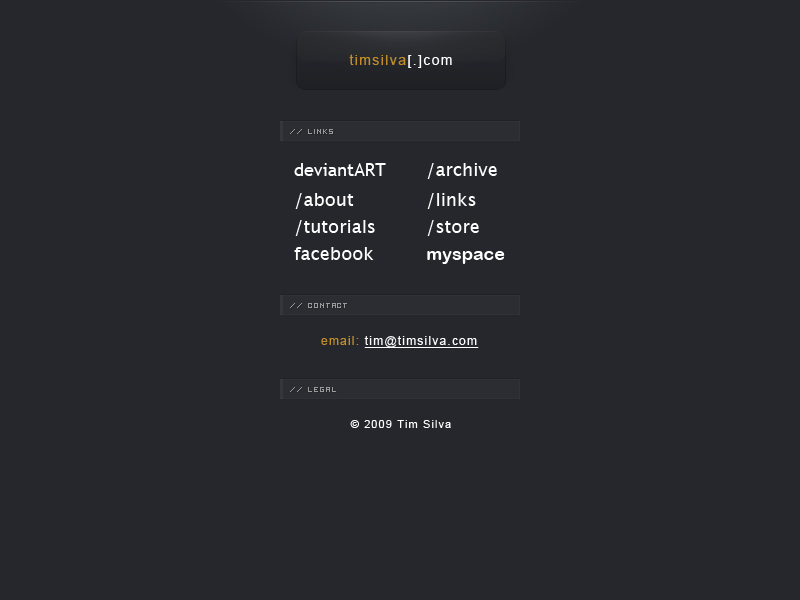
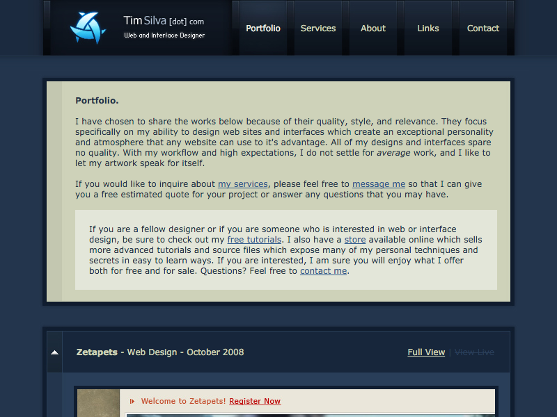
After the success of v8, I made a few minor tweaks to the website by centering the layout and updating the content a little. v8/v8.5 together were live on the site for over a year and half. This was the first version where I had figured it out. It helped me to attract enough business to stay afloat through college. Shortly after this website's launch, I co-founded the encide community and added a button to it on the links page.
ViewScreen Recording 📺
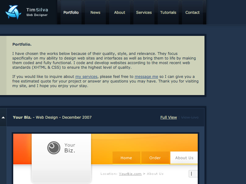
This is the first website that looked completely professional. v7 was a step in the right direction in terms of technology, but the styling was a bit off-putting for potential clients and customers. This new version was an experiment in using a more minimal interface with a strong focus on large content and my actual portfolio. This shift in focus really brought me a lot of new business opportunities.
ViewScreen Recording 📺
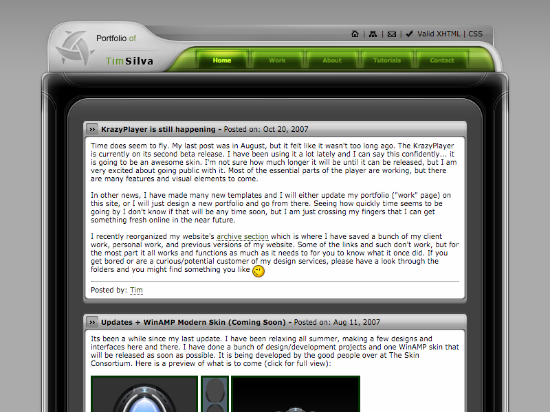
Immediately following the launch of v6, I started to build a new site in HTML. I was amazed at how much faster this process was, and I was able to complete the site in a fraction of the time compared to the previous flash site. As a huge bonus, it was also much easier to update. Although I didn't realize it at the time, this was the end of my flash website days.
ViewScreen Recording 📺
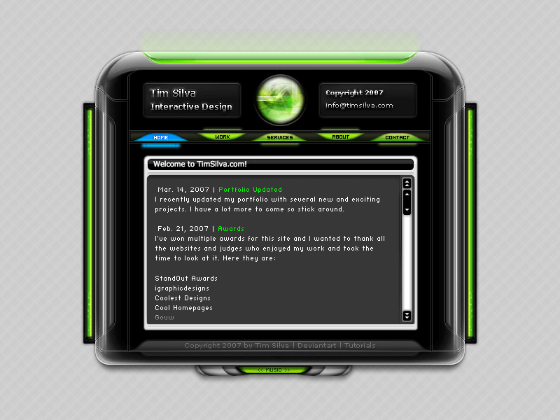
This was the most advanced flash website I ever created before I decided to focus on the HTML, CSS, and JavaScript side of the web. Creating a staging environment for building this website was too inefficient, and while I absolutely loved the rich media and animation capabilities of flash, I wanted to broaden my skills. With all that said, this is possibly the most interesting flash website I ever created. The level of interactivity and custom code was far beyond anything else I had created at the time. Plus, every portfolio item was visually attractive. I also won 7+ awards for this website within the month of the launch.
ViewScreen Recording 📺
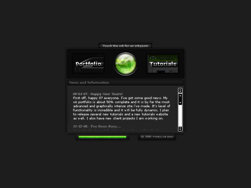
A few months after completing v5, I wanted to sharpen up the graphics and overall quality of my site. While v5 had exceptional functionality, I was learning so much at that time that I couldn't help myself from starting over. This little splash page was a testing ground for me; try resizing the browser window on a desktop device, the box always smoothly moves to the center. Also, if you move your mouse over the animated logo, you will notice that it dynamically warps the sphere. The portfolio link went to v5 at the time. The tutorials link has been archived here. This also had a few different color variations. I also considered including this in my “Dark Enigmatic” series by naming it the “Enigmatic Splash.” Instead, I experimented with a different direction which later became part of the v6 design (the green side bars).
ViewScreen Recording 📺
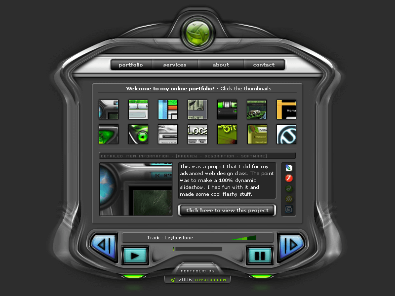
This version was a step in the right direction with my musical choices and the diversity that was finally showing up in my portfolio. I had functional interfaces, skins, client websites, logos, and flash-based advertisements.
ViewScreen Recording 📺
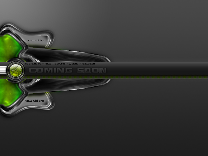
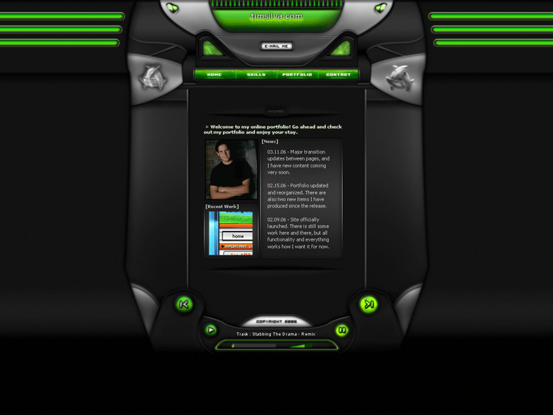
This website was all about creating a cool experience. It had a dramatic loading sequence, metal music, and lots of fading/hovering effects all over the site. The music player at the bottom was truly advanced with full controls and a playlist. I also had a reasonably complex portfolio section with a hover-scrolling effect that had varying inertia speeds depending on the X location of the user's mouse. It took me forever to code this site. Note: I called this website “Dark Enigmatic v2” because I had created something with similar colors before called Dark Enigmatic. I also made a v3 later that year which ended the series. I was interested in the sleekBlack series by then anyways.
ViewScreen Recording 📺
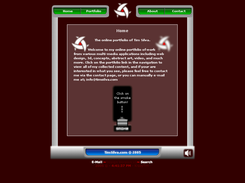
Just a few weeks after v2, I realized what I had created and wanted to start fresh. v3 remains the first website that I was ever proud of making. The music, animations, and contents are substantial and interesting.
ViewScreen Recording 📺
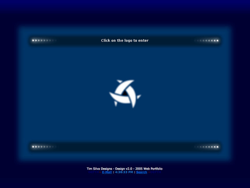
A few months after v1, I decided to create something less cringeworthy. This version featured a full loading sequence with a cheesy exploding logo effect, but at least the template looked a bit nicer.
ViewScreen Recording 📺
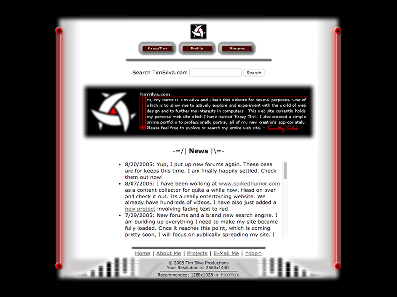
On May 15, 2005, version 1 went live. I crafted a custom logo and prepared an animated intro sequence with music. This version is the first official website in my personal domain's webography. I published my first logo on the same day that I released the website. I used the triquetra symbol for exactly 10 years to the day. On May 15th, 2015, I launched a personal rebrand with a TS monogram an a custom wordmark for my first and last name.
ViewScreen Recording 📺
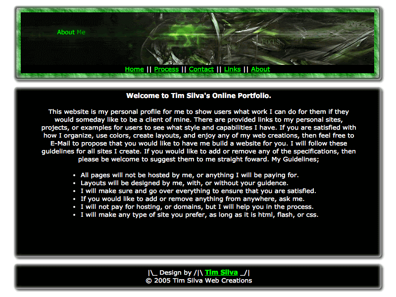
This was my first “professional” attempt at making a website where I offered my services.
ViewScreen Recording 📺
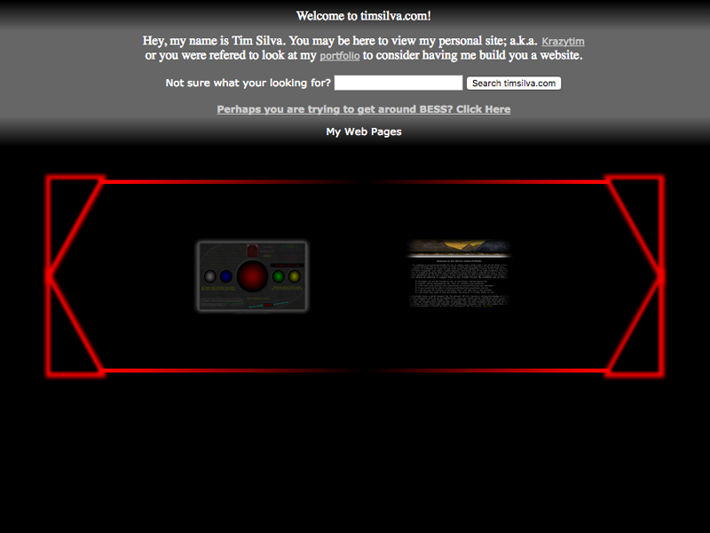
On May 8th, 2005, I tossed this up on my website because I had just acquired access to the domain. At the time, it was just a placeholder portal for my personal website called “KrazyTim”, an embarrassing alias I picked, and my professional website attempt which I called my “Profile” at the time. I also created an iframe proxy server which allowed peers at my high school to get around an annoying service called BESS which would block computers from visiting fun websites like MySpace. I added this because my friend Jon Henry ran a website called “jahari.tk” that did the same, and I wanted to offer a backup.
I also created but never launched (to my knowledge) what I now call v0.1, a quick concept from around May 12th that I scrapped for v0.5 and v1.0 instead (which were both live at overlapping times).
ViewScreen Recording 📺
Before I owned my domain, I had a few test websites on free hosts along with some primitive learning exercises I did for my high school course called “Intro to Web Design.” These include the first html file that I ever created, the first student website that I built, and several other experiments and school assignments: (1) (2) (3) (4). I even used a few free forum services (1) to give my friends and nonexistent fans a platform for communication. Most of these early websites score tragically high up on the cringeworthiness scale. I was self-aware and being sarcastic for the most part in regards to the imagery and writing. I can now admit that I was hardly aware of my poor grammar at the time; I simply didn't care. Years before designing my first websites, I was actively directing, filming, producing and editing a home-video styled series of films featuring stunts, skits, pranks, skateboarding, and other similarly angsty activities directly inspired by copying the CKY & Jackass era from the late 1990s up until to the mid 2000s. I began working towards these films in 2002 by creating drafts with friends using pre-digital equipment (VHS & VHS-C tapes). After several iterations, I began a three part series which lasted between 2003 and 2005 (with a few updates and extras up until ~2006 when design took over my life). We used MiniDV tapes and any camera we could get our hands on. I edited these films with the best video editing software I could possibly afford; ArcSoft ShowBiz and then Ulead VideoStudio (now Corel) and Ulead DVD MovieFactory. I taught myself how to use their glitchy software that would typically freeze with virtually no learning resources. Instead of paying attention in high school, I hustled and learned how to make these films while having fun with friends… I have no regrets! Amazingly, the year that I stopped is the year that YouTube launched. While the series was fun for my local friends and family, I am glad they weren't available online early on for obvious reasons. Anyways, I have always enjoyed creating. The earliest obsessions that I can remember include building skateboarding ramps, building houses with my Father during summers, building tree forts and tiny cabins in our backyard/field/creek, collecting and organizing rocks from my creek (I grew up in the country), and folding advanced origami as a young child. I was born to create, so digital design felt right when I first discovered it in 2004, especially because most of the processes and jobs leave behind little or no footprint.