In the beginning, design was my casual hobby. Naturally, the process of making products that people enjoy using has become my greatest purpose. Since 2005, I have sustained business with happy clients including household brand names, agencies, startups, and even individuals by crafting their exceptional ideas into tangible realities. My services include UX, UI, apps, web, logos, brands, prototypes, presentations, code and motion.
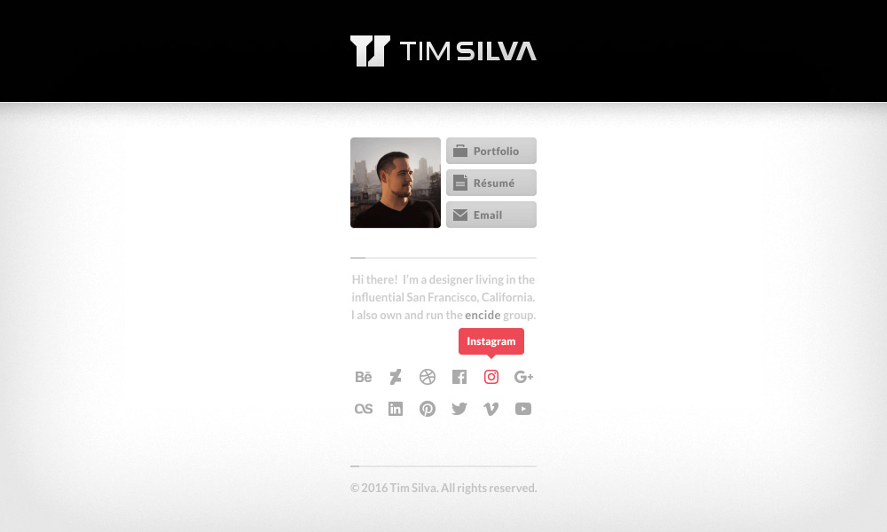
I'm a creative with an entrepreneurial penchant and a deep rooted passion for user-centered design in an ever-changing world of diverse experiences. My private, product design portfolio is available upon request.
I'm a creative with an entrepreneurial penchant and a deep rooted passion for user-centered design in an ever-changing world of diverse experiences. My private, product design portfolio is available upon request.

Verizon
Job

Verizon Media / Oath
Job
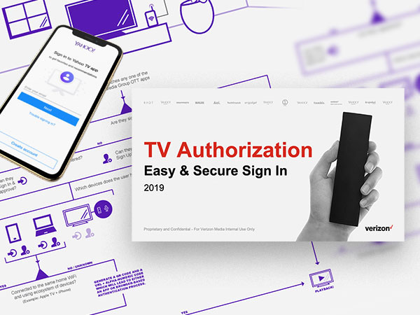
TV Auth
Verizon Media
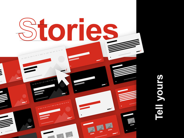
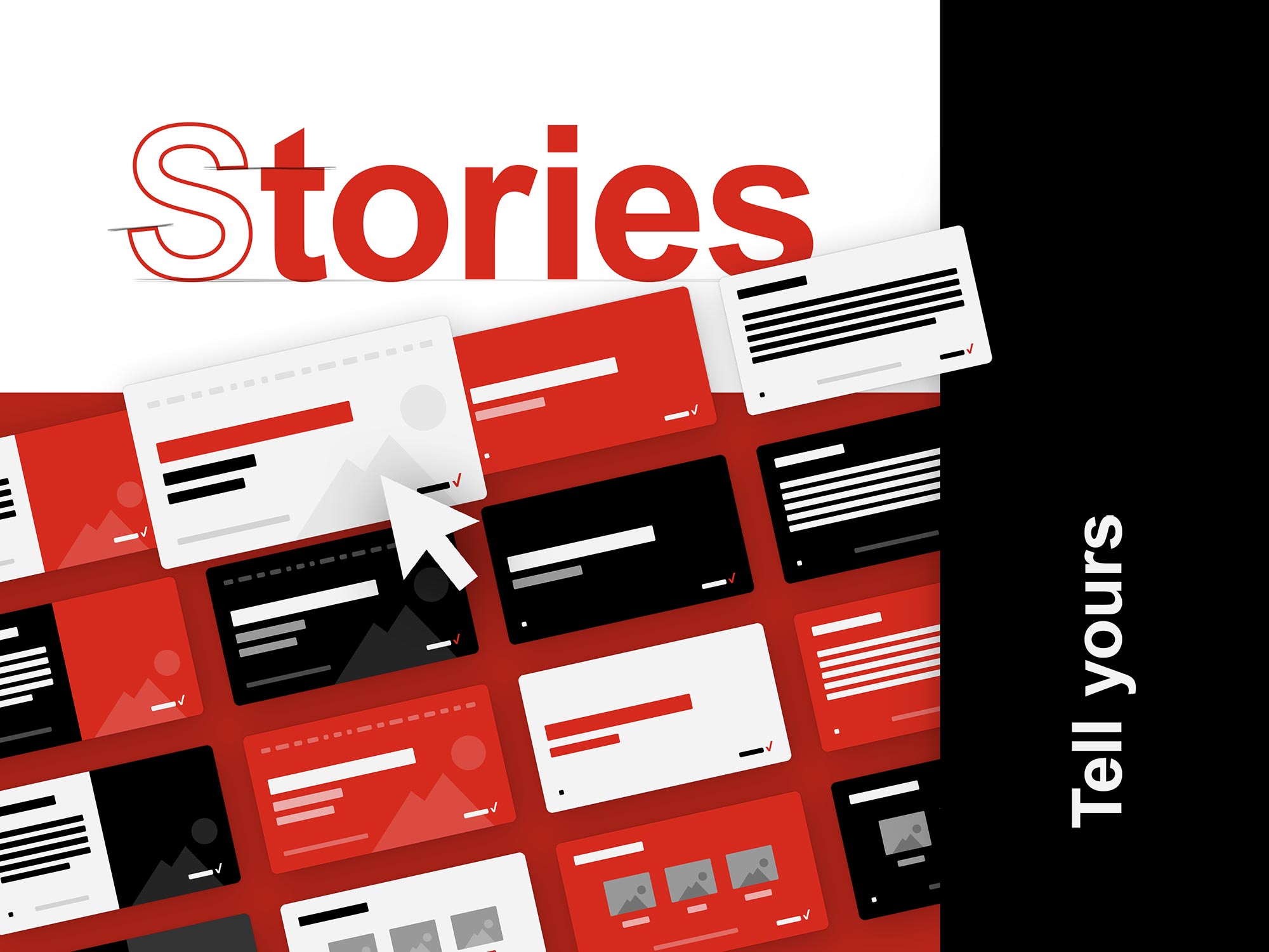
Stories
Verizon Media

Fios
TV Product
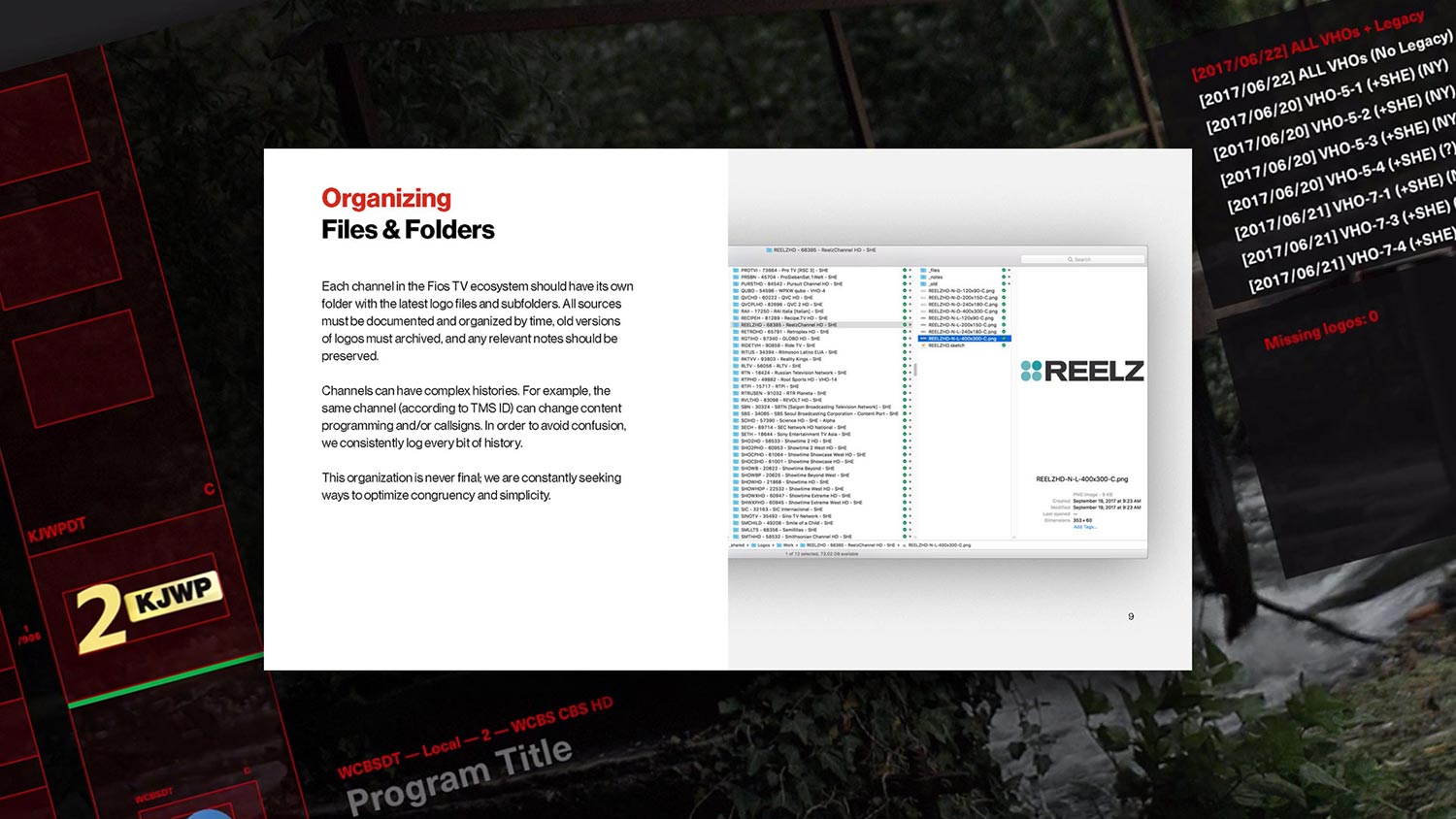
Asset Design System
Verizon Fios
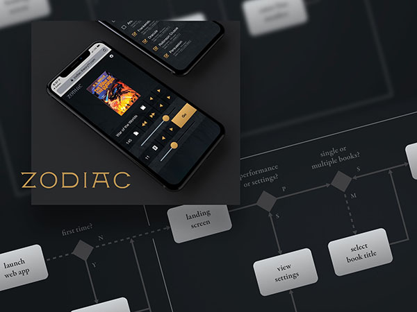
Zodiac
Theory11
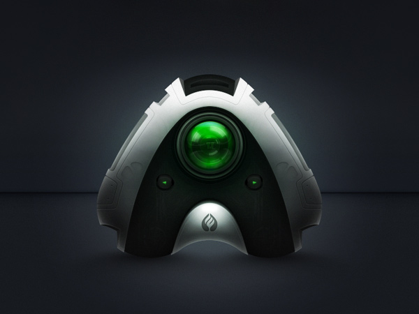
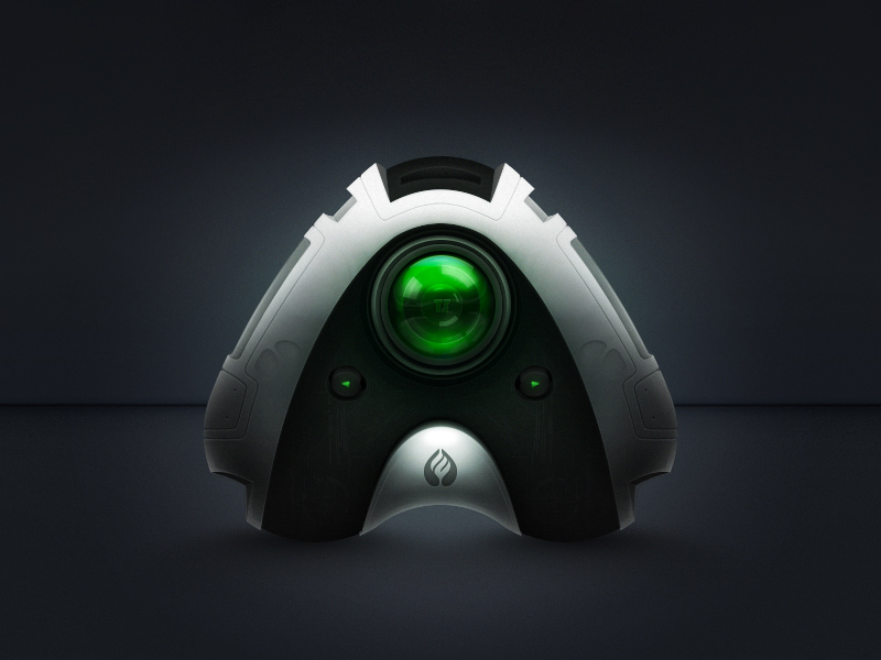
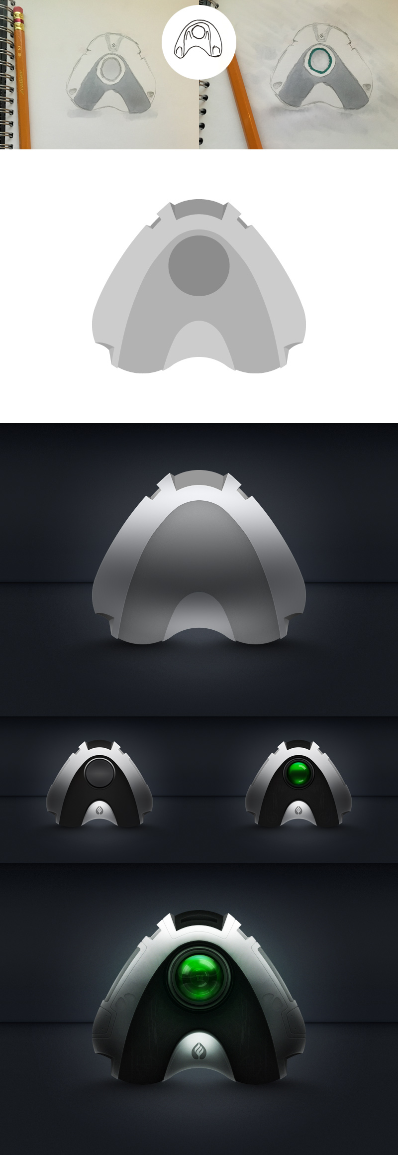
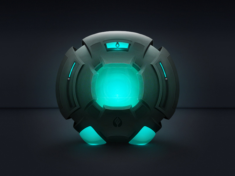
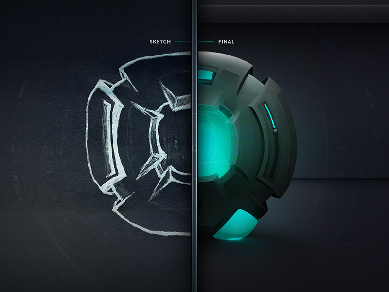
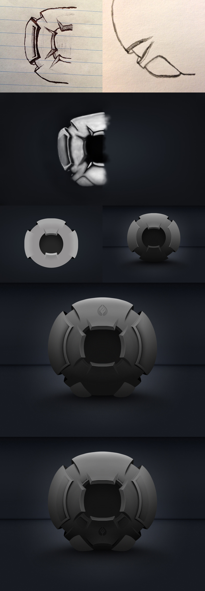
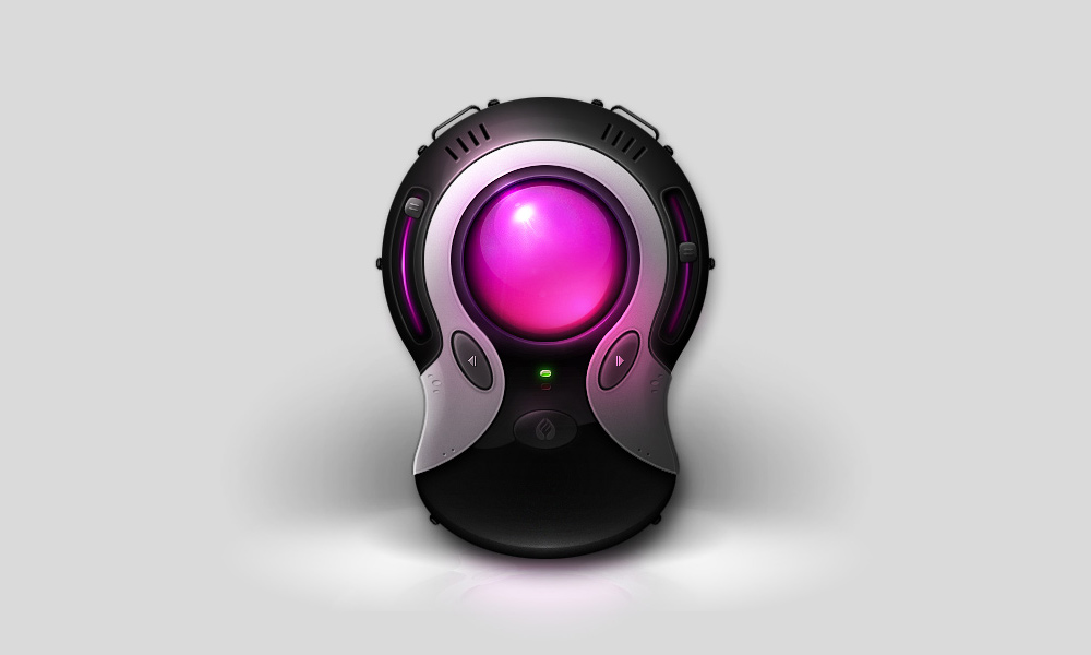
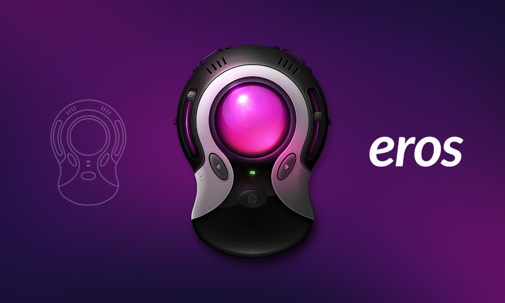
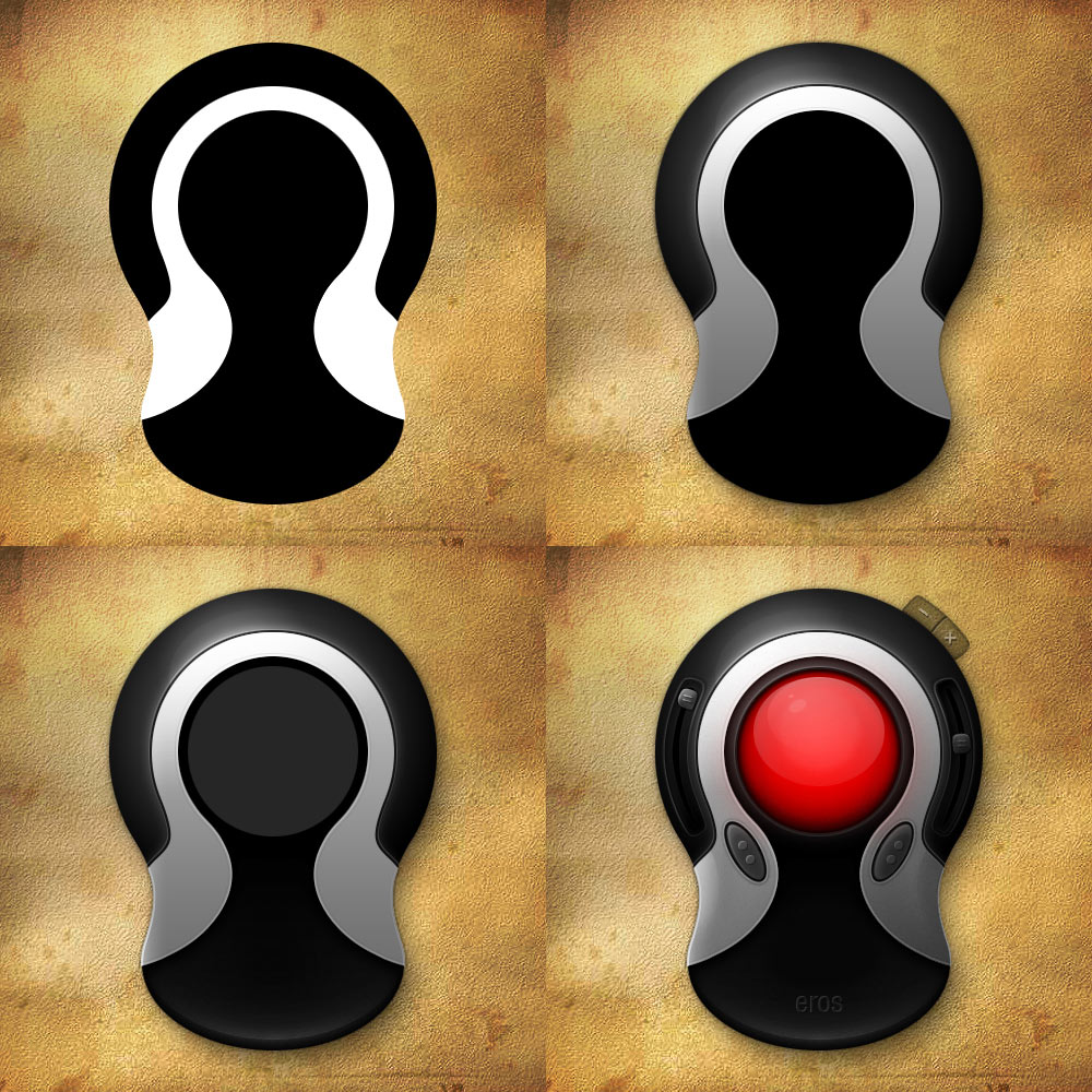
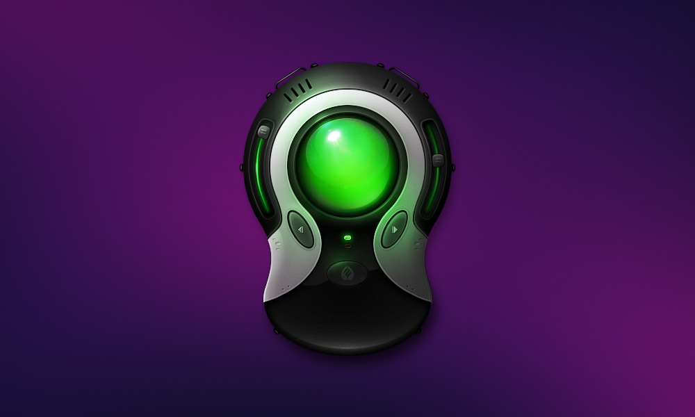
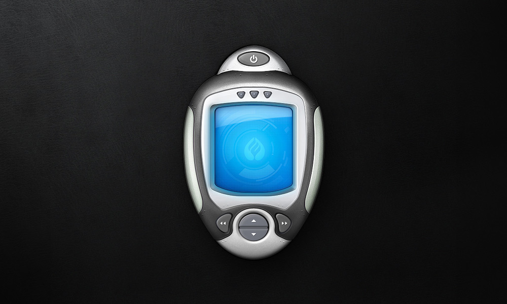
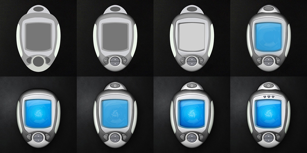
Industrial Designs
Concept
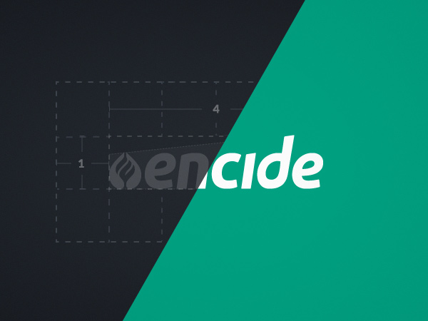
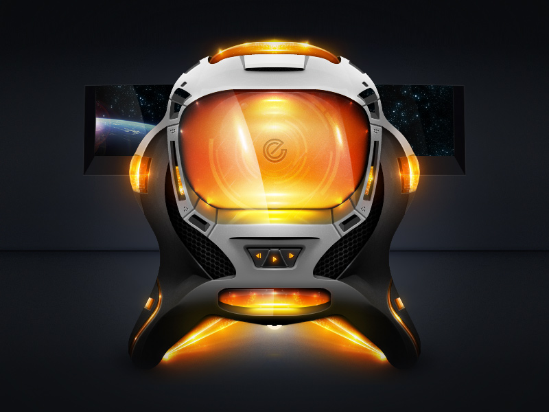
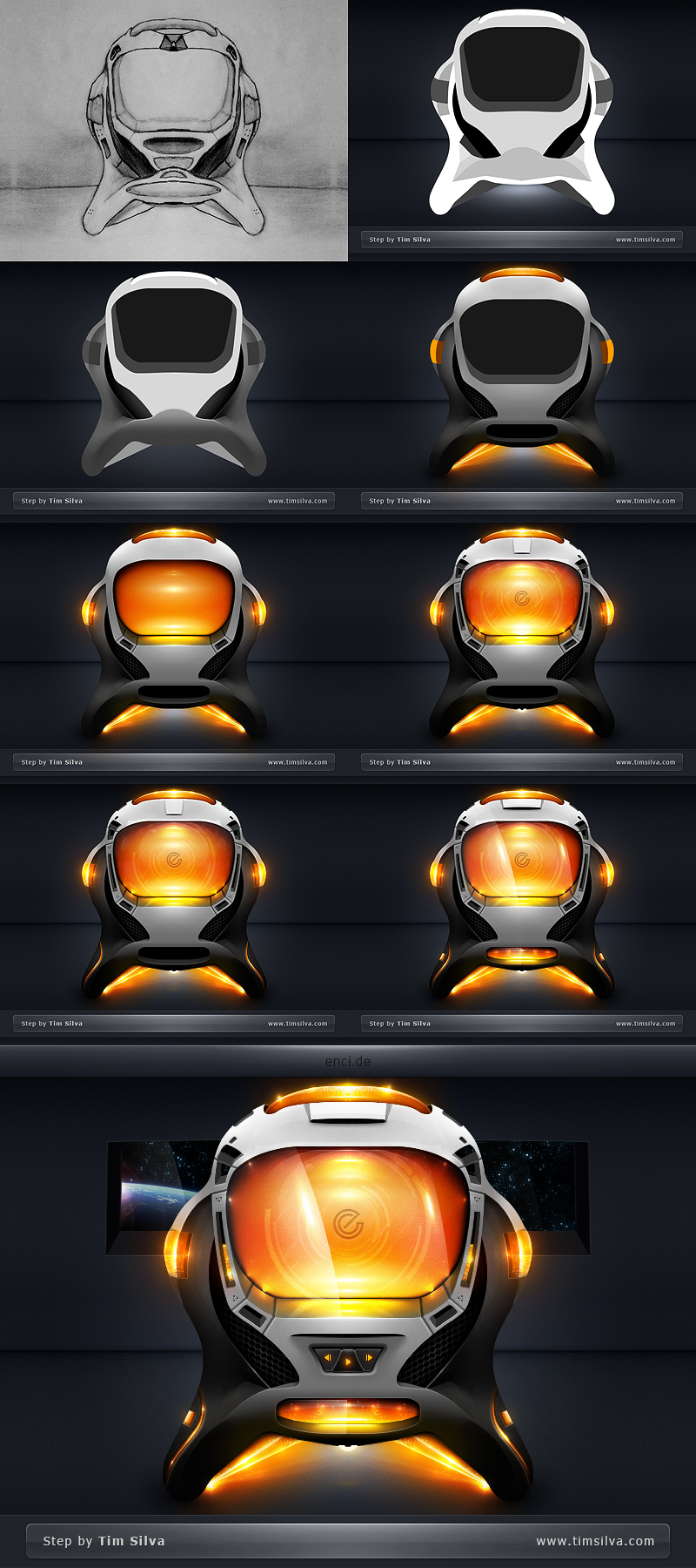
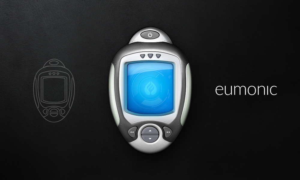
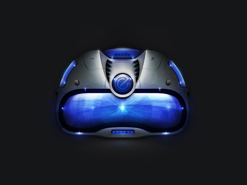
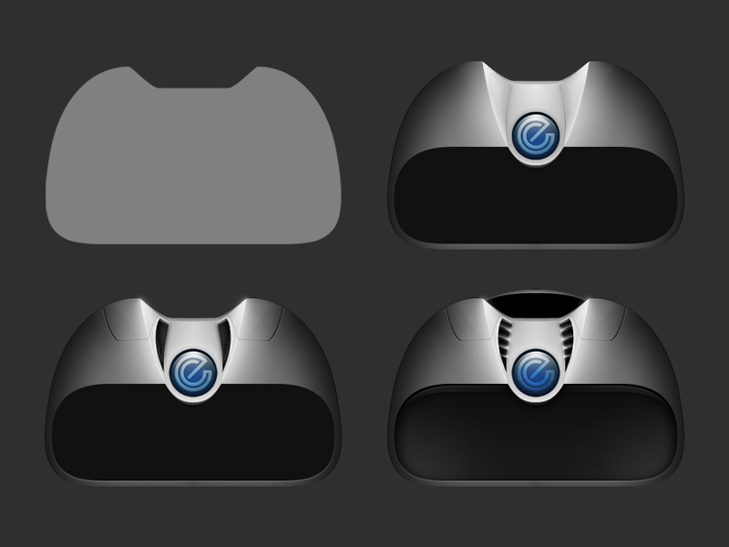
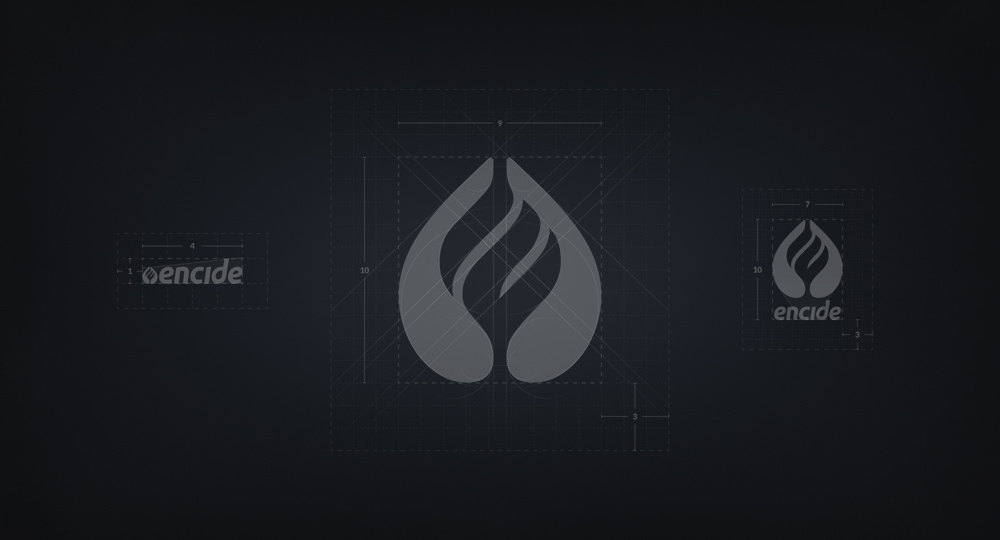
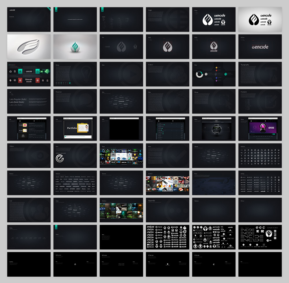
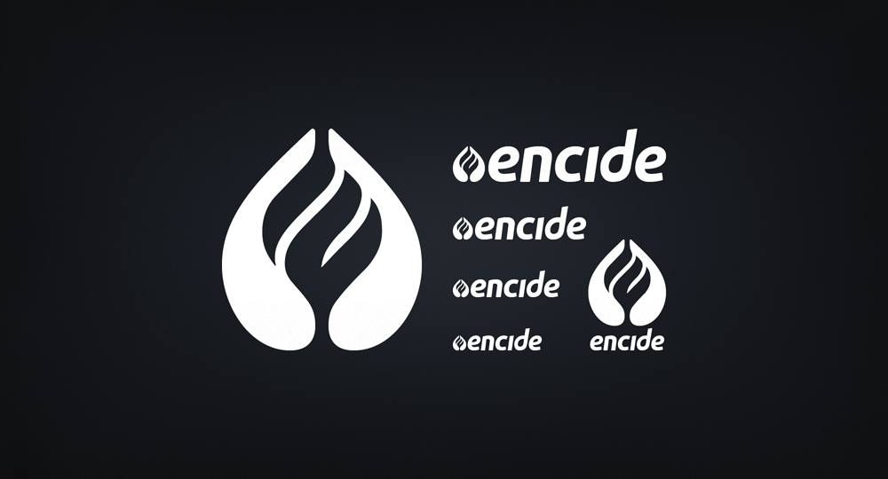
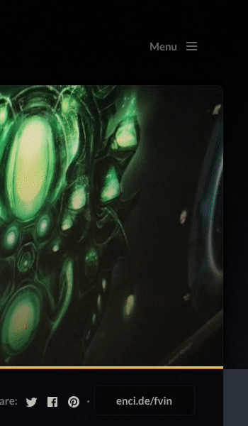
Encide Brand & Web
Startup
Brand & Web
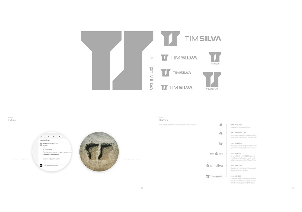
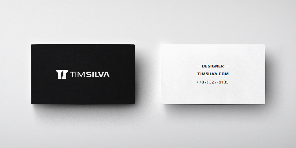
Personal

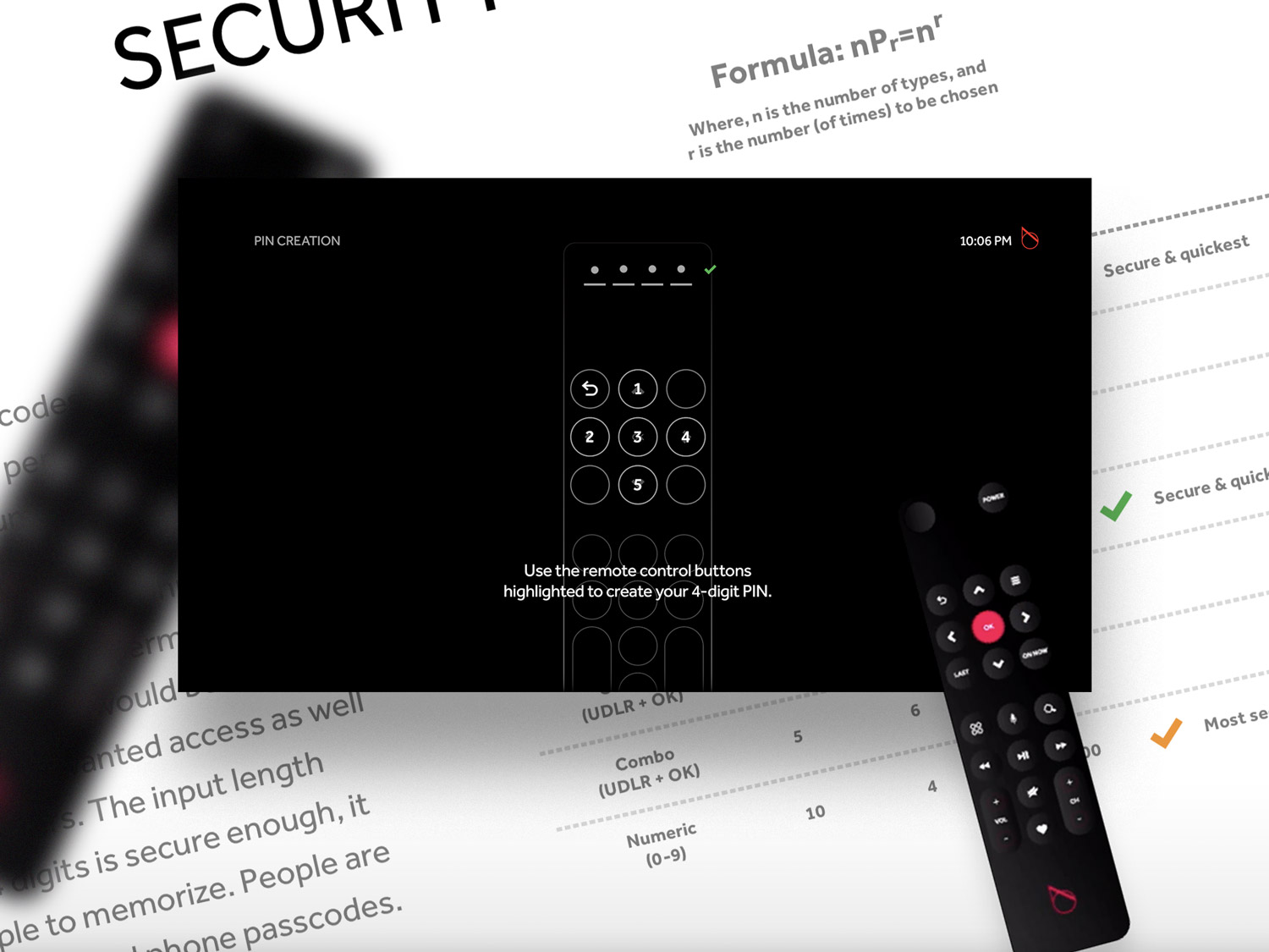
Pin Codes
Verizon Fios
Interaction Model
Verizon Fios

Mobile Apps
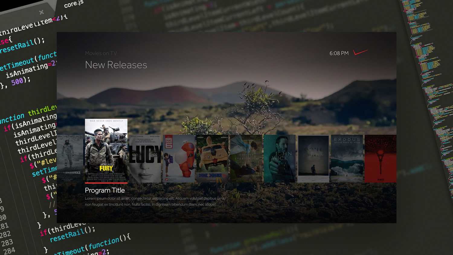
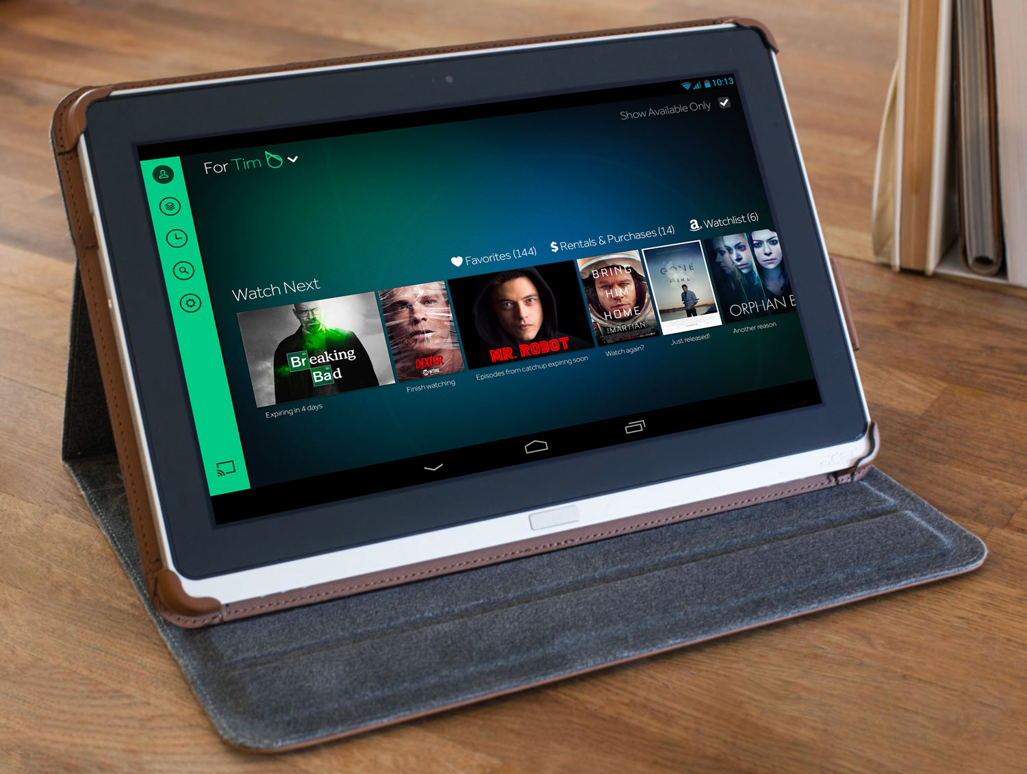
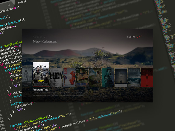
Verizon Fios & Intel's OnCue
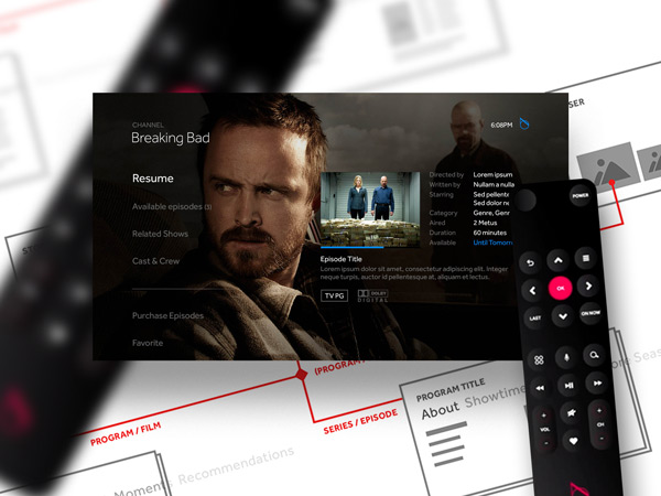
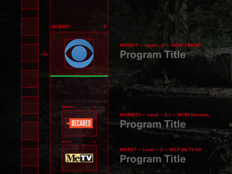
Program Info
Verizon Fios & Intel's OnCue
OnCue
TV Product
Intel
Job

Archetype
Job
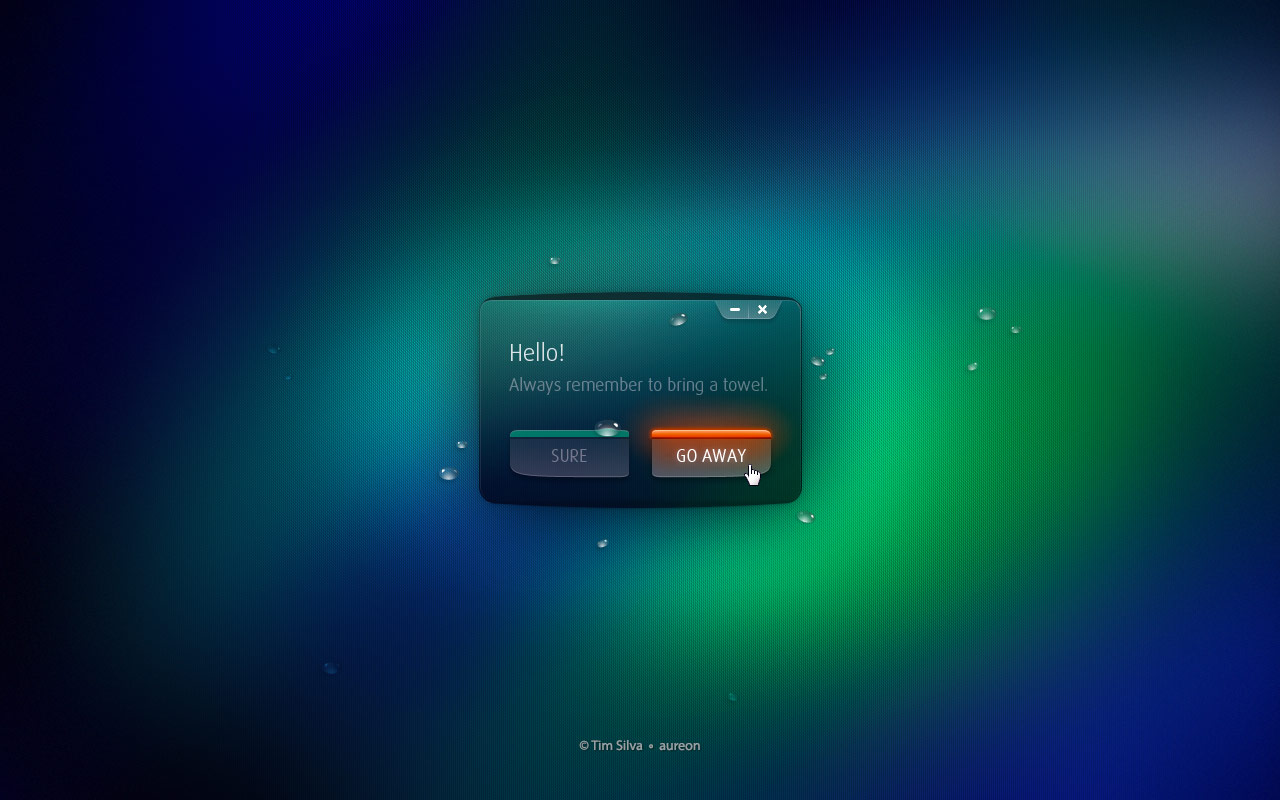
Aureon
Concept

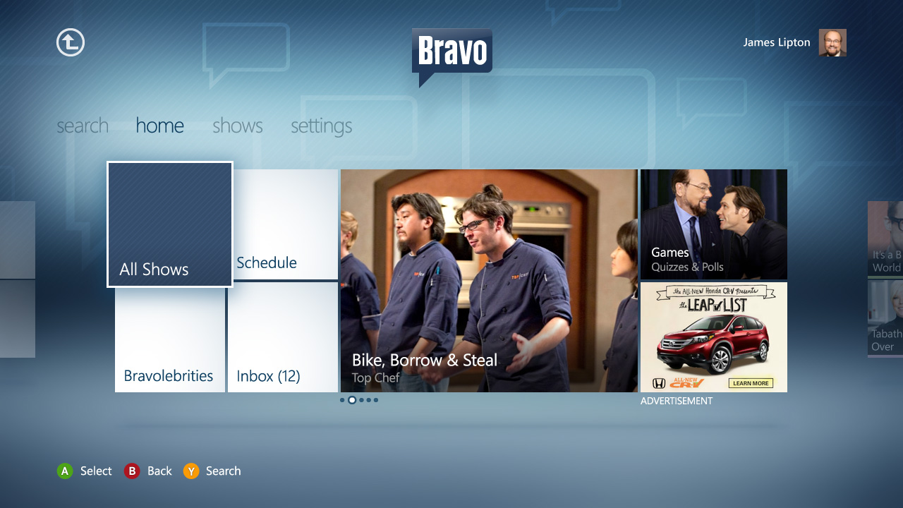
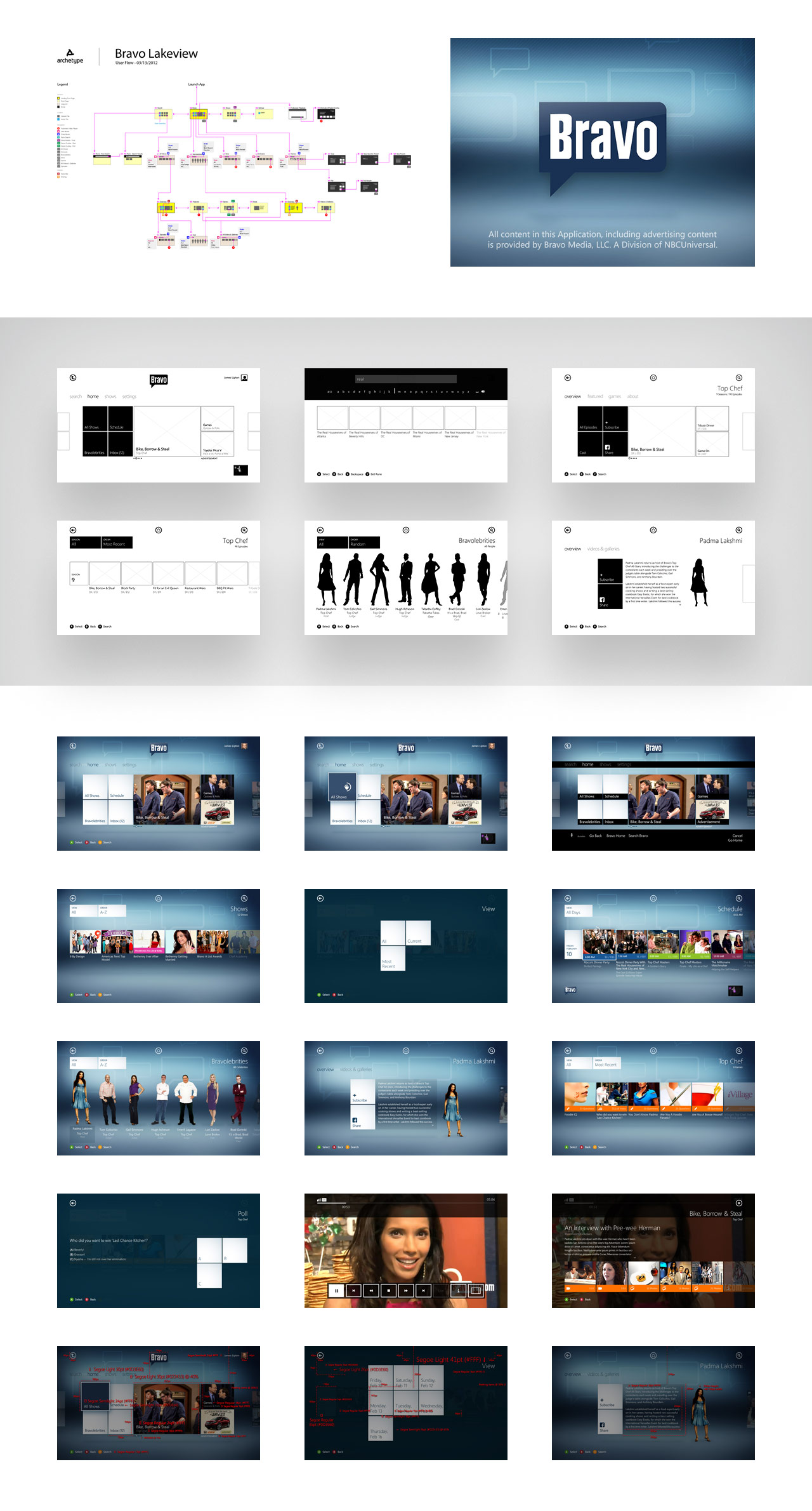
Bravo
Xbox App

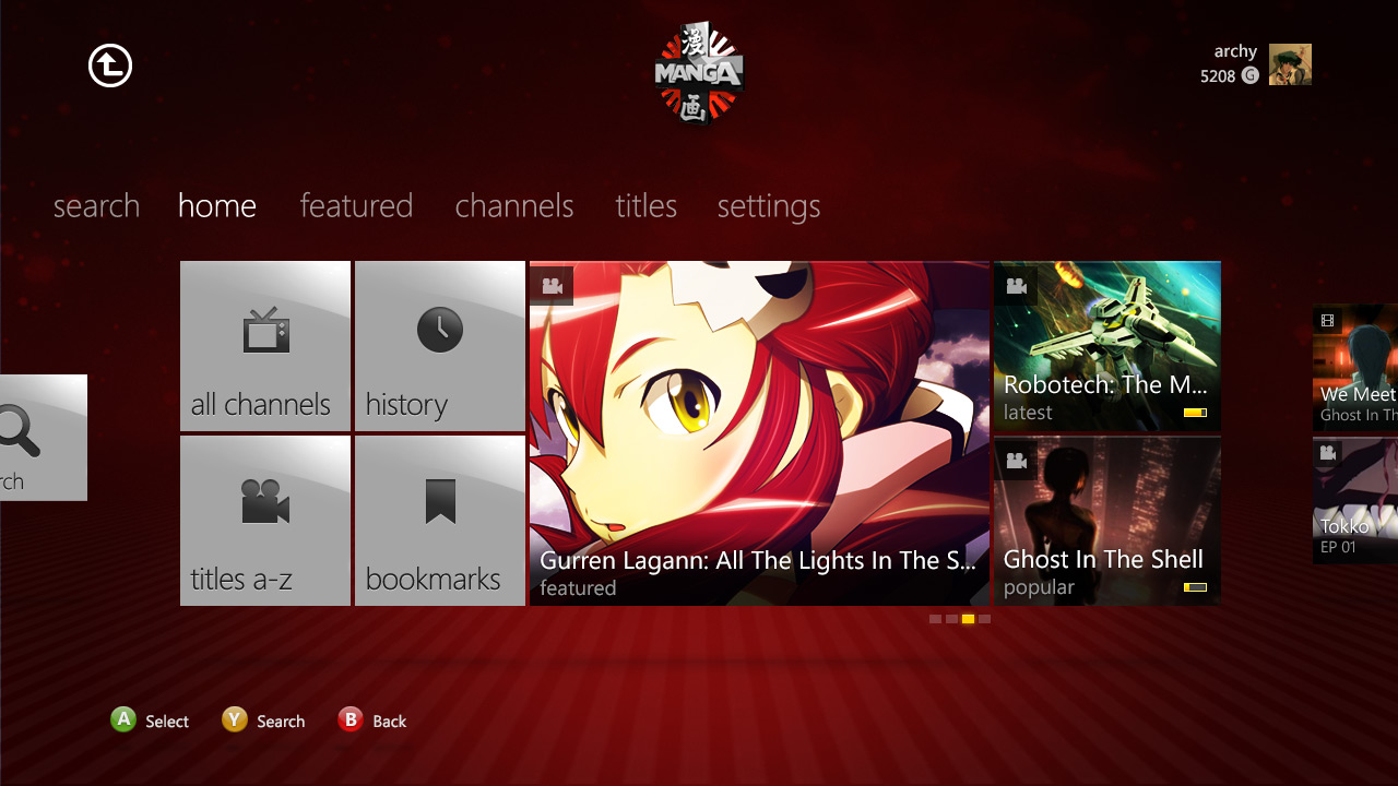
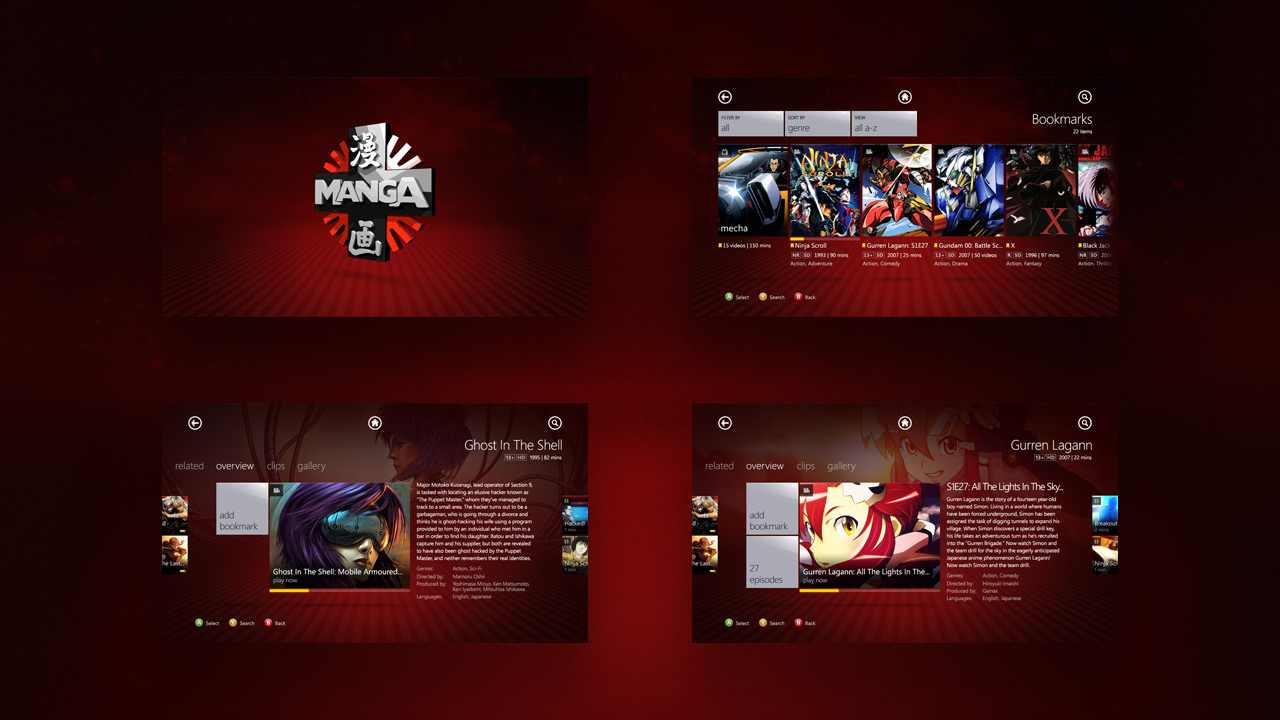
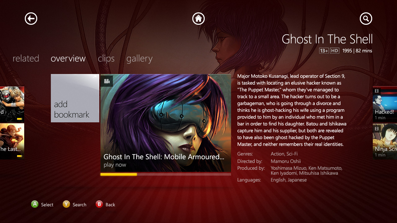
Starz Manga
Xbox App
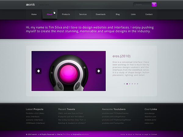
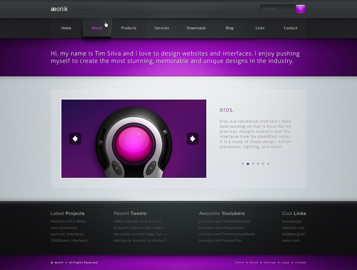
Aeonik
Web Design
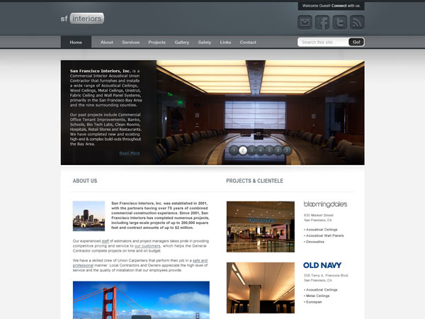
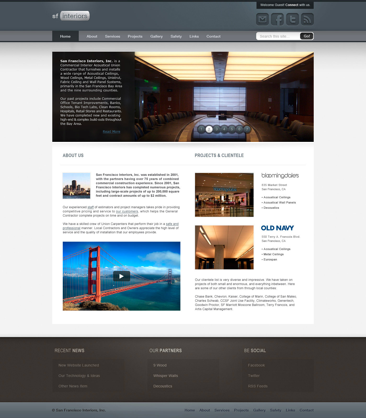
San Francisco Interiors
Web Design
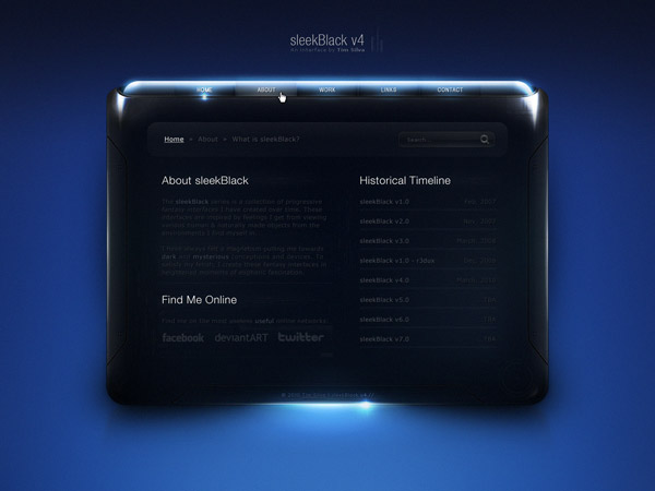
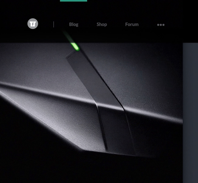
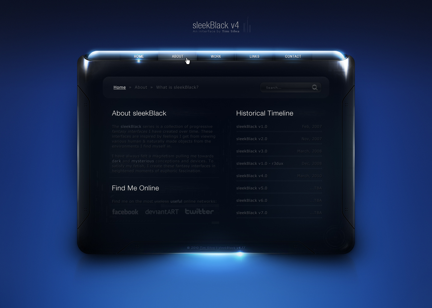
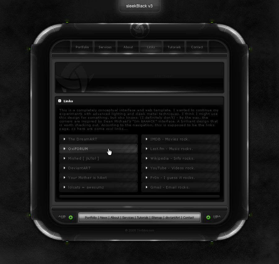
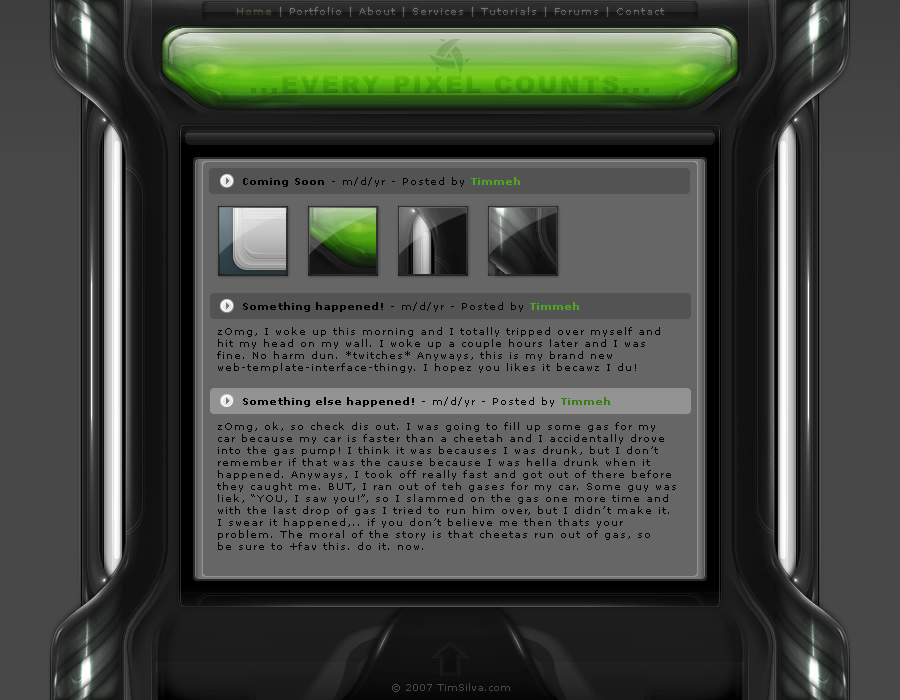
sleekBlack Series
Web Design
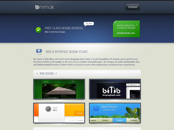
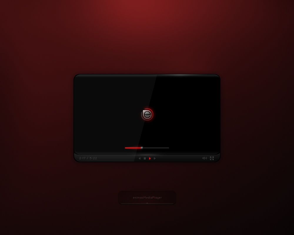
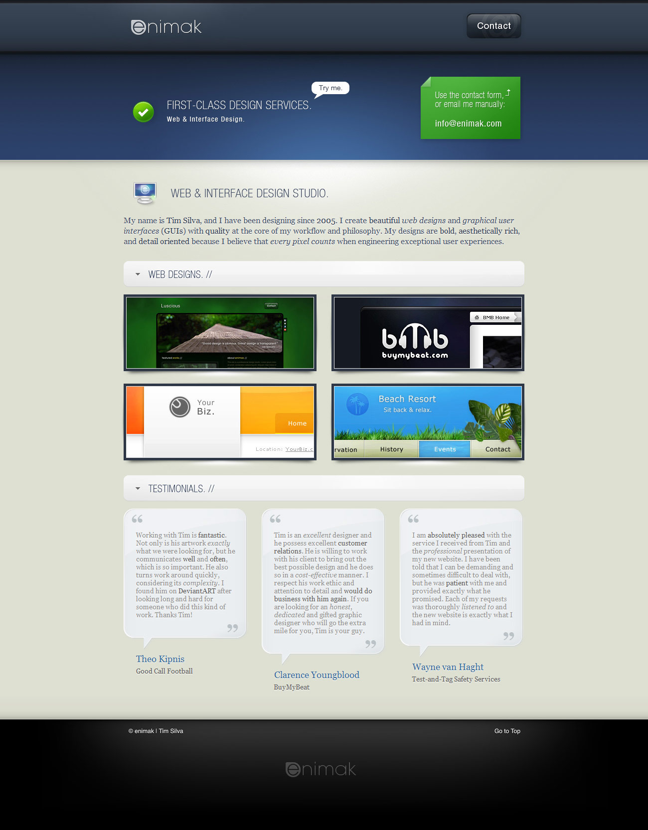
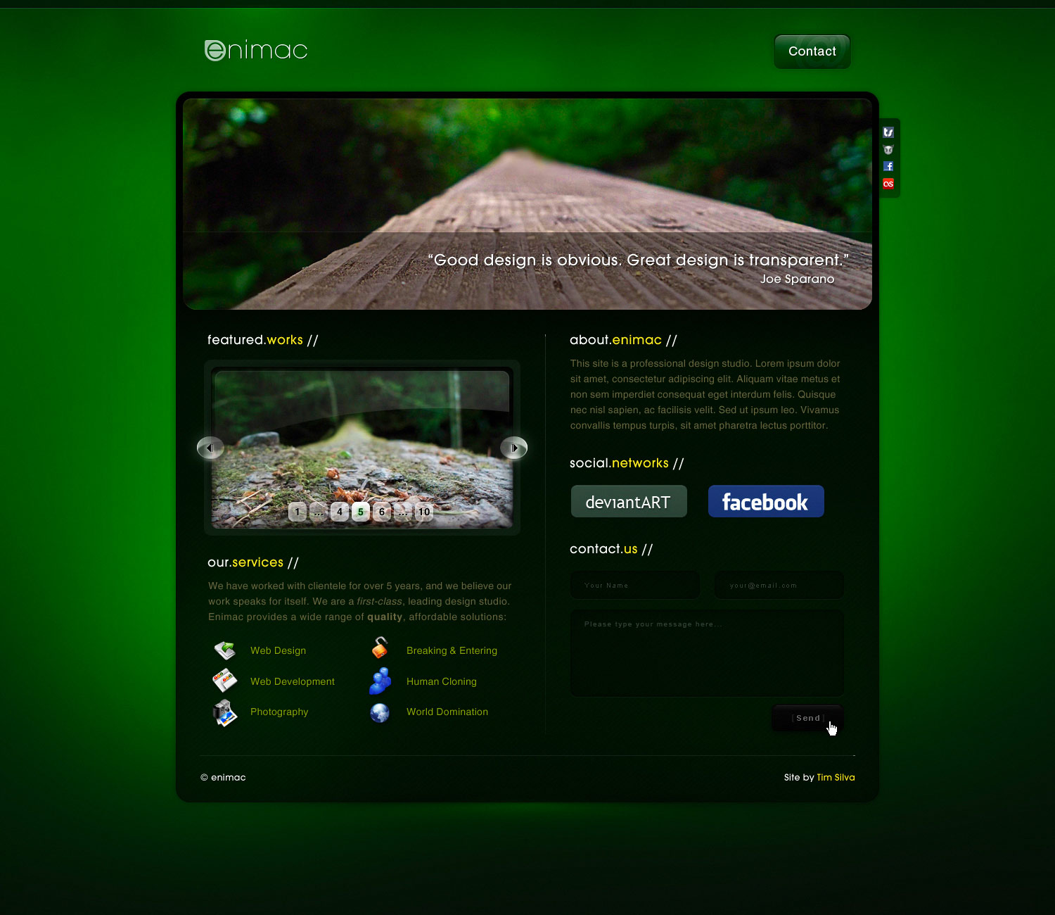
enimak
Web Design
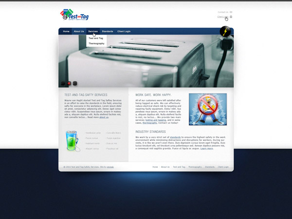
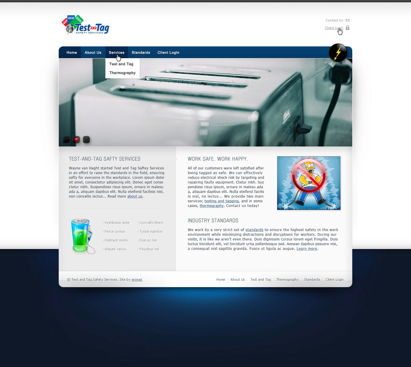
Test and Tag
Web Design
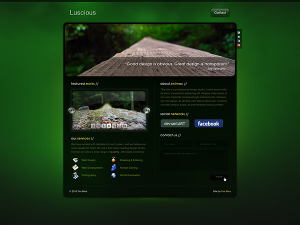
Luscious
Web Design
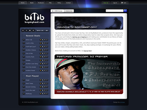
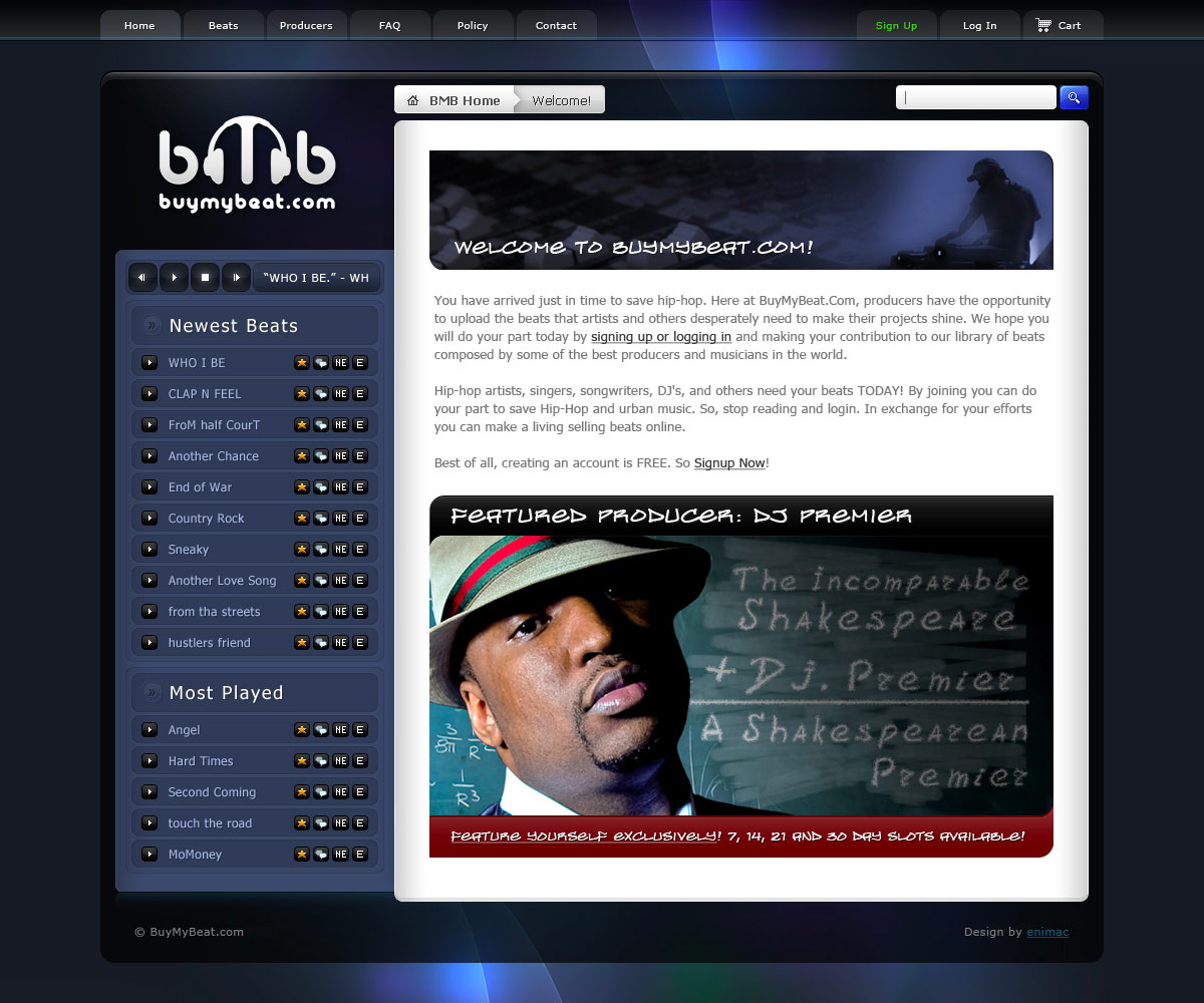
BuyMyBeat
Web Design
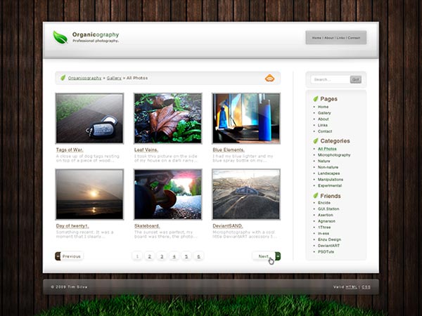
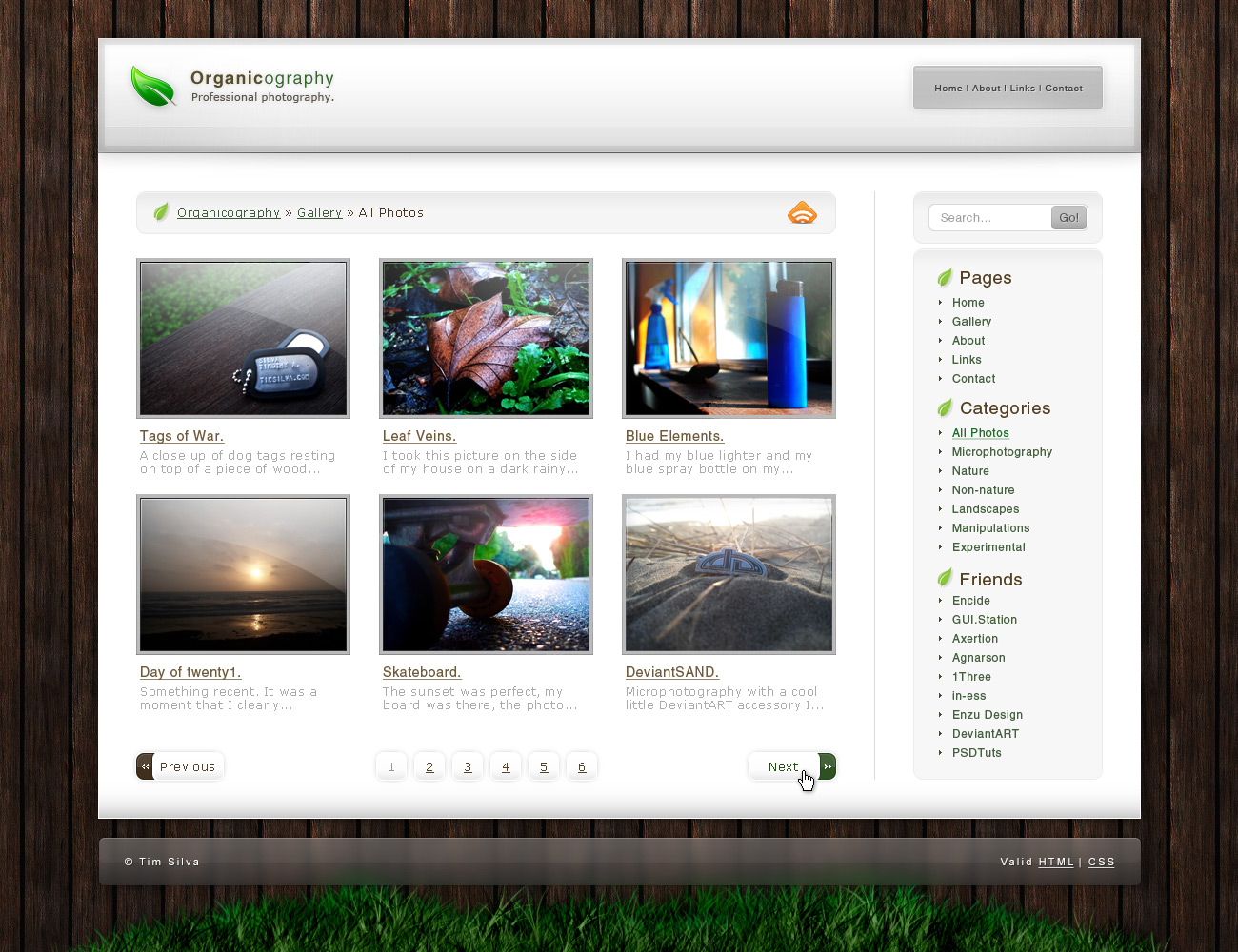
Organicography
Web Design
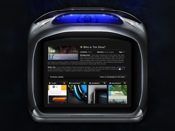
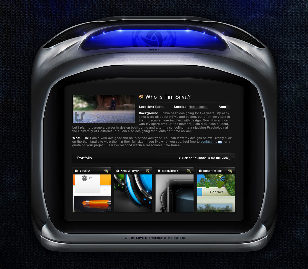
Surface
Web Design
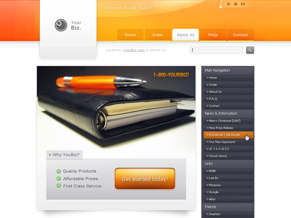
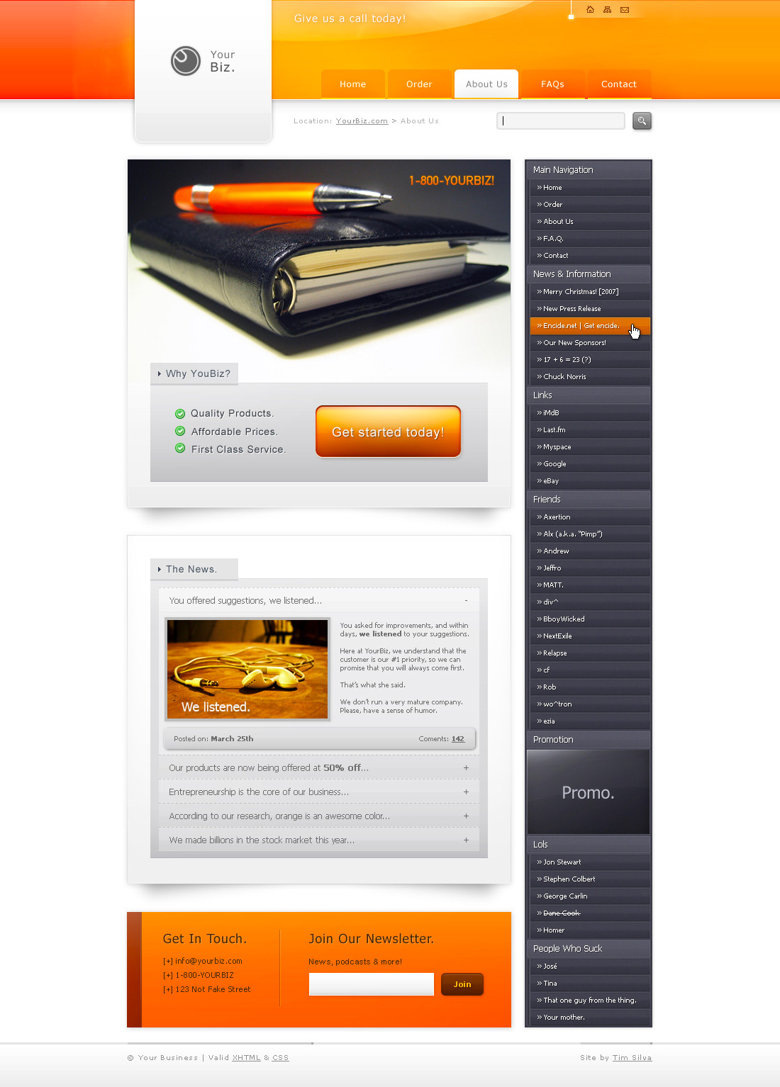
YourBiz
Web Design

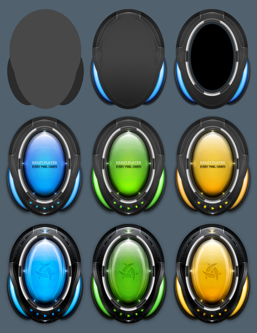
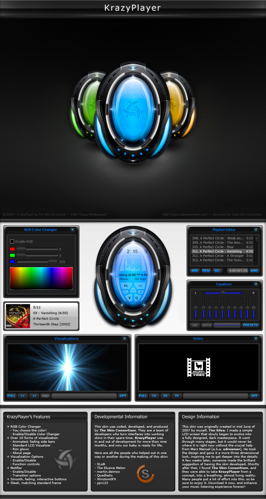
KrazyPlayer
Winamp Skin
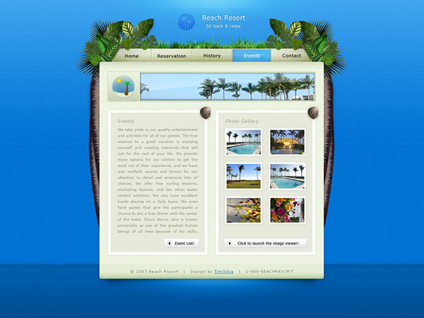
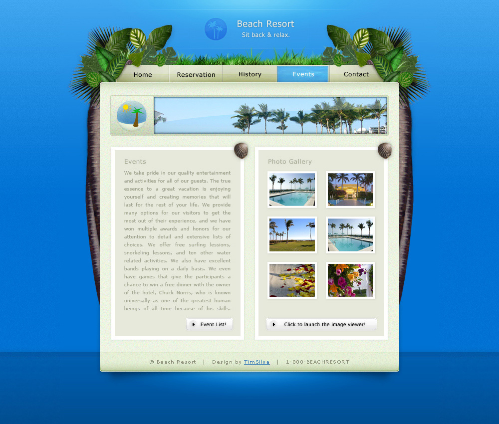
Tropical Beach Resort
Web Design
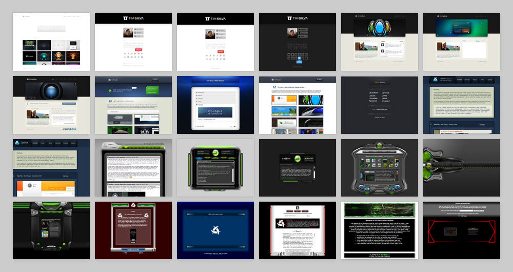
Brands I've had the pleasure of working with.
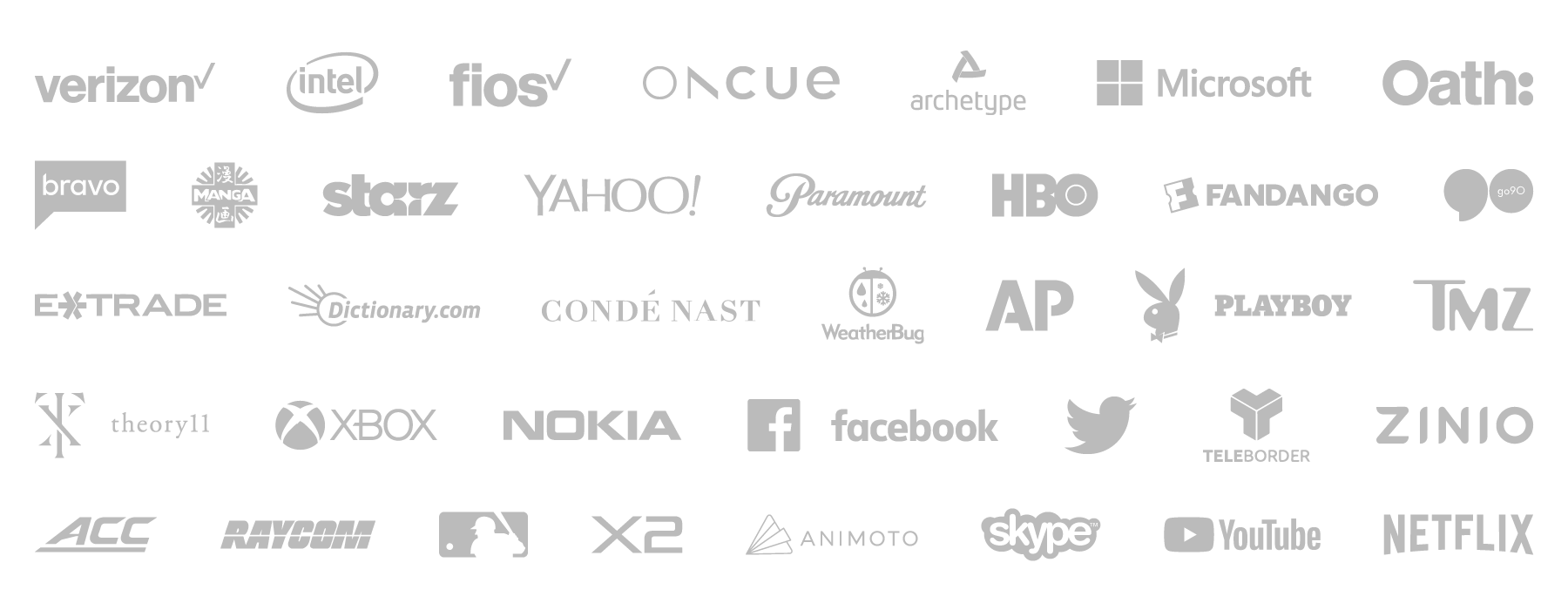
Just some of the brands and clients that I've had the pleasure of working with since 2005.
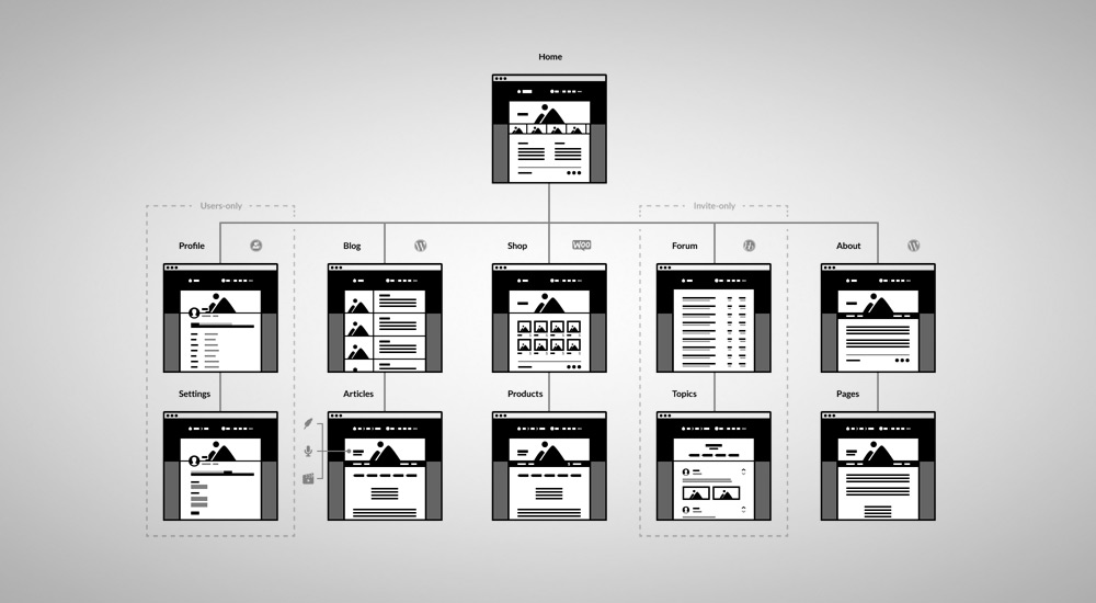
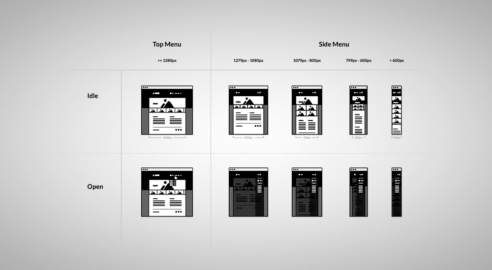
Skills, services and technologies that I practice.
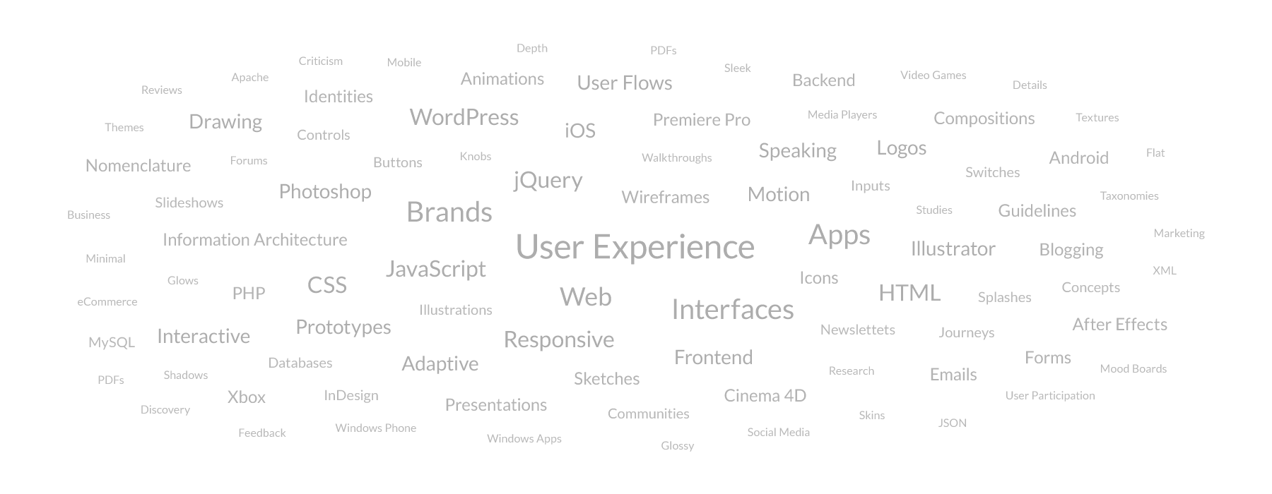
This word cloud highlights what I can provide for you, with the more prominent items highlighting my specializations. This list includes skills, services, technologies, platforms, software, languages, disciplines and deliverables. Do not mistake me for a jack of all trades; I just spend an unsually copious amout of time both learning and mastering as much as I can.
Interested in discovering what I can do for you?
Contact Me