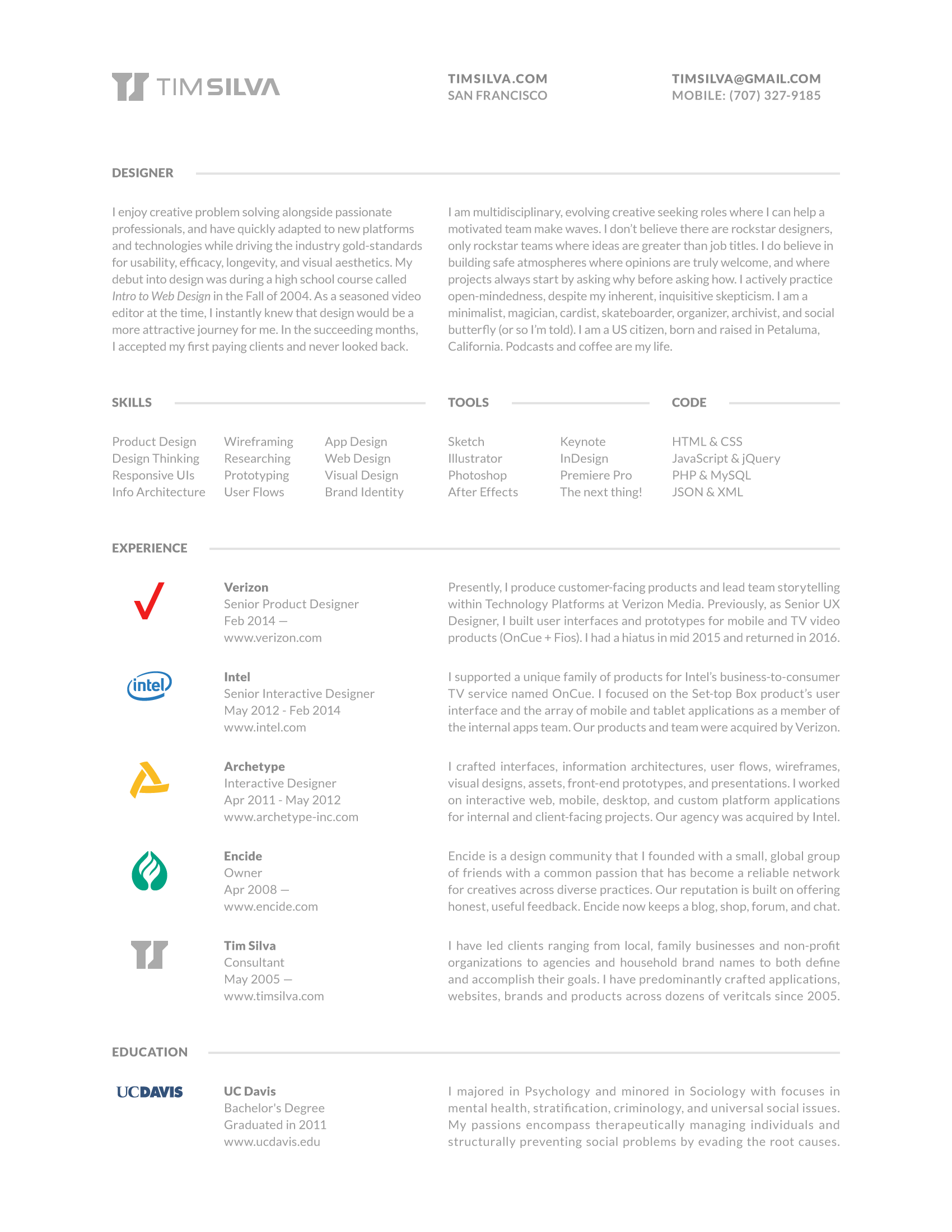
In the beginning, design was my casual hobby. Naturally, the process of making products that people enjoy using has become my greatest purpose. Since 2005, I have sustained business with happy clients including household brand names, agencies, startups, and even individuals by crafting their exceptional ideas into tangible realities. I also own and manage encide, a prolific design community offering a blog, a shop, and a forum where creatives can collaborate, master trade skills, and advance in their careers. My services include UX, UI, apps, websites, logos, brands, prototypes, development and motion. I'm a full-stack designer with entrepreneurial ambitions and a knack for dreaming up fantasy user interfaces; sleek and futuristic concept art meant to explore what might be possible.

Verizon Media / Oath
2018–Now

Verizon
2014–Now
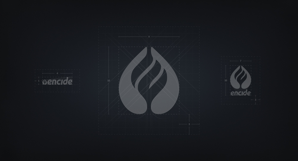
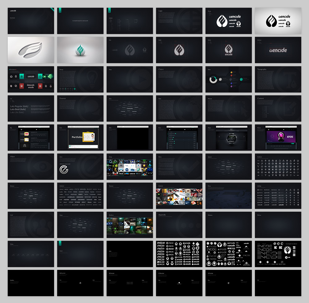
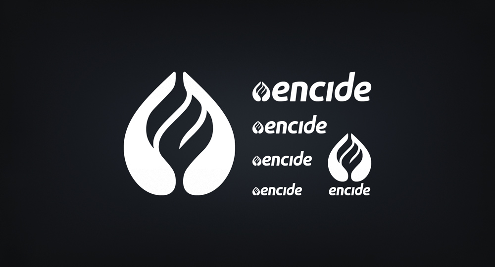
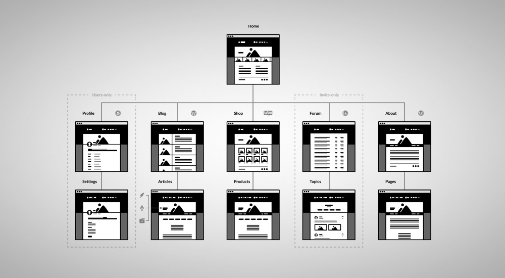
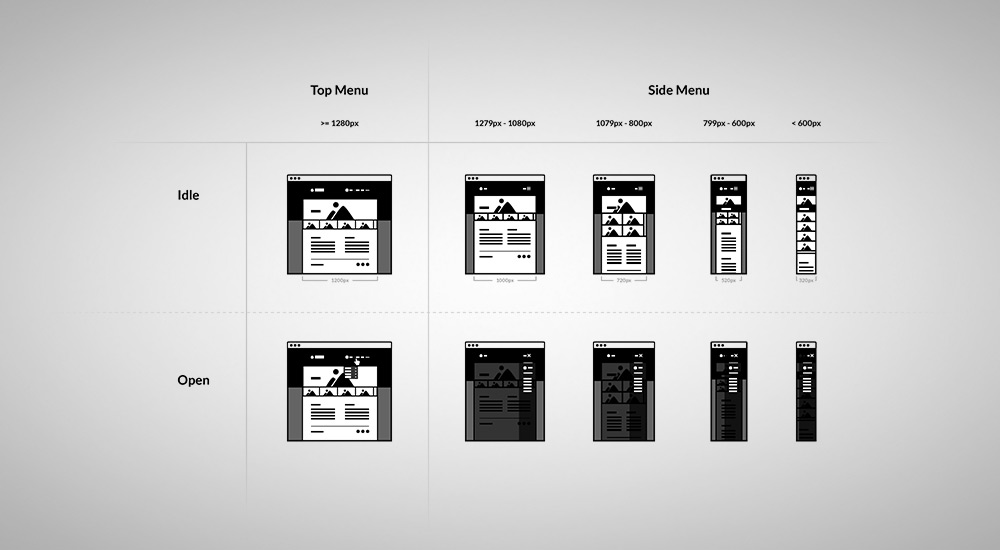
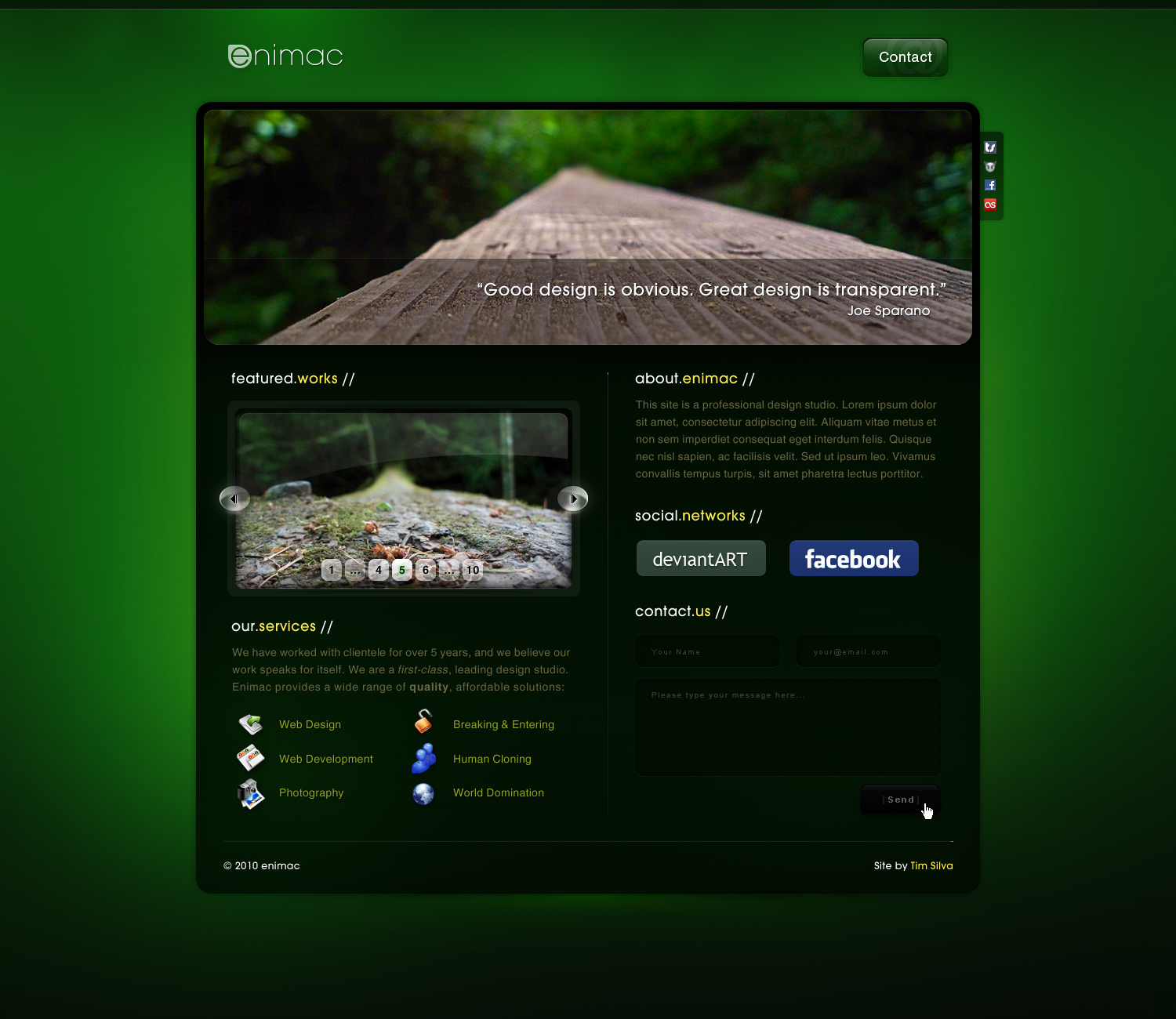
Encide Brand & Website
2008–Now
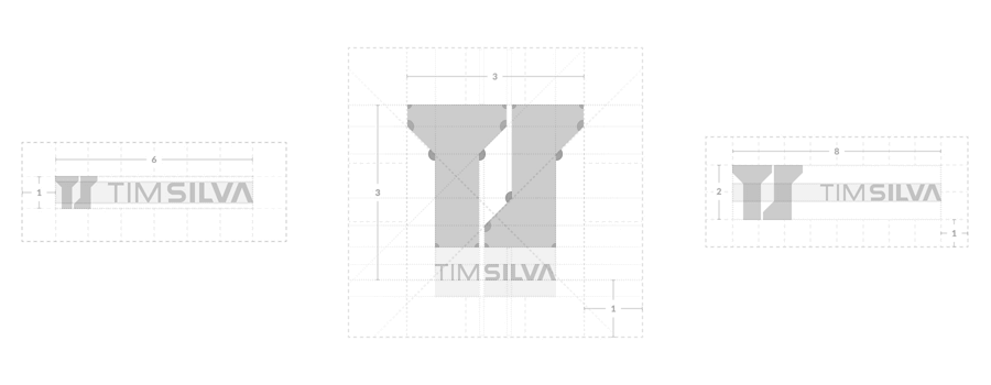
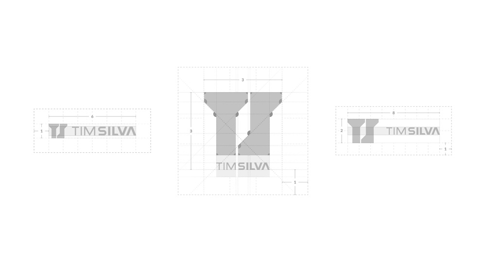
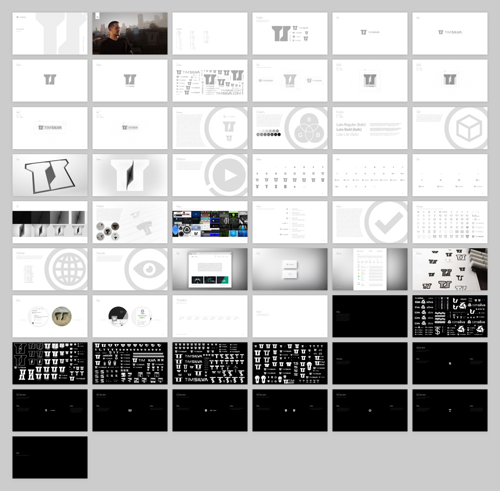
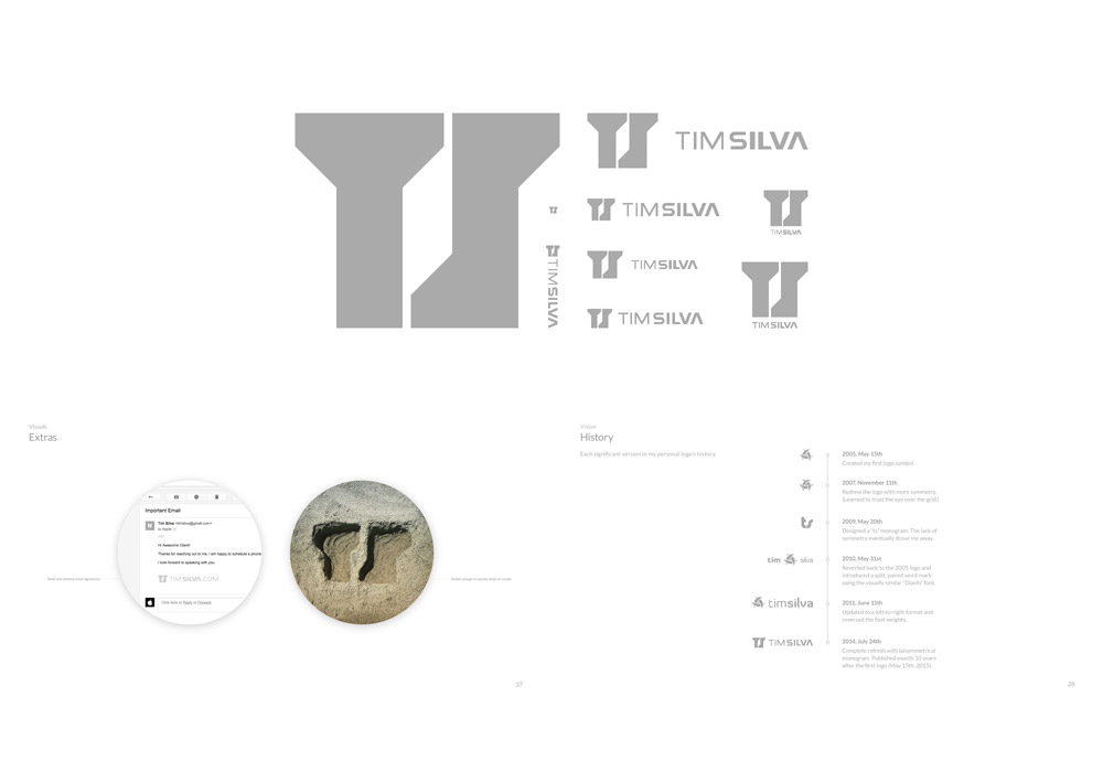
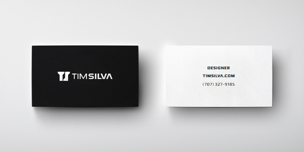
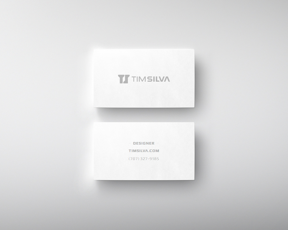
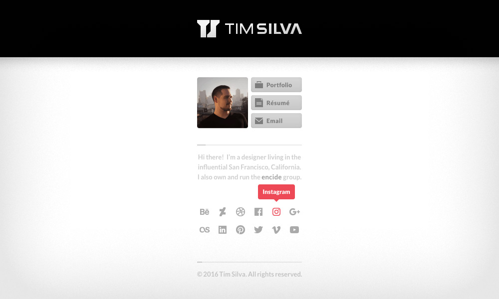
Personal Brand & Website
2005–Now
Fios
2014~2018
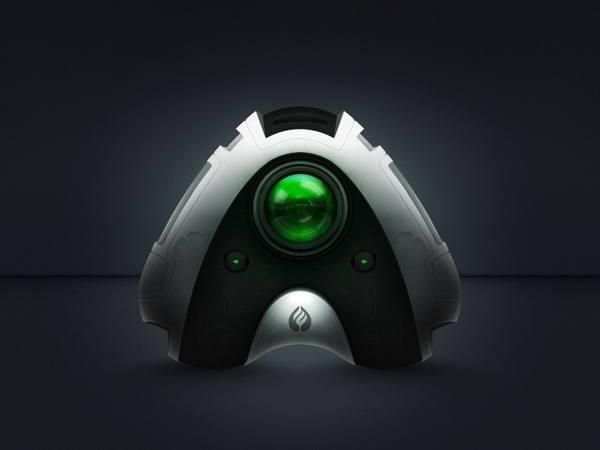
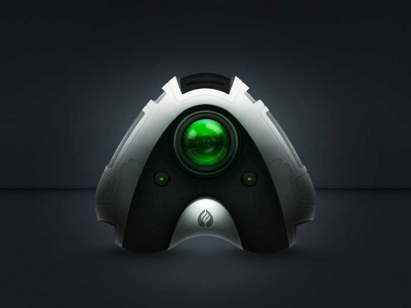
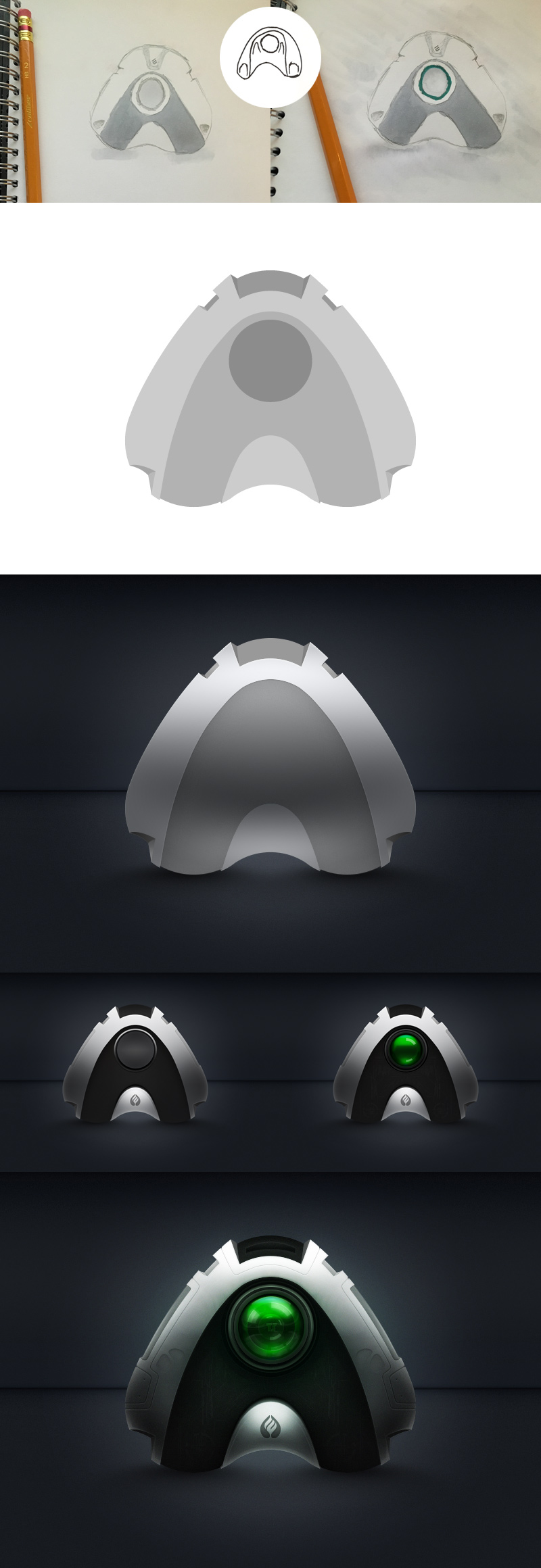
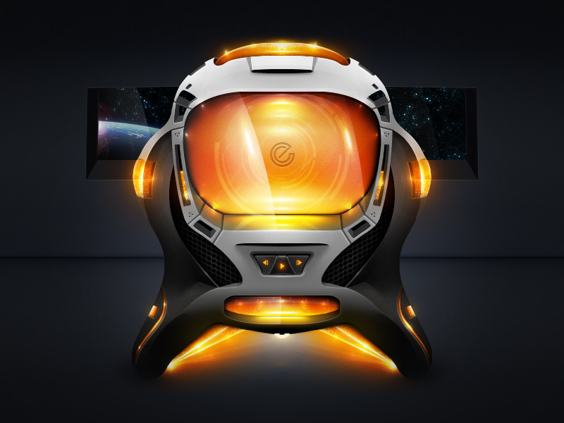
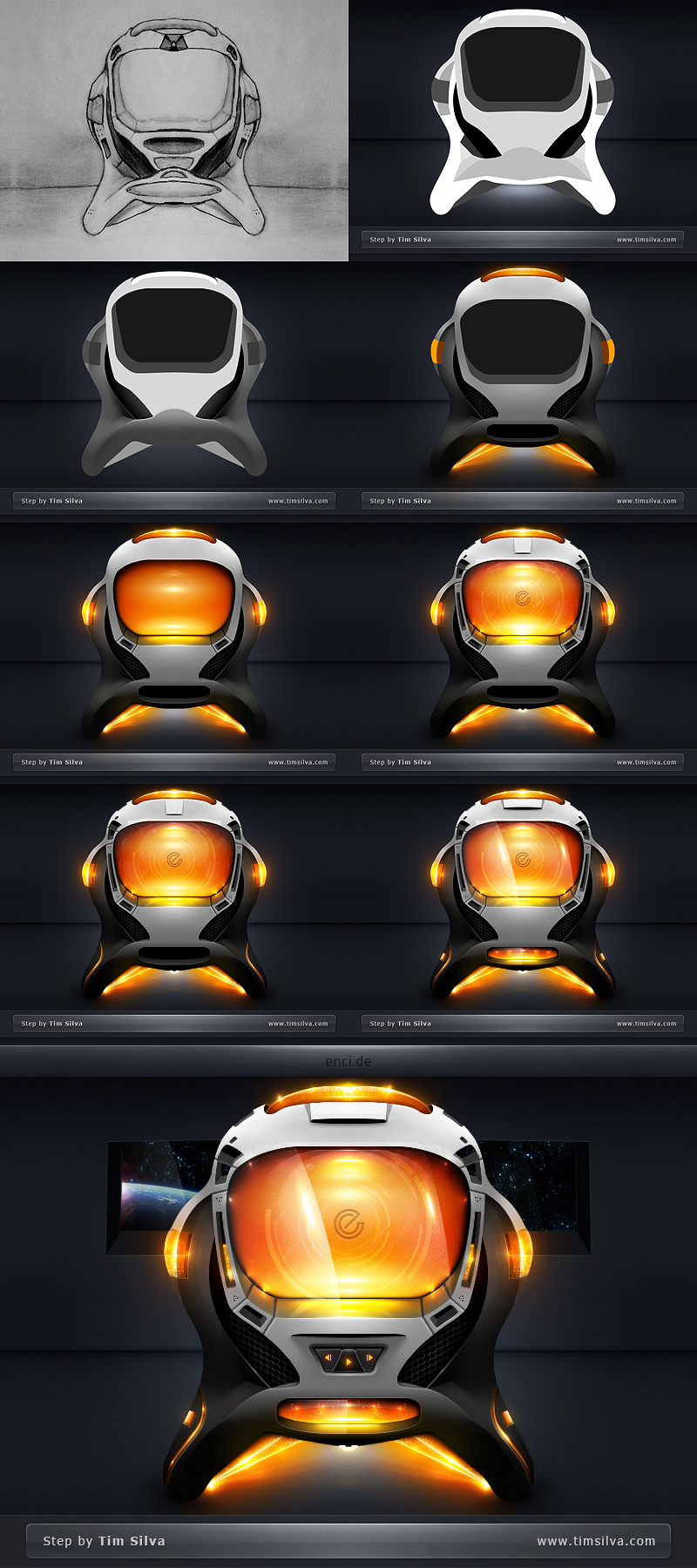
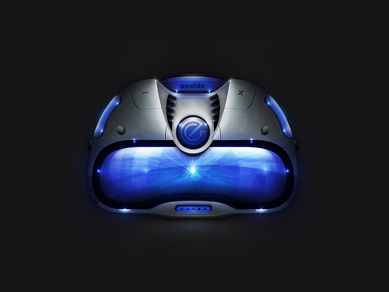
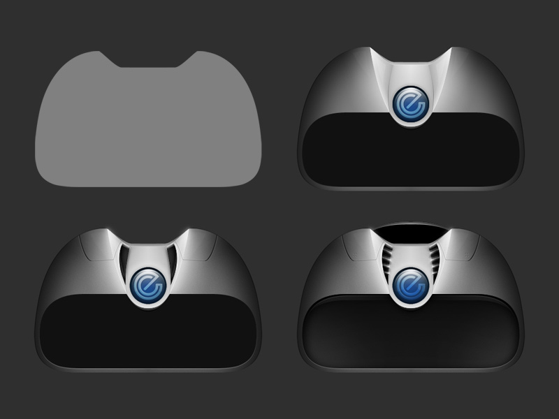
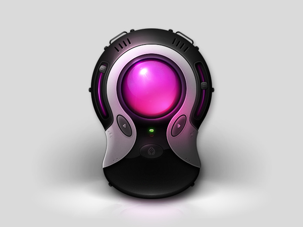
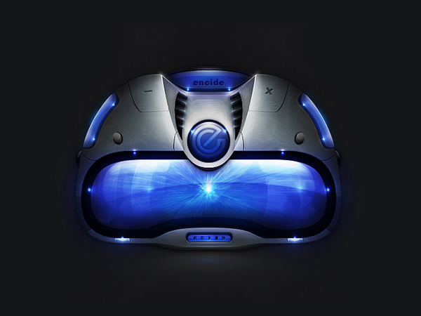
Encide Interface
2016
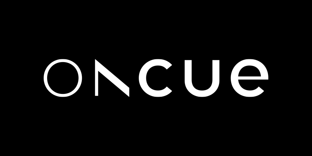
OnCue
2012–2015
Encide Interface
2014

Intel
2012–2014
Encide Interface
2012

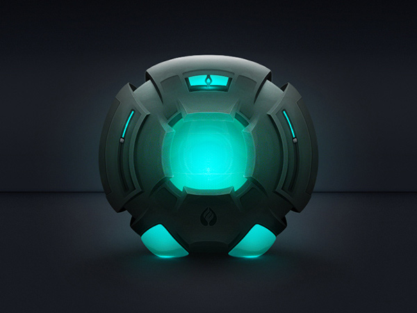
Archetype
2011–2012

Calescent
2012

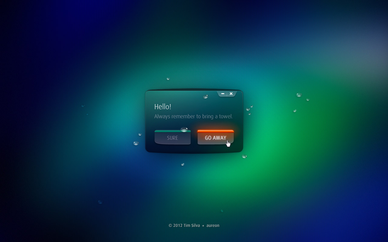
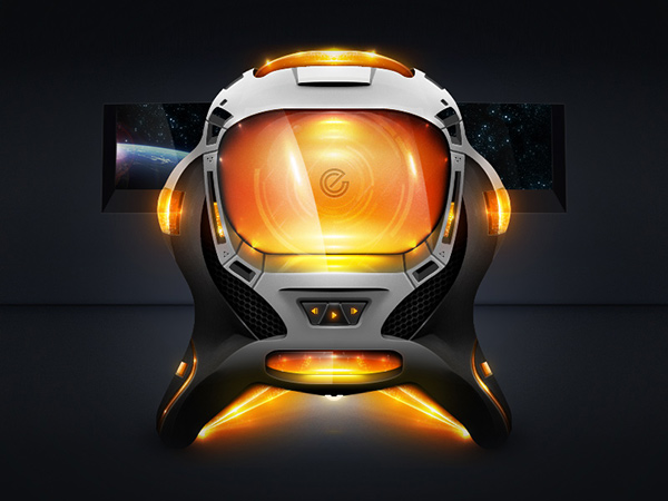
Aureon
2012
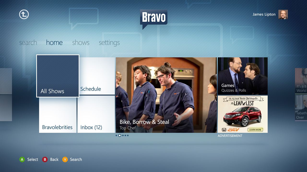
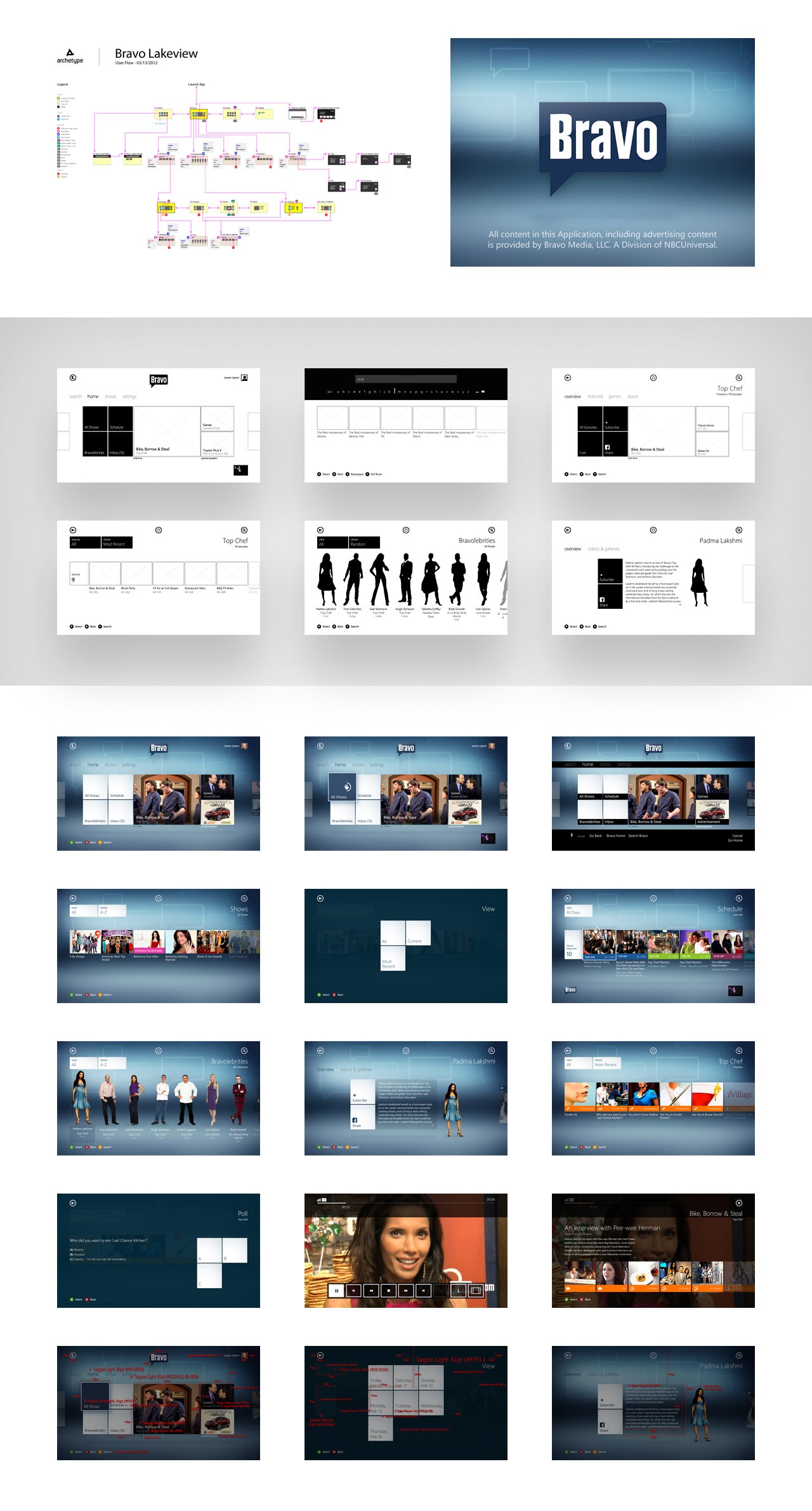
Bravo Xbox
2012

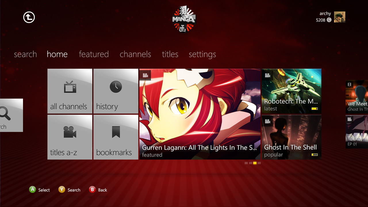
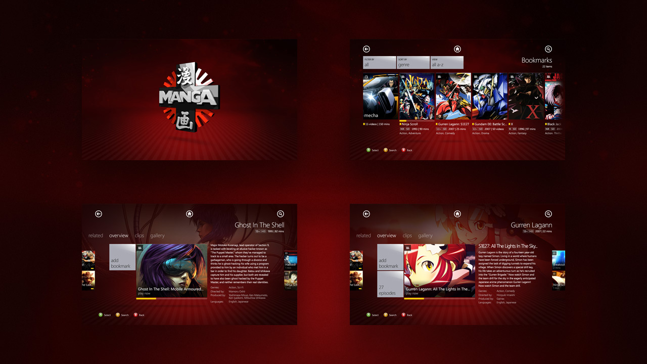
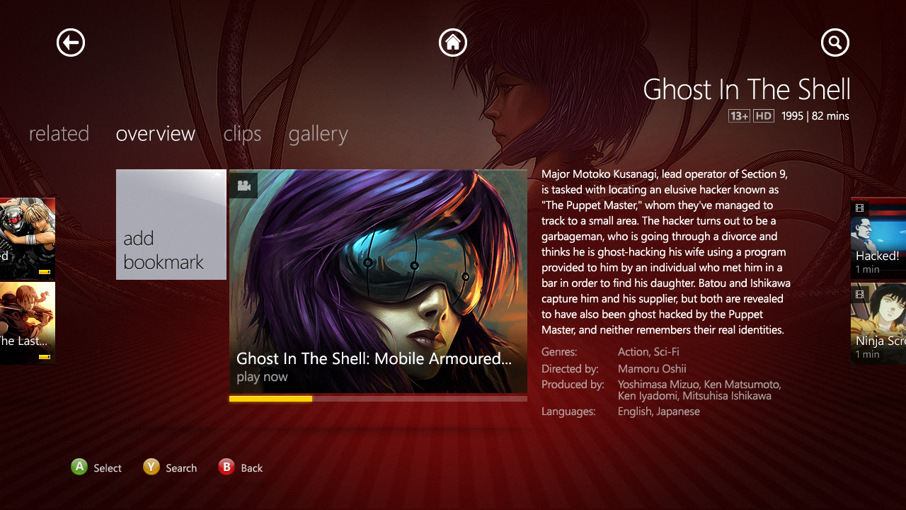
Manga Xbox
2011
Encide Interface
2010
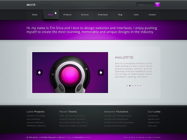
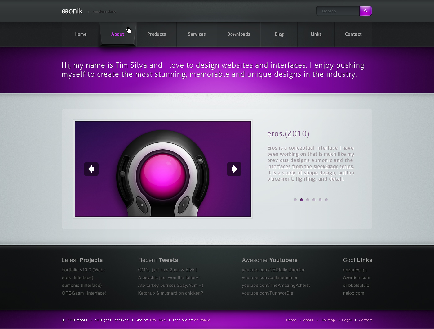
Aeonik
2010
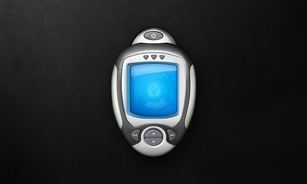
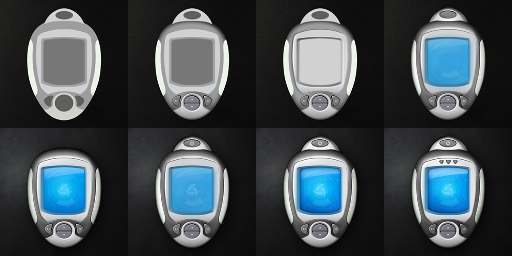
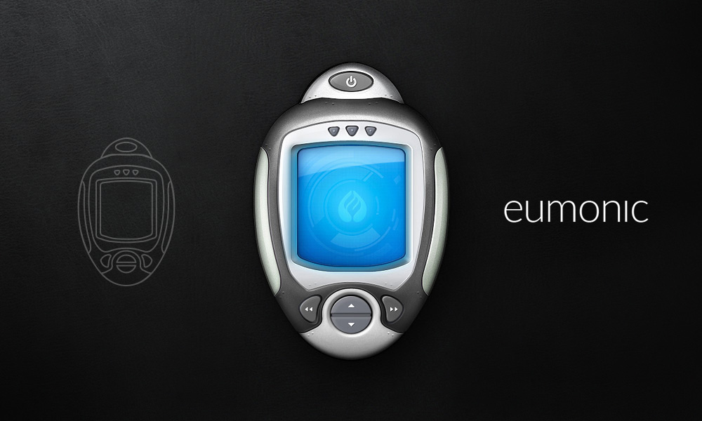
Eumonic
2010

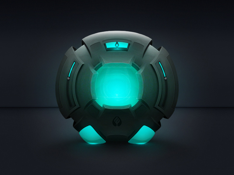
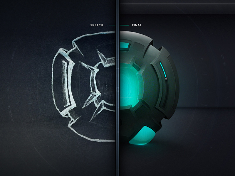
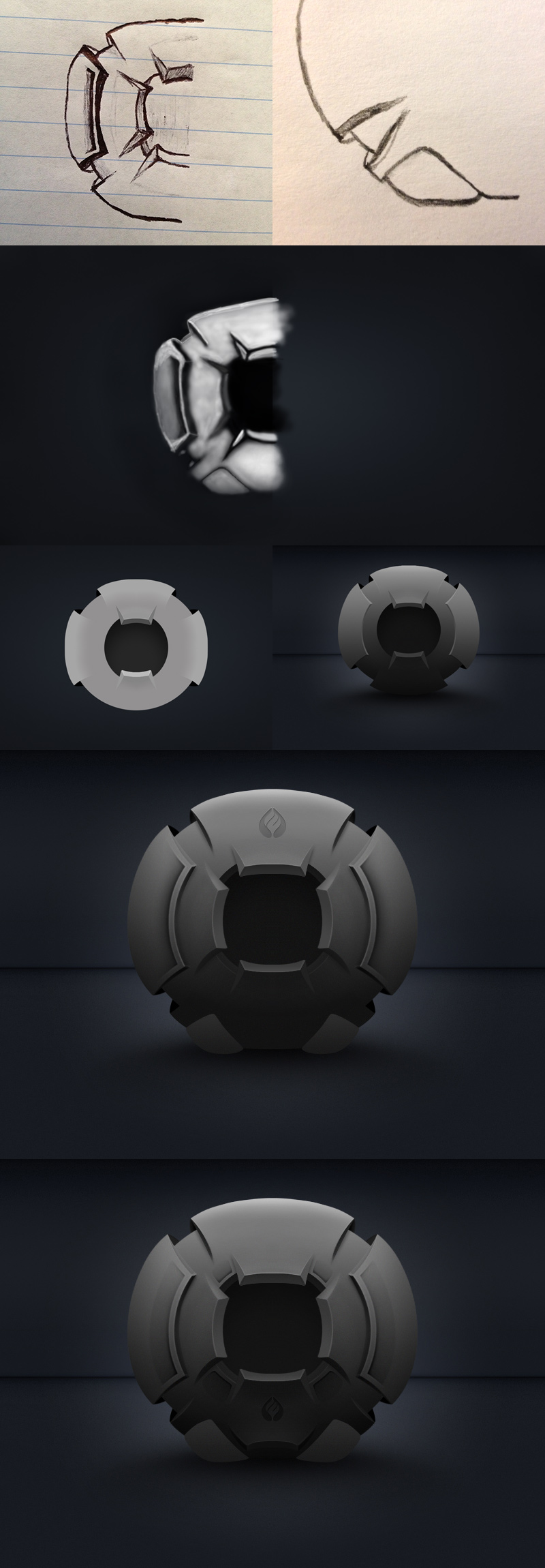
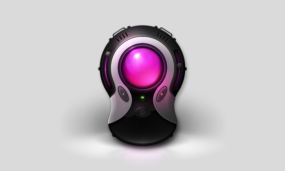
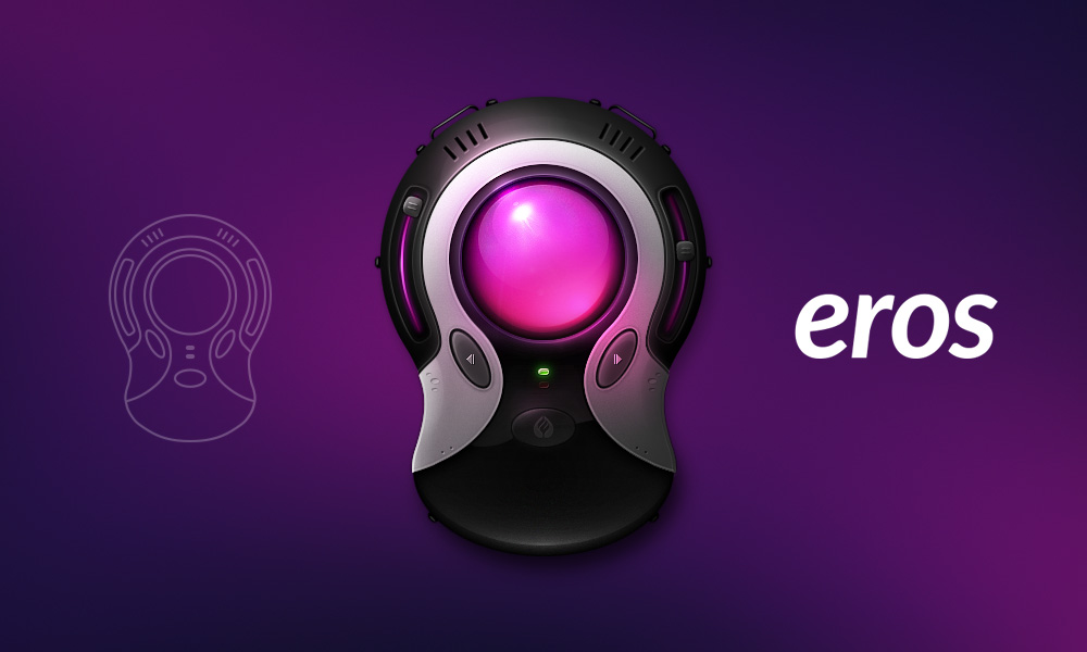
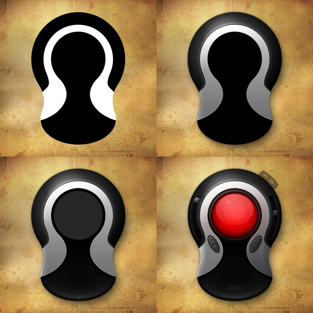
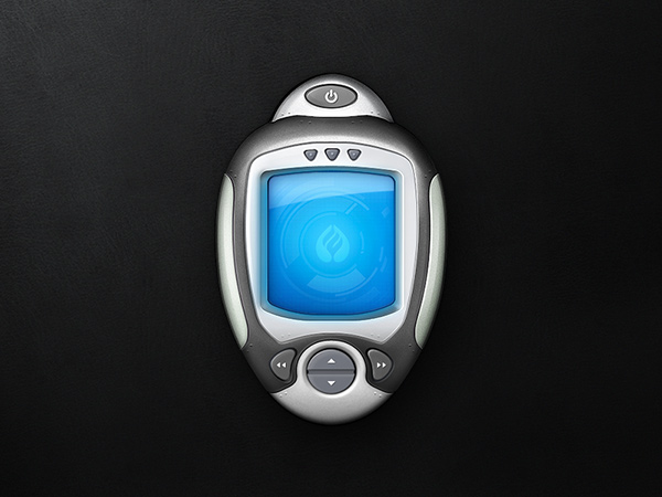
ORBGasm
2010
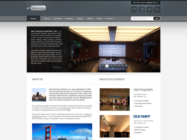
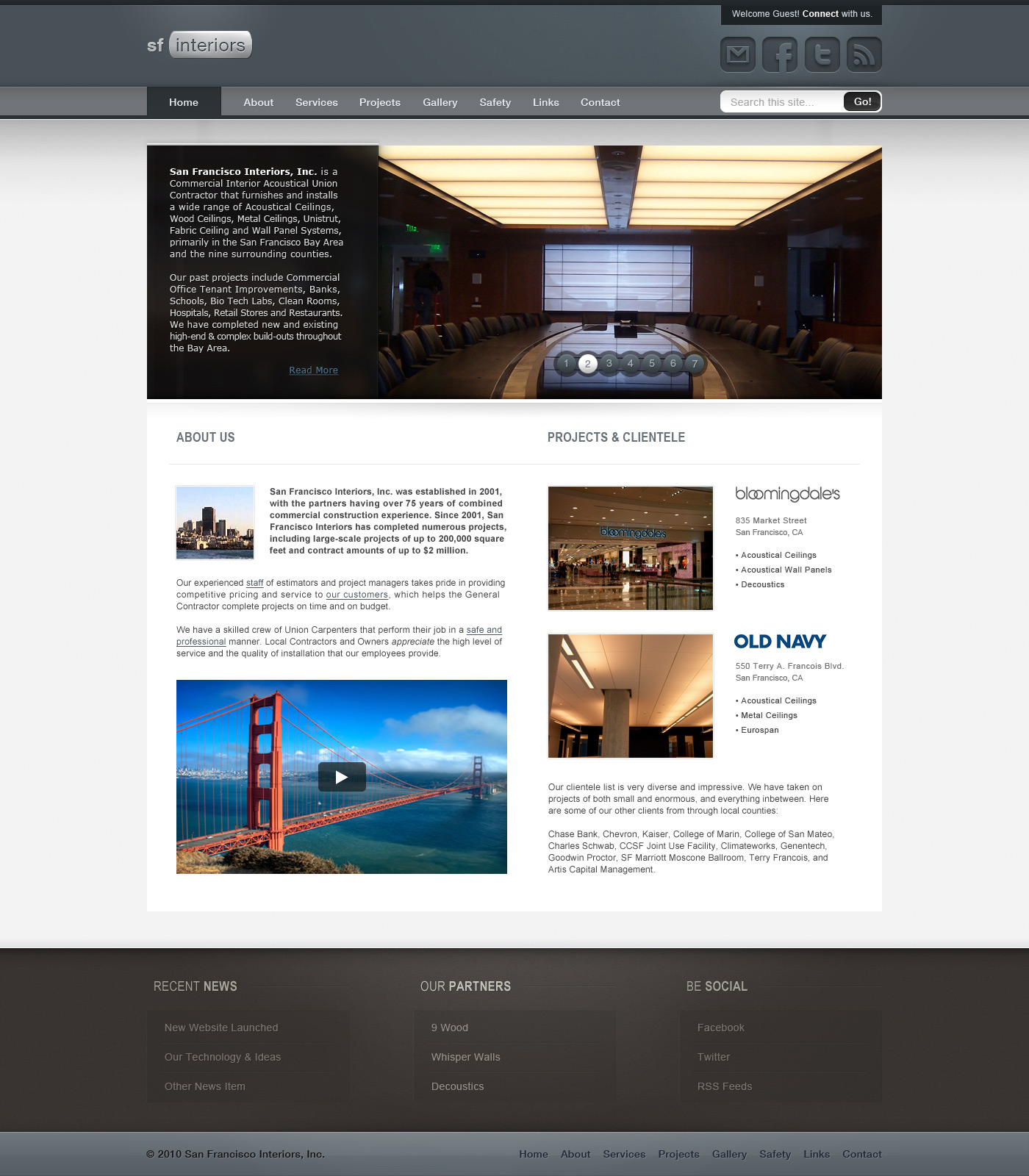
San Francisco Interiors
2010

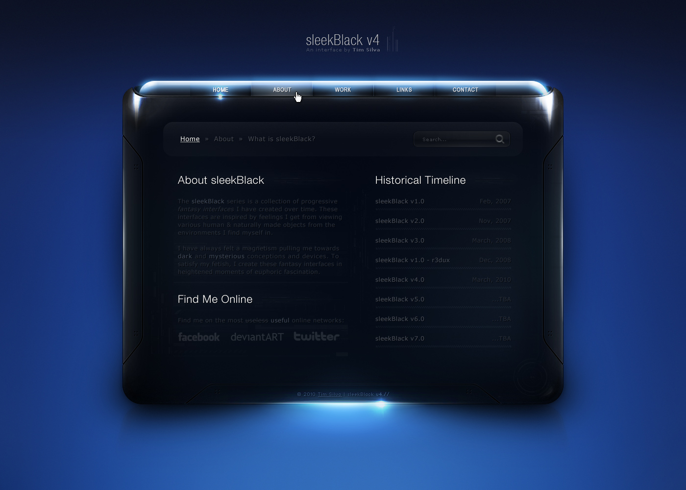
sleekBlack v4
2010
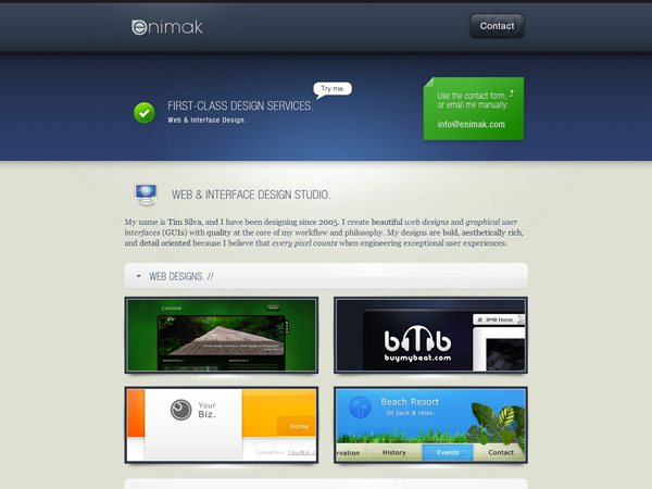
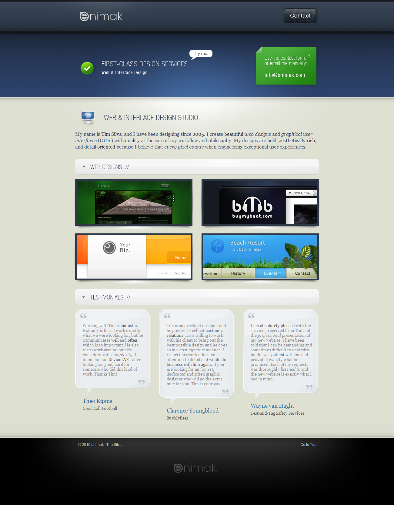
enimak
2010
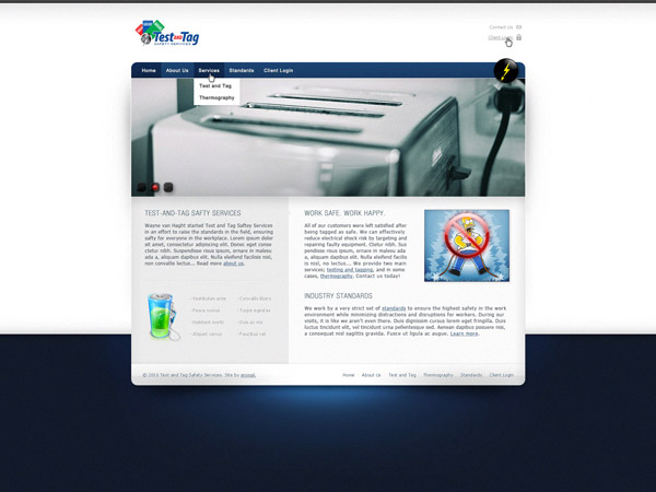
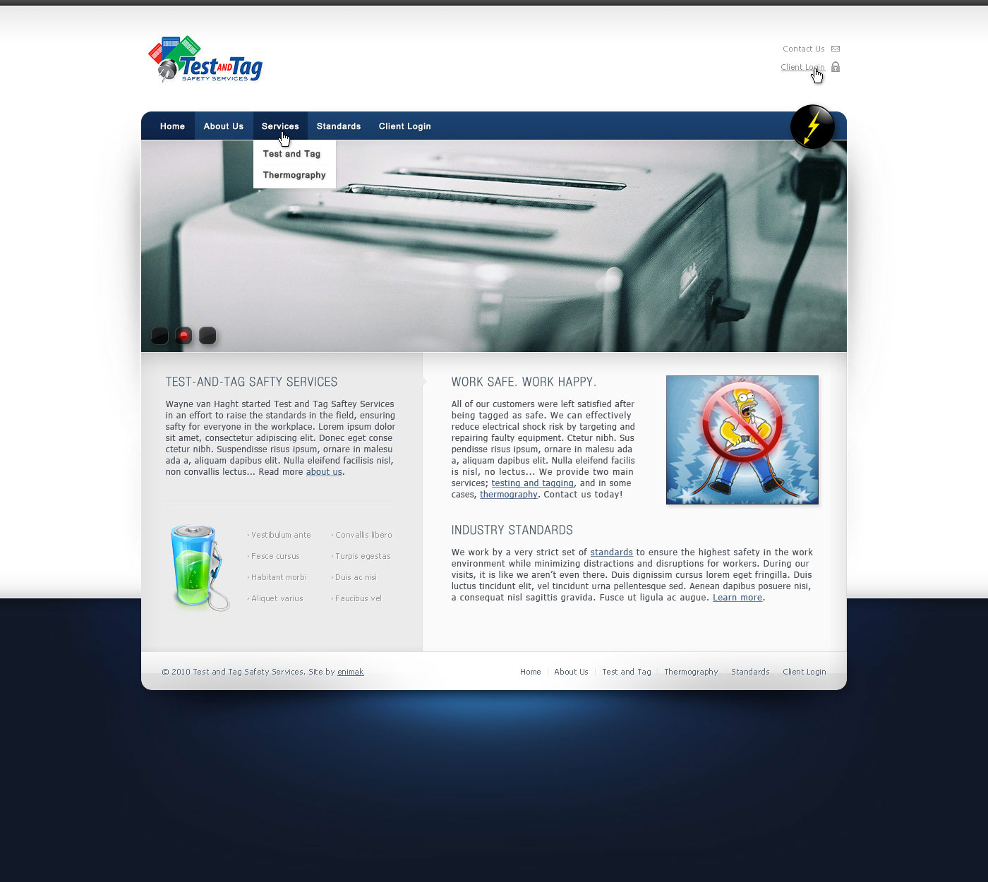
Test and Tag
2010
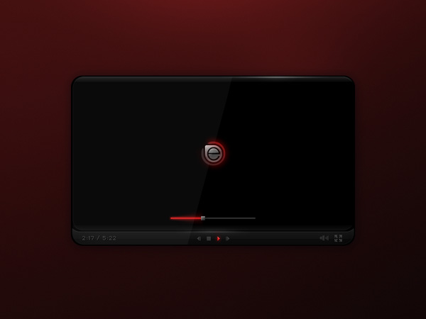
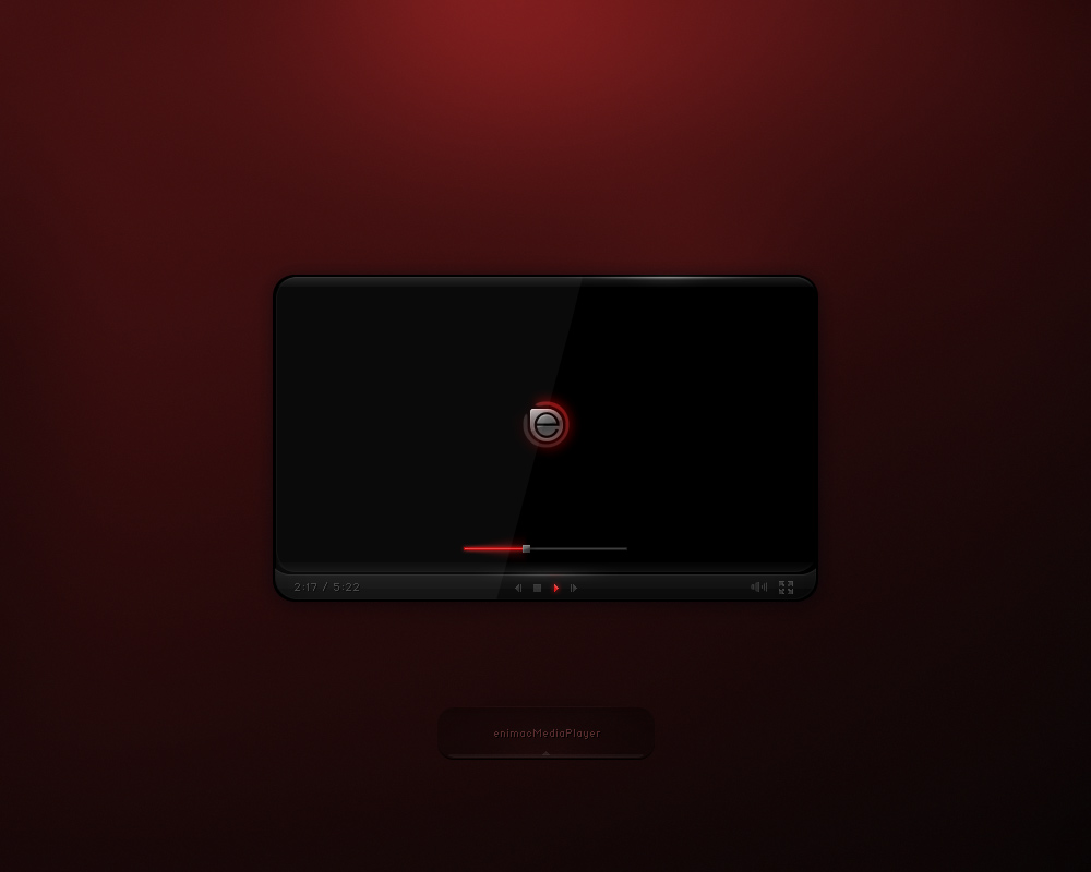
enimacPlayer
2010
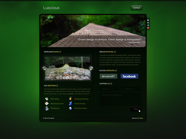
Luscious
2010
Encide Interface
2009
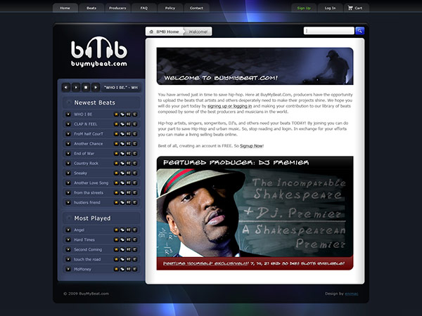
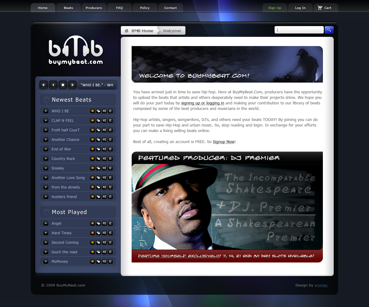
BuyMyBeat
2009
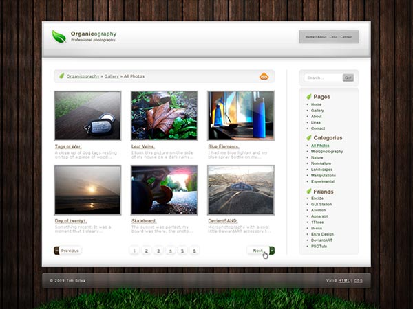
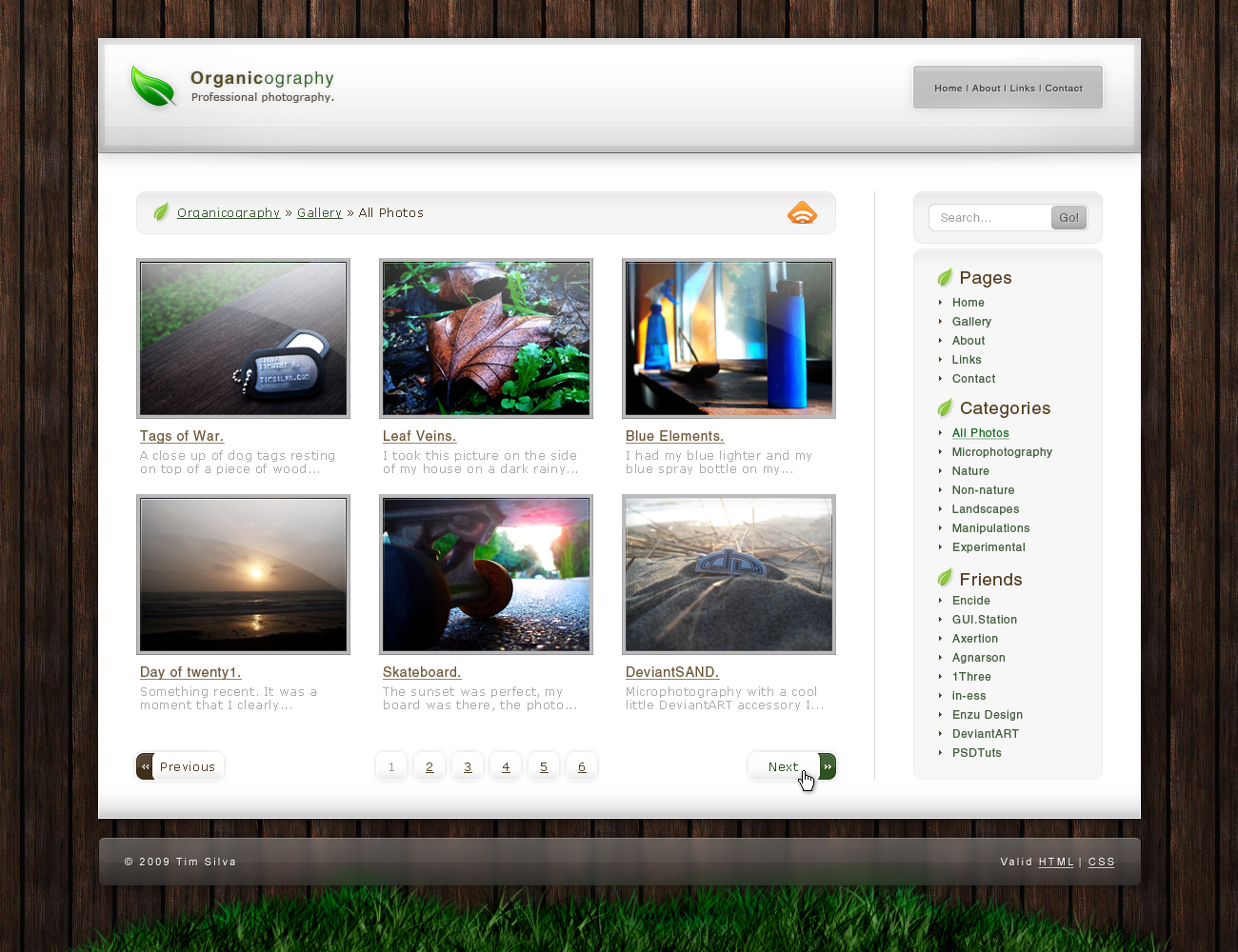
Organicography
2009
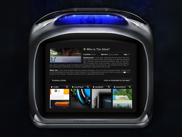
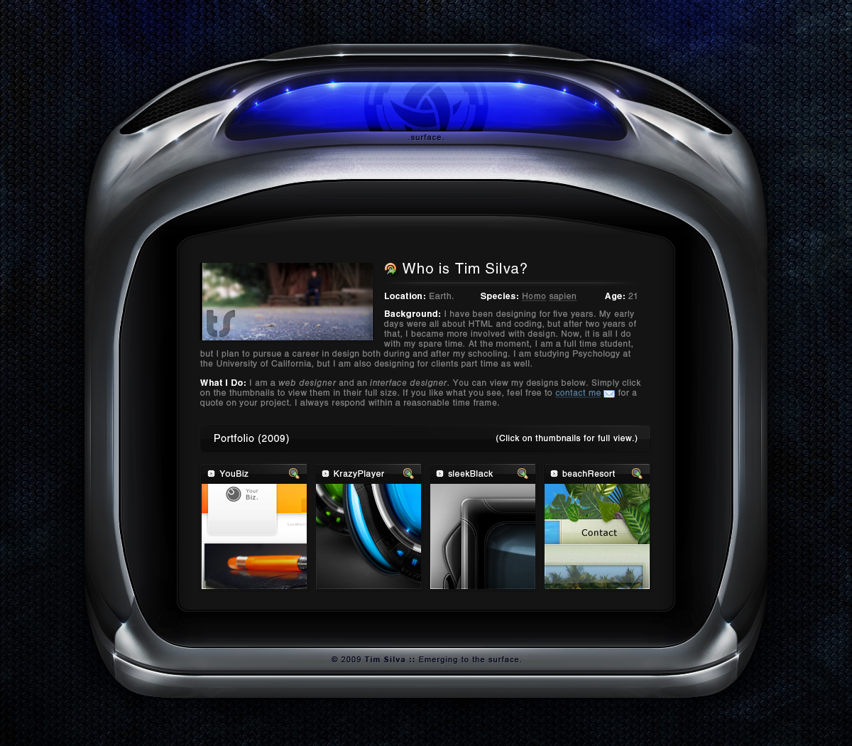
Surface
2009
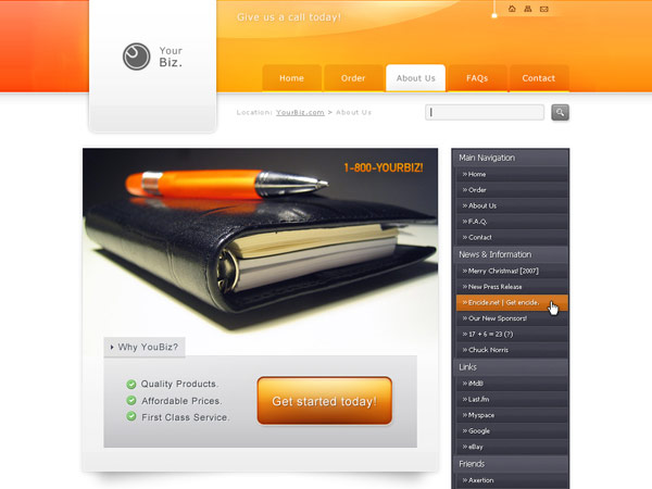
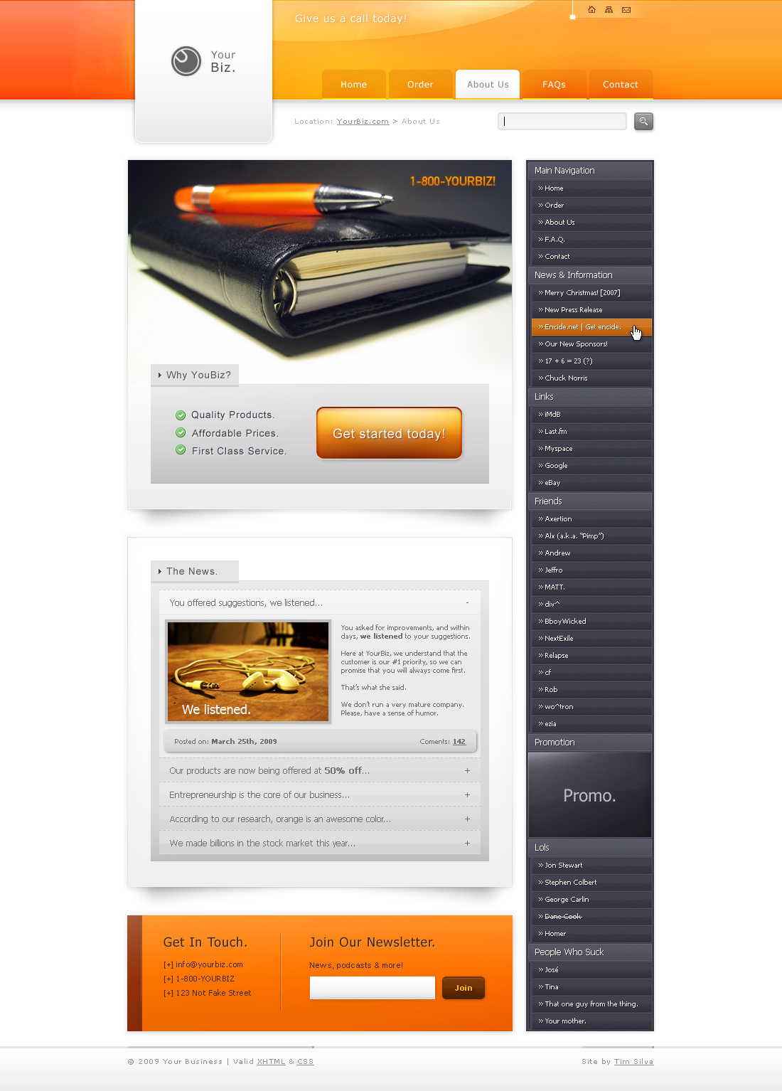
YourBiz
2009
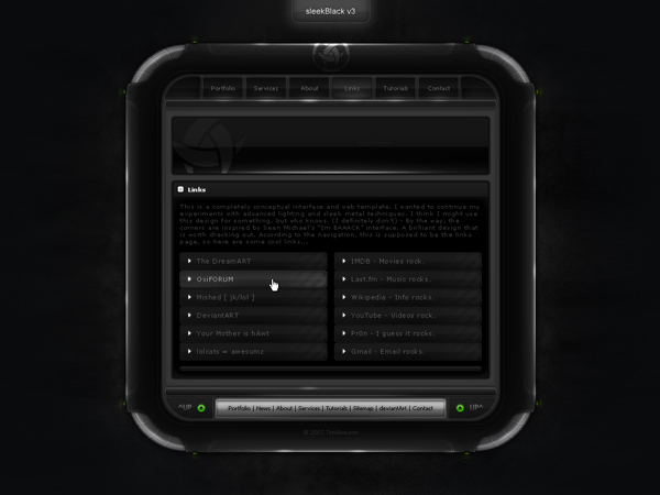
sleekBlack v3
2008

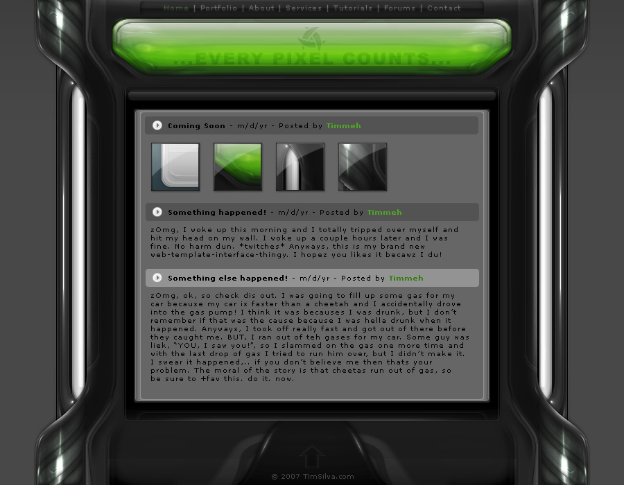
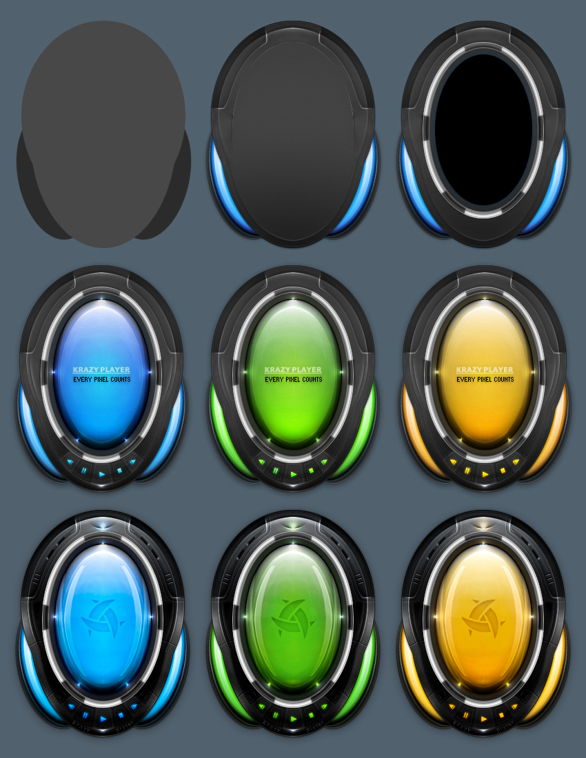
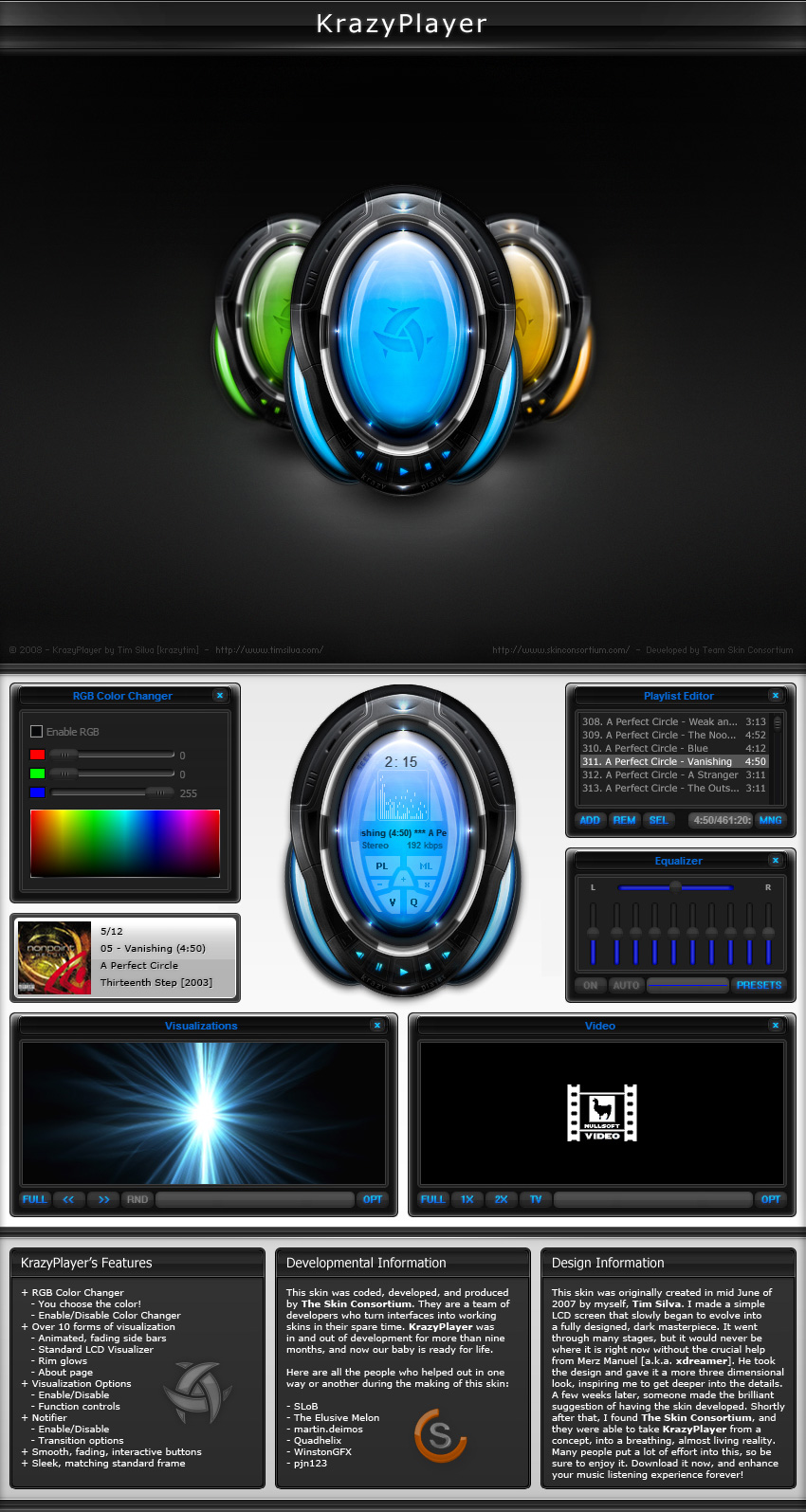
KrazyPlayer
2006–2008
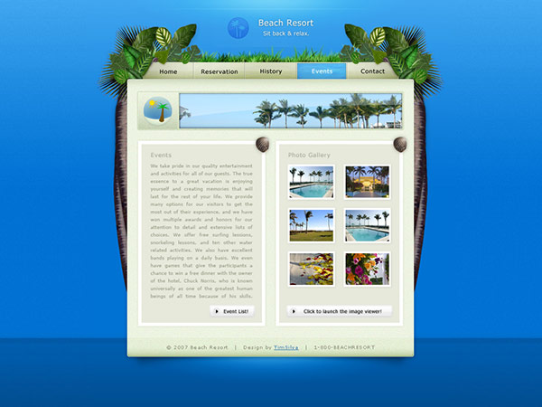
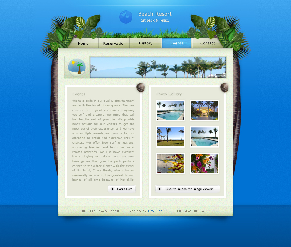
Tropical Beach Resort
2007

sleekBlack
2007
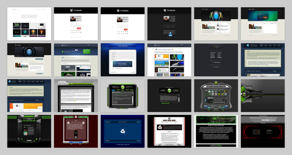
Brands I've had the pleasure of working with.
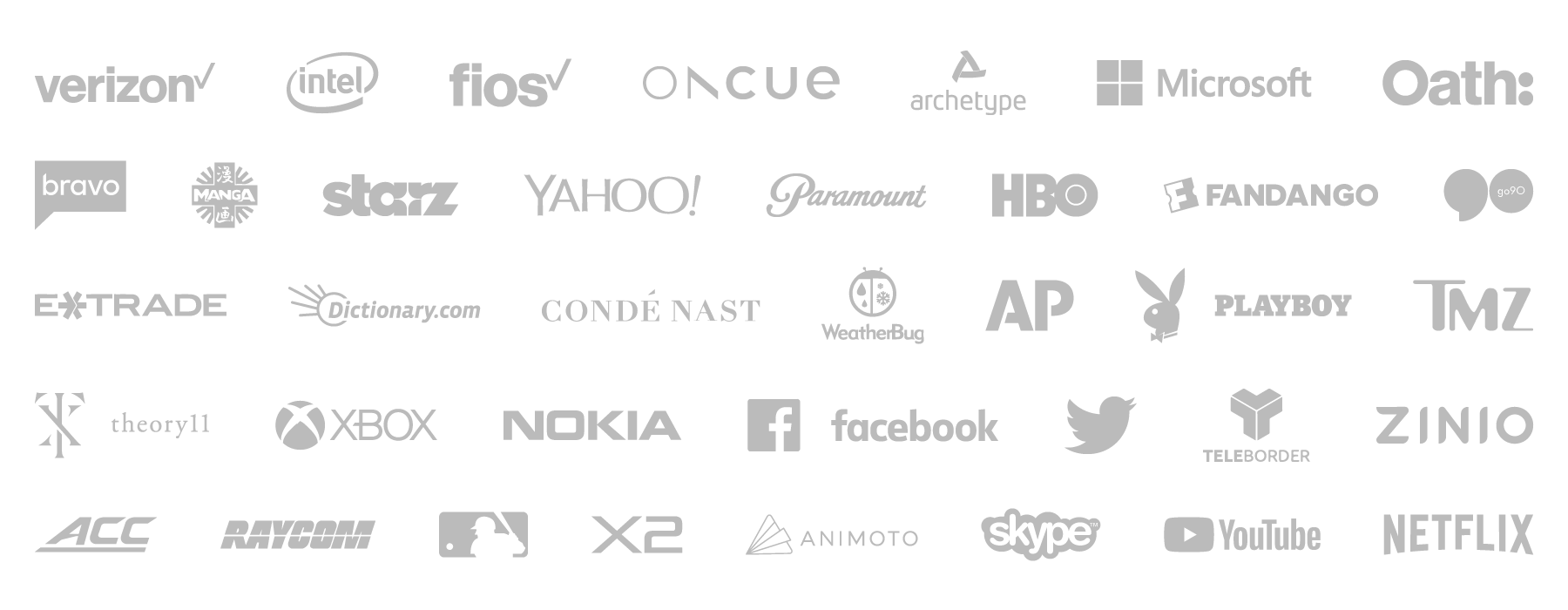
Just some of the brands and clients that I've had the pleasure of working with since 2005.
Skills, services and technologies that I practice.
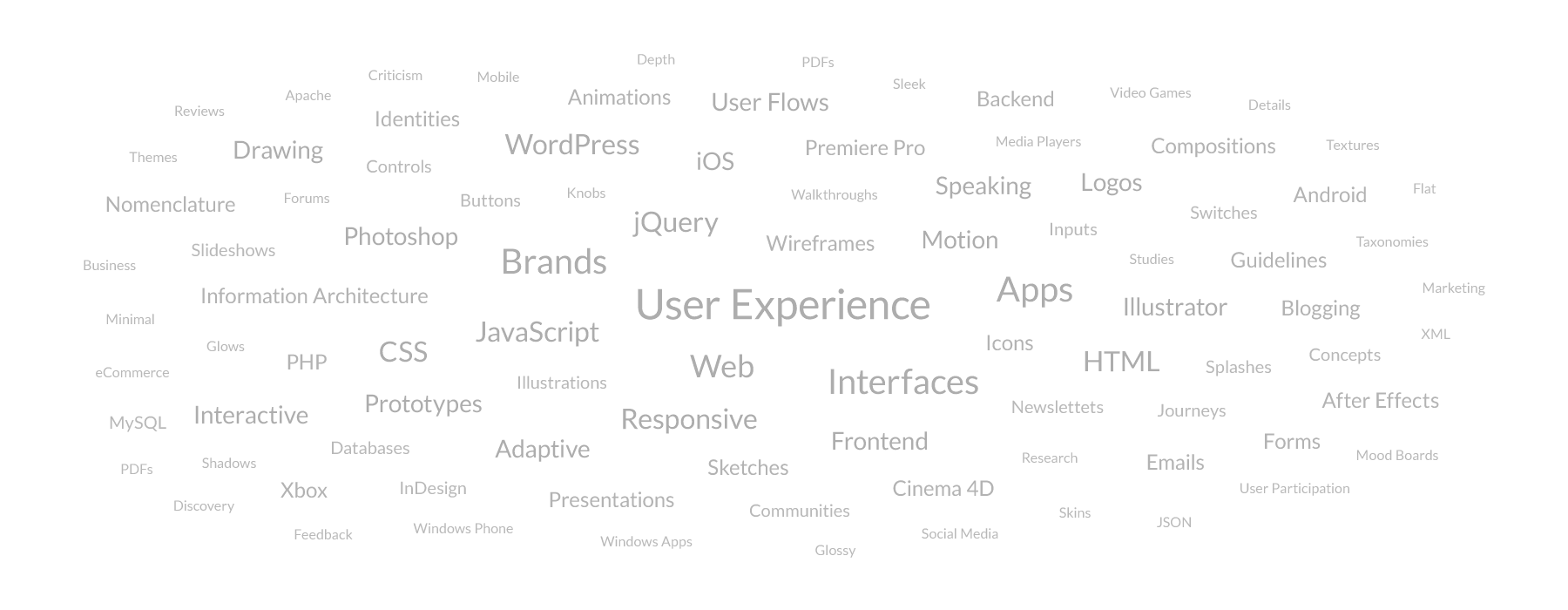
This word cloud highlights what I can provide for you, with the more prominent items highlighting my specializations. This list includes skills, services, technologies, platforms, software, languages, disciplines and deliverables. Do not mistake me for a jack of all trades; I just spend an unsually copious amout of time both learning and mastering as much as I can.
Interested in discovering what I can do for you?
Contact Me