Successful products come from passionate, aligned teams who listen for customer needs—not rockstar designers in isolation. For a broader look into my background and story, please review the homepage of this site.
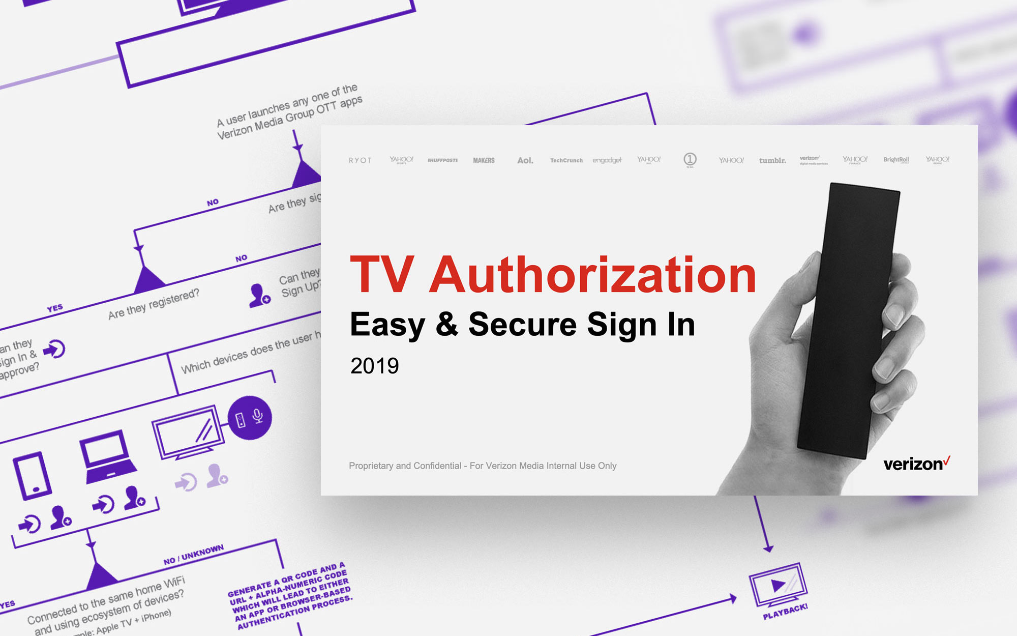
Verizon Media TV Auth
Q1 2019
Verizon Media brands are coming to smart TV platforms throughout 2019. Apps will ship on platforms like tvOS, Android TV, and Roku for brands including Yahoo, Yahoo Sports, Yahoo Finance, HuffPost, TechCrunch, and more to videofy these properties and increase revenue. From the Identity Platforms team (within Technology Platforms), I led a cross-functional project with four teams to build a multi-namespace, multi-platform sign-in framework.
Duration:
2 months, part-time
Mediums:
TV, Mobile, Web
Key Metrics:
Sign-in success rate for weekly active users (using either method)
Status:
Delivered & shipping on multiple releases
Above is the delivered TV interface cycling through Verizon Media properties road mapped to launch/update within the year. Below is the mobile sign-in flow using our internal Identity Design System with my own contributions that shipped.
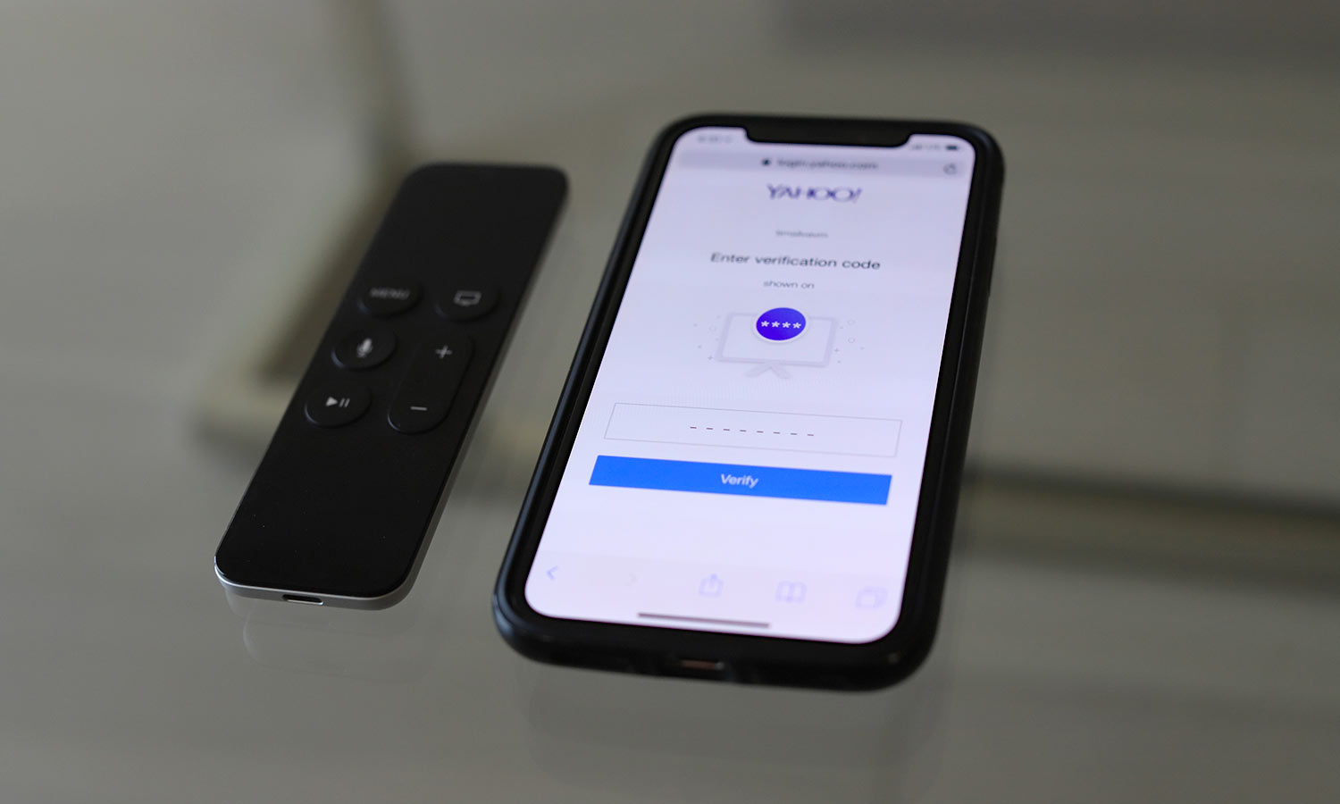
A silent v1 of a primary Yahoo! tvOS app shipped (shown later) with an onboarding video previewing what content to expect, followed by a rough sign-in screen with the ability to opt out and use the app as a guest. Given the incoming apps in the pipeline, I saw the need to build an effective solution that respect's user intent, builds value, reduces friction, and gives secure access to unlock favorites and recommendations. This framework was built to reduce duplication of efforts by being a white-label framework for all of our brands.
This was an important contribution to Verizon Media's focus on bringing our customers from users to daily members, an OKR from the top.
Companies & Properties:
Verizon Media, Yahoo, + more in 2019.
Platforms:
Mobile Web, tvOS, & AndroidTV.
My Role:
Lead Product Designer
Stakeholders & Collaborators:
Design Platforms Team:
Sr Design Director, Prcpl Designer, Illustrator
Identity Platforms Team:
2 Sr Prcpl Engnrs, **VP of Identity, Web Developer
Yahoo Apps Team:
Sr Product Designer, Sr App Dev, Sr Director of Product
Yahoo Marketing Team:
Director of Marketing / Copywriter
I kicked-off this project with stakeholders in a discovery session to define requirements, explore technical solutions, and seek opportunities to leverage our ecosystem. From my past ten-foot experience, I knew that any solutions involving typing with TV remotes (passwords, for example) would be slow and unsafe. We agreed that the quickest way to implicitly allow secure access on the TV is to authentication from another device that is already signed in.
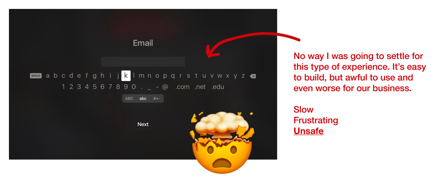
Our business-needs and user-needs had both overlap and conflict. On the business-side, we needed to get as many users signed-in as possible as that directly impacts our revenue. On the user-side, we of course needed to offer a frictionless experience, but also the option to skip it for now.
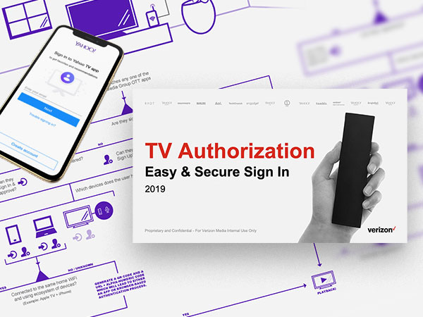
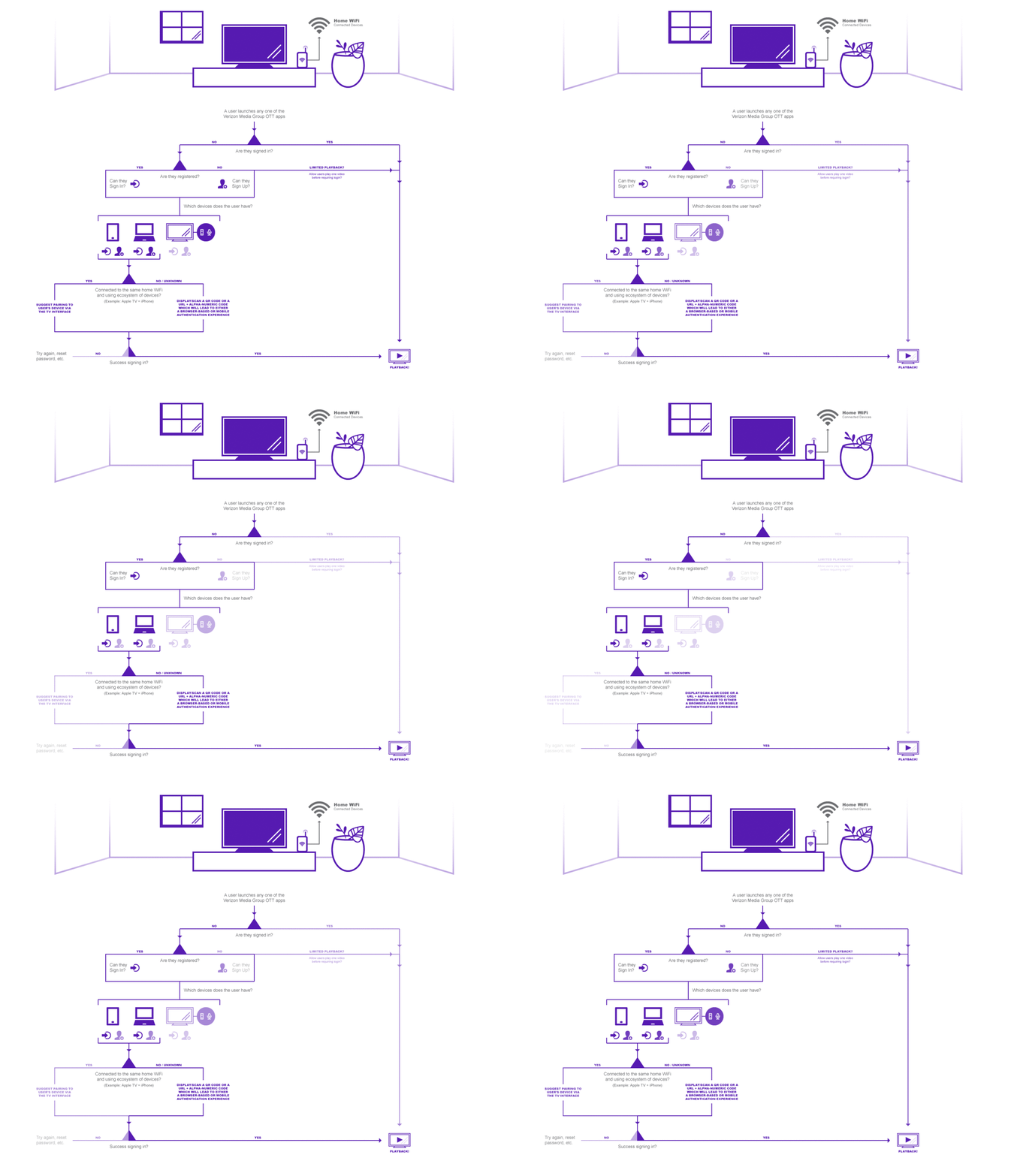
Below is a diagram I put together after meeting with stakeholders to help us wrap our heads around the sign-in methods, the most important use cases, and business needs.
Our VP of Identity, Senior Principle Engineer, and I picked two of the four sign-in methods that were the clearest choices for reducing friction for users as well as being cost-effective solutions to build across our properties with video-based content.
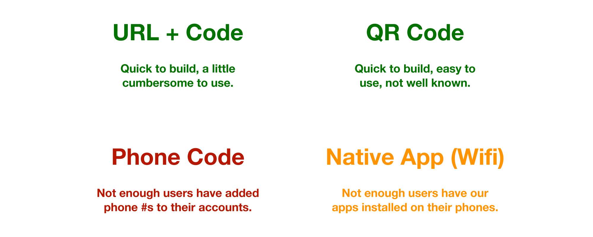
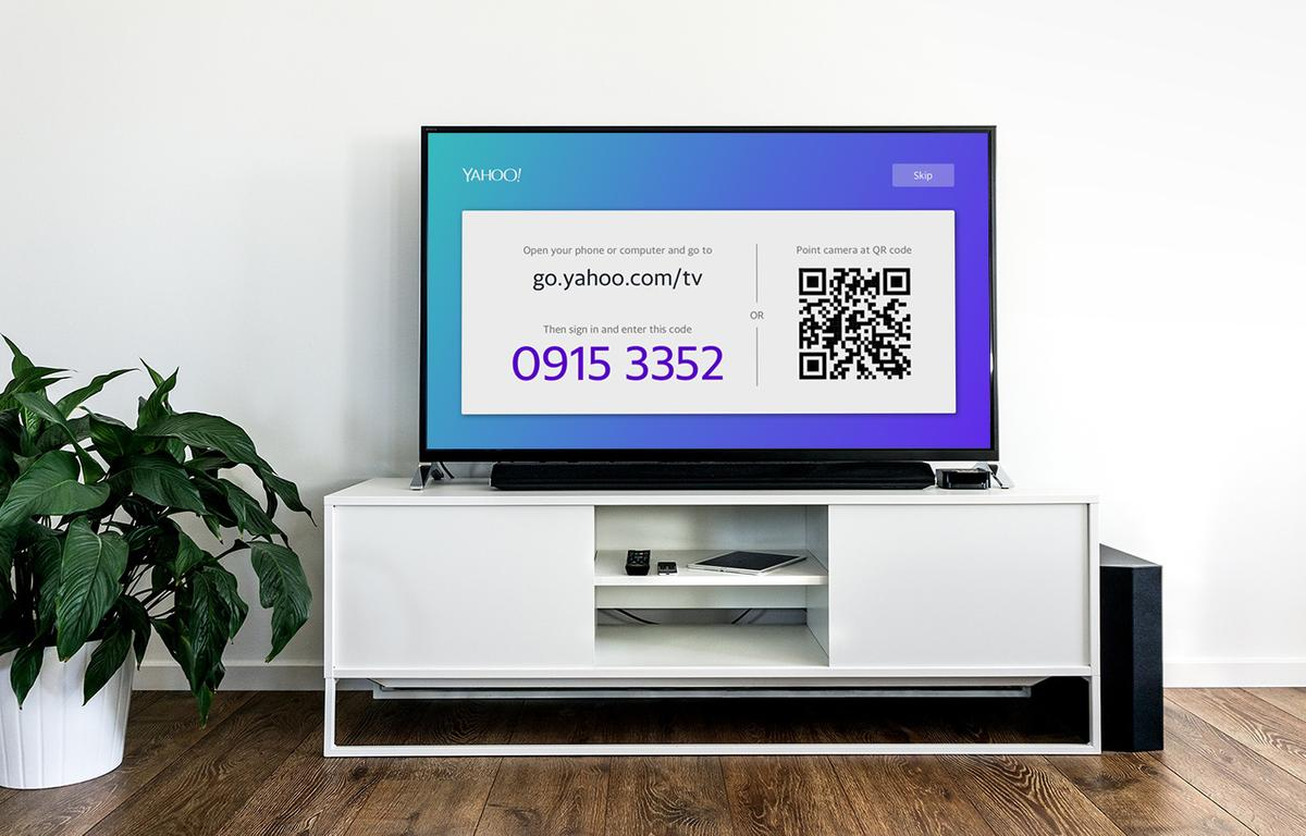
After reviewing our options for sign in methods and requirements, we decided to build a two-in-one page for the upcoming v2 app. By displaying an authentication URL + code, as well as a QR code (with the code baked into the URL for less typing), we can get people of nearly all technical prowess signed in.
I also set future plans to incorporate an authenticator tool that is being built for the Yahoo Home native app. This would work when the smart TV device and the user's phone are connected to the safe wifi network. This is the quickest method of all, and if the conditions are met, it would override the two-in-one flow automatically.
Below you can see the quick and dirty prototype an engineer put together to validate that the two sign-in methods were working from a technical perspective, even if it was rough around the edges. We were able to learn a lot from this draft.
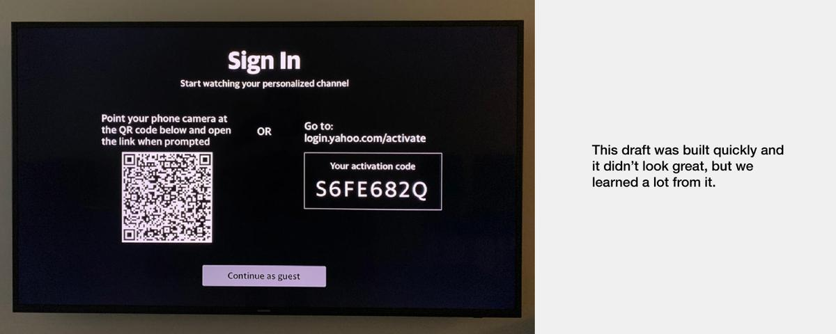
To our surprise, roughly 43% of our Daily App Users signed in to the silently launched version of the app.
Analytics from our silent v1 launch showed that 43% of a statistically significant group of people who arrived at the sign-in screen over a one-week period had successfully signed in. I also leveraged our in-house usability lab to test this screen with a small handful of participants. As suspected, all but one of them skipped using the prominent QR code method and used the URL + code method or skipped the sign-in entirely. However, the one participant who knew what the QR code was happy to use it! Anecdotally, we found that people who know how to use QR codes strongly prefer them.
A common belief is that QR codes were introduced way ahead of their time. They are gaining in popularity in the US, and in China, for example, QR codes are already used and loved by most of the population.
With this knowledge, I pulled together wisdom from stakeholders and built a refreshed design that felt more inviting, and could raise sign-in percentage. I also identified a number of key visual and UX design issues to resolve that are shown in the images above.
I designed the wireframes to final designs using Sketch (leveraging and contributing to a pattern library from the Yahoo App team) paired with Zeplin for developer hand-off. I also built an interactive prototype to dial-in the animated interface.
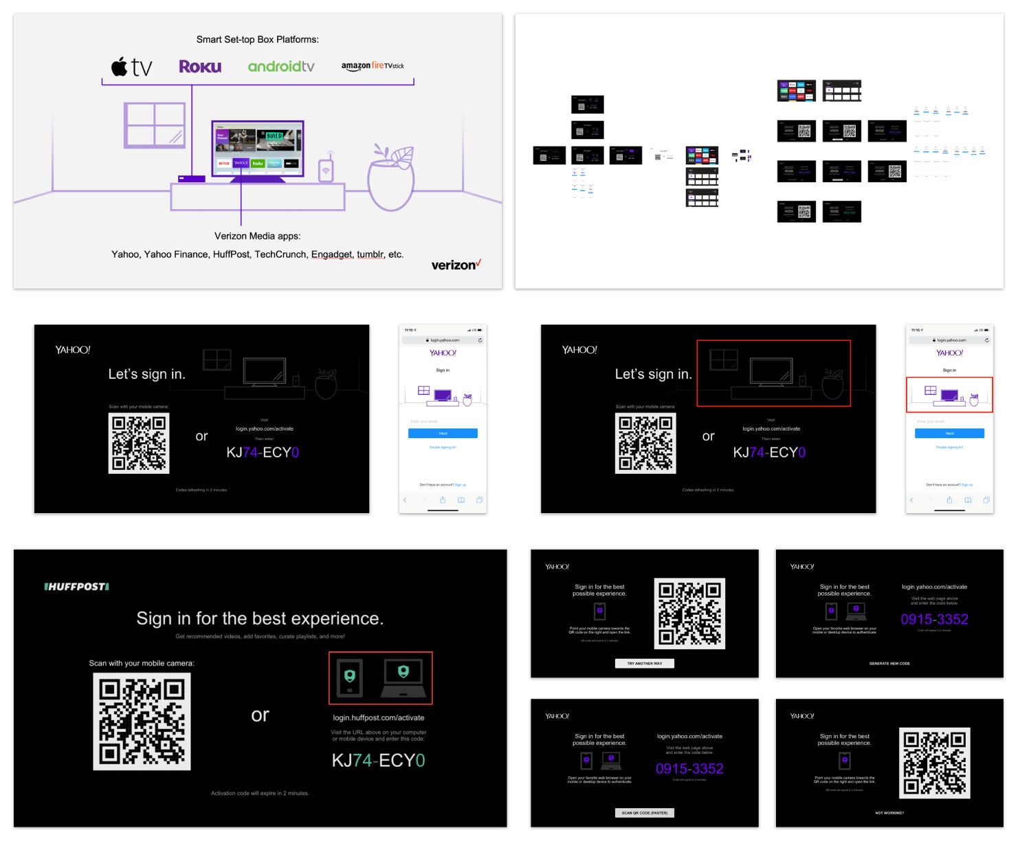
We explored splitting up the two methods into different screens, and found that deciding to use the URL + code method first would be a disservice to the persona who strongly prefers QR codes. Flipping it the other way around would lead people to skip the sign-in process because they don't understand how to use QR codes. I pushed for keeping both methods in a single screen, but in order to accomplish that, we need to carefully review every interface element and minimize down to just the essentials.
Single-screen is the way to go. What can we get rid of?

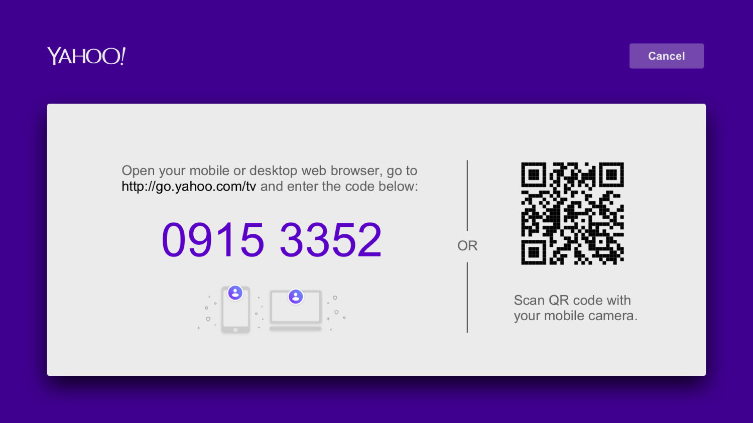
I made a case for shorter URLs. If we are going to ask users to open their phones, open their browsers, and then type in a URL, let's keep it succinct! I was able to track down the engineer in charge of domains and URLs (he's been at Yahoo since 1996!), and we collaborated to design a URL schema that would only require the creation of one unused sub-domain that could be used across all of our properties and isn't just limited to TV authorizations. This could work with VR goggles, smart fridges, wearables, etc. by replacing the "/tv" with "/whatever". These web pages will all have custom illustrations that offer a high continuity by visualizing the user's context.
I also collaborated with our lead engineer and security team to simplify the codes. By using numeric-only, we could prevent users from having to switch back-and-forth between the alpha and numeric keyboards while they type. I also pushed for shorter codes (4 digits long), but since our properties are constantly being horizontally attacked, this would be unsafe. We agreed on 8-digit, numeric codes. These codes must also expire after 30 minutes, requiring a manual refresh (seen in the final video below) in case users arrive at this screen and then don't complete the sign-in for any reason.
Below you can see the more commonly used URL + code method. After the final "success" mobile screen, the TV interface would continue to the signed-in landing page.
Below you can see the more efficient QR code method.
After several rounds of iterations, tests, prototypes, design reviews, and an alignment with the Yahoo Apps Team, I arrived at the final design with sign-off from all stakeholders.
I explored every detail of how to display URLs, codes, QR codes, and instructions. We attempted to split them up into multiple screens, and landed on a minimal, two-in-one screen that has high scannability and can be understood at a glance. We pushed for the shortest code possible, and achieved high continuity between the TV and mobile flows by keeping a consistent visual hierarchy and brand tone. Lastly, this framework is simple enough to be used on multiple TV platforms, and by changing the colors and the logo, it appears beautiful with each of our properties. Initial tests showed a double-digit increase in sign-ins (for Yahoo), a significant improvement at scale.
Verizon Media Stories
Q2 2018 - Q2 2019
When I joined Verizon Media (which was called Oath at the time), there was a substantial backlog of visual design work that needed to be done quickly. Verizon's merger of AOL and Yahoo led to the formation of Oath in June of 2017. I moved over from Verizon Fios nearly a year after this event. By the time I joined, there were still many decks, documents, internal materials and tools using antiquated brands that needed to be refreshed not just on the surface level, but on a storytelling level.
Duration:
~10 months, part-time
Mediums:
Desktop, TV, Web, Projectors, and Stage Screens
Key Metrics:
Ratio of DIY decks to curated decks, and impact of the latter
Status:
Delivered 20+ high-impact deliverables, enabled 83+ others
Inspired by the storytelling.design movement, I saw an opportunity to own storytelling for key events, documents, and deliverables, as well as redesign a template system based on the needs of the Technology Platforms org ran by John Matheny, senior leadership within the company (up to our CTO Atte and his direct staff), and anyone with feedback or requests.
This initiative blossomed into colleagues creating over 83 presentations, at least, before I lost count. Plus, I worked directly with senior leadership (from our 5G VP Mason, up to our CTO Atte and CEO Guru) on a handful of high-impact presentations that all successfully served their missions. My efforts continued seamlessly between the Oath to Verizon Media rebrand, and I even owned the main stage presentations for the 2018 Tech Pulse company-wide event. Here is the full breakdown of my impact:
6+ decks with 5 VPs
8+ decks with 2 SVPs
3 decks with our CTO (Atte)
1 deck with our CEO (Guru)
3 decks for our CEO (Guru)
4 decks for the Verizon CTO (Kyle)
2 decks for the Verizon CEO (Hans)
Plus (at least) 83 decks that I enabled others to create on their own (DIY-style).
On top of these deliverables that I was a stakeholder in, I also turned my efforts into a resource that will enable others to create their own stories for years to come. I created an internal website for the template system, tracked metrics/usage, and evangelized it.
Following the rebrand from Oath to Verizon in early 2019, I updated the templates to be fresh month within a week after the announcement which led to a massive surge in adoption during a 3-month period before the branding team launched collateral.
Above is the internal web site I used to promote the template system and win over internal customers and provide a hub for leaders and storytellers within Verizon Media.
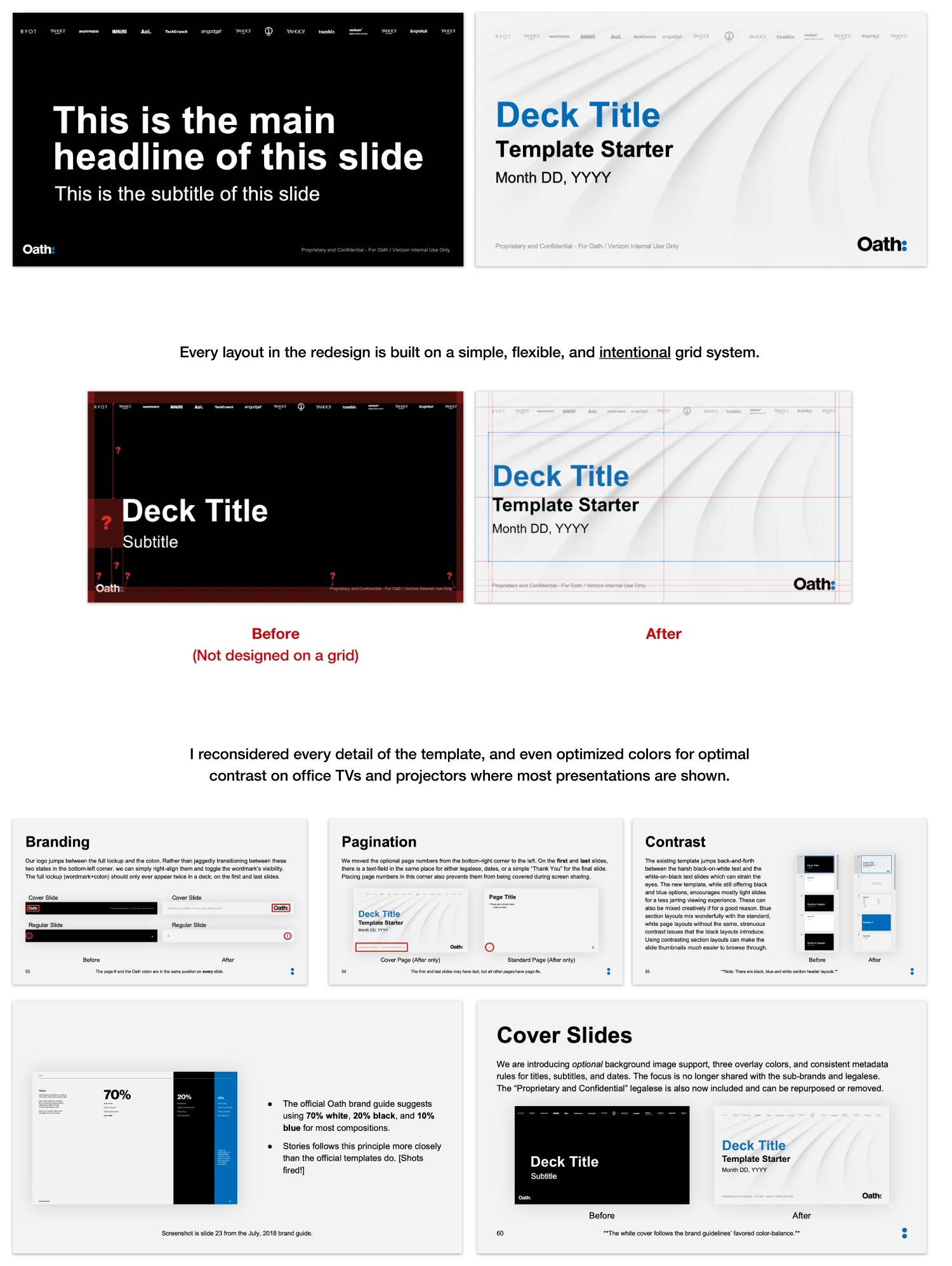
Below you can see some of the before and after changes I made to the core template. Some of the biggest issues with the existing resource included inconsistent elements (page number locations), limited layouts and components, and a lack of page-type hierarchies. I even made sure to follow the brand guidelines closely.
I also led visual design for Tech Pulse 2018, a company-wide event where employees traveled from our 26 locations all over the world to meet, give talks, showcase posters, and celebrate our successes. There were over a thousand employees in attendance, while thousands live-streamed the event as well. I worked directly with SVP John Matheny and BizOps Head Payal Syal to produce, structure and execute on the 11 main-stage decks with the most visibility during the event.
I took responsibility over framing the stories, producing pixel-perfect graphics, visualizing complex data, providing simple speaker notes, and driving rehearsals with the speakers. This was a last-minute project due to the events team losing their designer, and I stepped-in quickly while still juggling other projects. I took the opportunity to collaborate directly with our CTO and CEO on their presentations, and was able to deliver every asset, on time, during a fast-paced week.
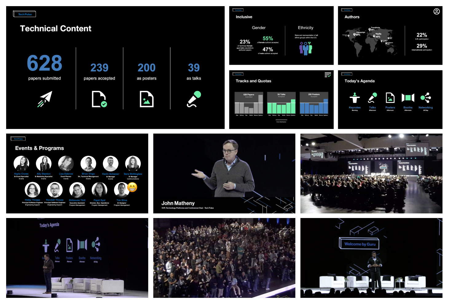
Check out the snippet from the event below, along with the wrap-up sizzle reel.
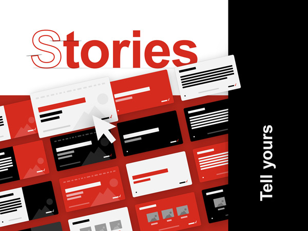
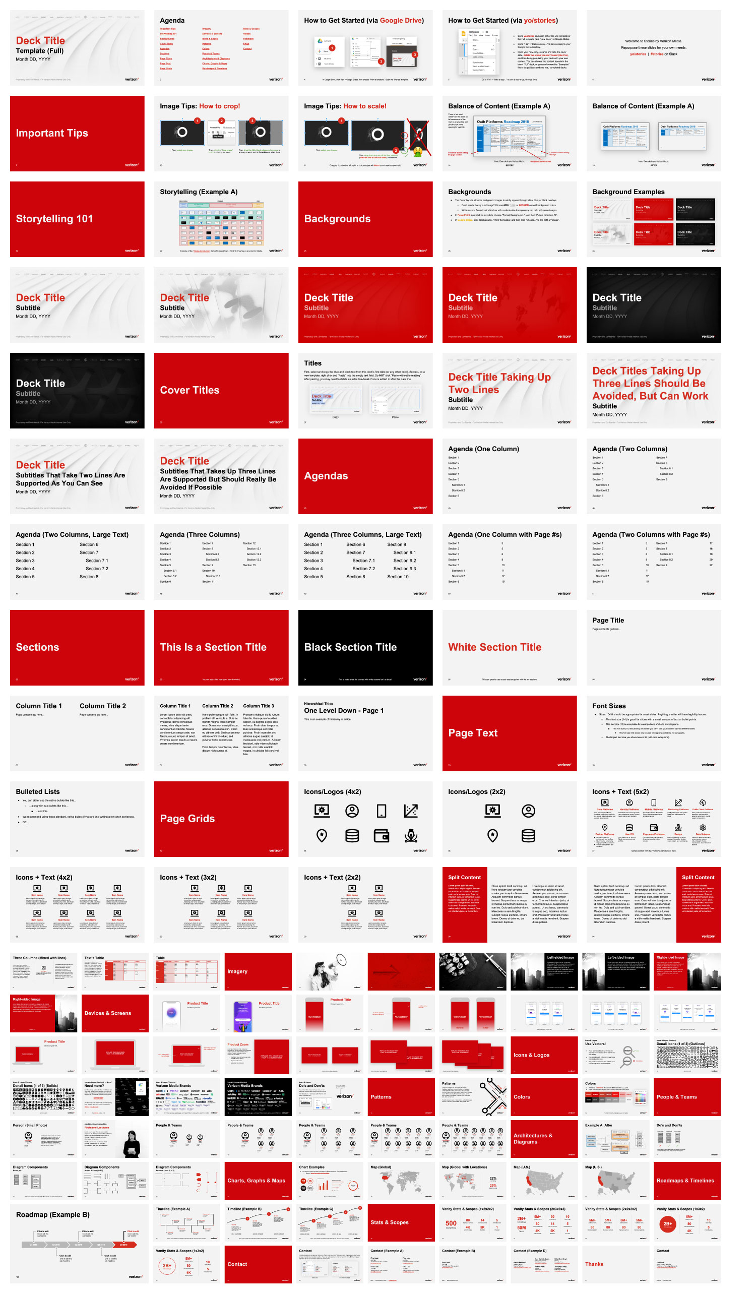
Below is a high-level preview of the content layouts and over 20 components that I built based on requests and the needs of the high-impact deck requests I led. This stable system has everything from simple columns and tables, to icon sets and product mockups that have been used both internally and externally.
The components and layouts are simple, dynamic, and modular enough to use seamlessly with other templates, including the ones for Tech Pulse that were inverted and dark to match the event branding. Once I put this out into the wild, I started to receive positive feedback from colleagues all over the world.
"OMG the decks and content on yo/stories are amazing. Thank you, thank you, thank you!"
Ashley Wolf - Principal Technical Program Manager
"Everybody just says 'wow' to me when I share this on Slack!"
Rosalie Bartlett - Open Source Community Lead
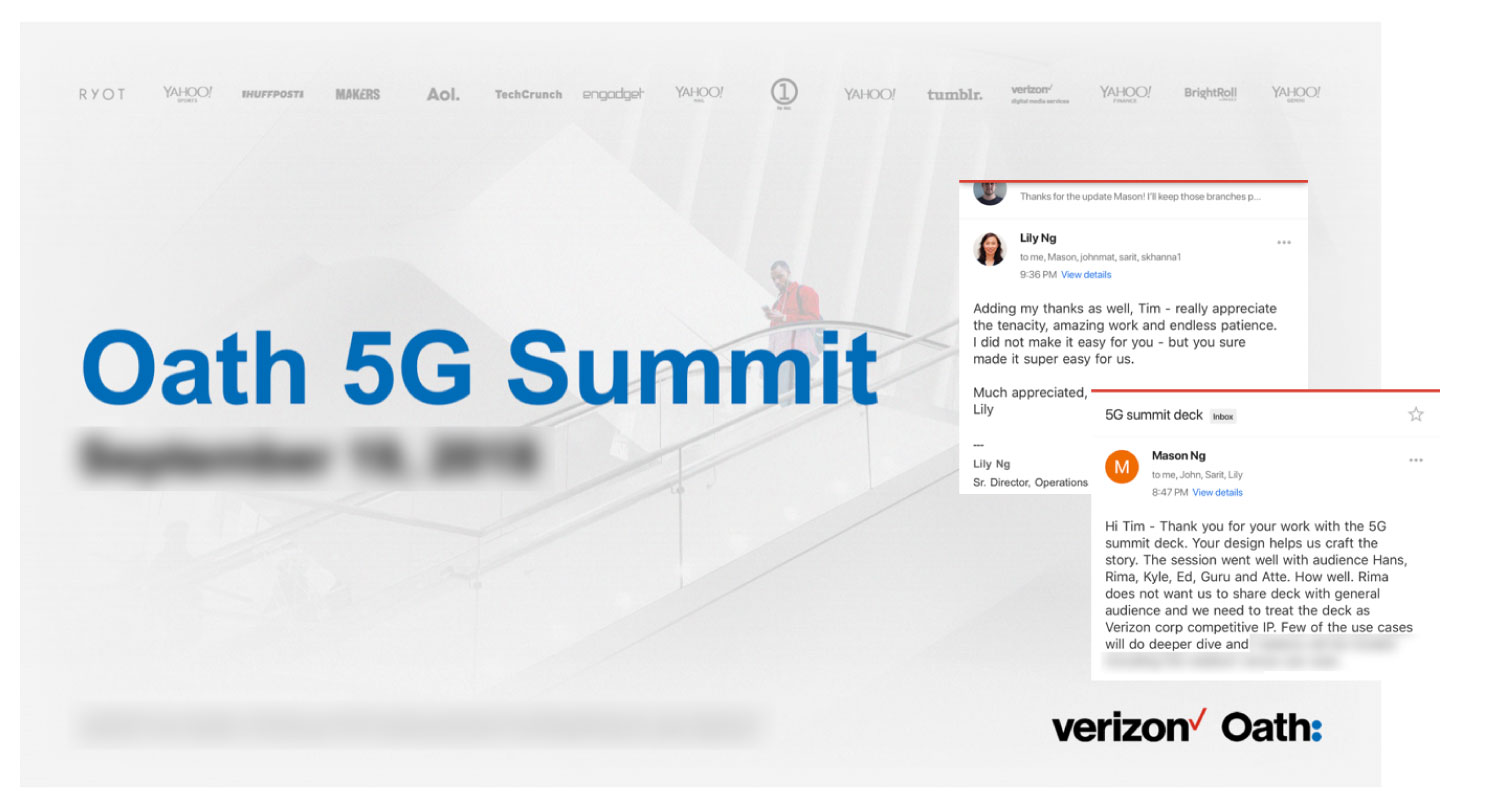
I was a stakeholder and collaborator with VPs and C-level leaders on seven critical 5G decks that ultimately led to the renaming of Oath to Verizon Media to demonstrate Verizon's commitment to Oath properties and potential with 5G technology. While I did not save visuals from these projects due to the sensitive IP involved, this was rewarding work.
Verizon Fios Asset Design System (Channel Logos)
2017-2018
The Fios TV service has lived through many platforms and evolutions. Since ~2015, the set-top box (STB) and companion mobile apps have moved towards immersive interfaces where video content is always playing behind a see-through interface. The artwork being displayed in the UI, like movie posters, showcards, and logos, can make or break the experience. The Verizon Fios platform had a long history of relying on low quality artwork and assets that have been sourced from meta-data firms.
While these production services are better than nothing, they are expensive and leave a lot to be desired. In 2017, I took ownership of the challenge and introduced A-level assets for the first time to our products used by millions of customers on TVs, phones, and tablets.
Duration:
2 months
Mediums:
TV, Mobile, Web
Key Metrics:
Quality and consistency of live assets, and lowest maintenance time
Status:
Delivered & ingested, still in use as of 2019
I formed an asset design system from scratch that brought over 1,000 channel logos from D-grade quality to A-grade within months. This collection was adopted by our existing and upcoming set-top box platforms and their families of companion mobile and tablet apps that are collectively used by millions of Fios TV customers across the U.S.

Up above, you can see how essential high-quality assets were to the TV product experience. Below, you can see the same importance of assets in our family of companion apps. Poor quality assets ruined an otherwise premium experience. Every logo from our set of 1,000+ needs to work on both dark and light backgrounds, effectively doubling the workload. Some logos could work on both backgrounds, but in many cases, we had to be resourceful in order to find or create assets that would cover both needs.
Working on the internal product team, as well as with external agencies, most design comps were produced with high-quality, unrealistic artwork (including logos) for years. We would have these beautiful visual comps of our interfaces, but the actual products didn't offer the same impact due to the real assets. This refreshed set not only improved our real products, it also became the go-to resource for all design teams.
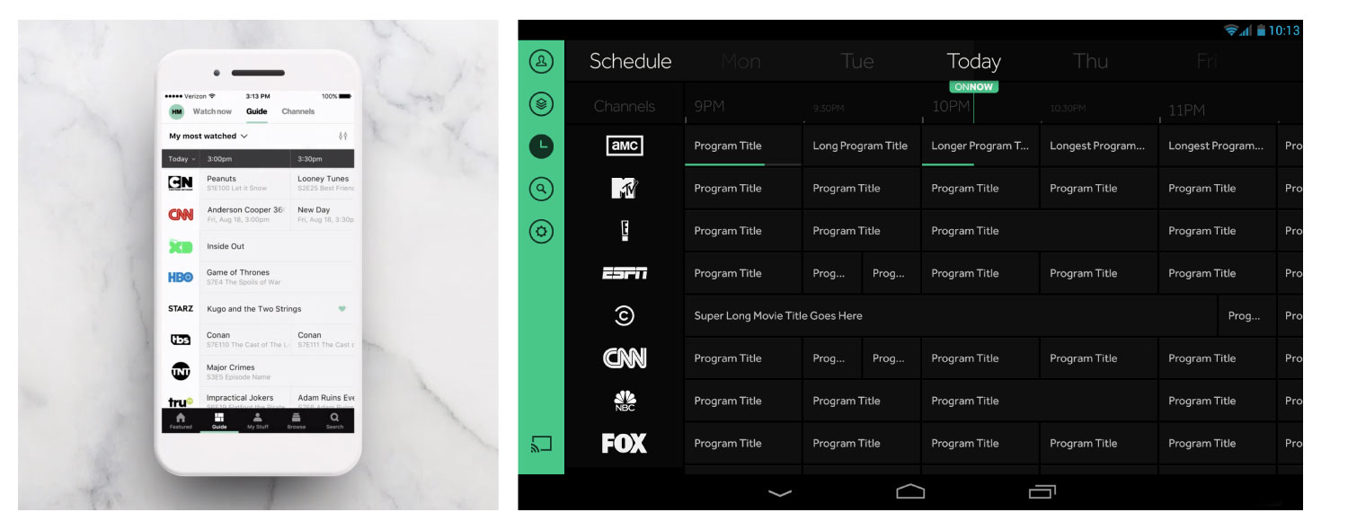
I provided art direction to increase the quality of the artwork across the entire experience for our STB platform and our iOS/Android apps for phones and tablets. I formed a cost-effective plan and system to increase the quality of an ever-evolving database of over 1,000 channel logos from over 21 U.S. (VHO) regions that could be maintained by one person at a time with consistent results.
With so many channels, including unique channels, sets, and instances; it was critical to have a high-quality asset to visually represent each one in a lineup as that little graphic is all the channel has to grab someone's attention. Due to the ephemeral nature of visual brands, we meticulously organized how we sourced, produced, documented, and maintained these assets in order to support our products and services in as many contexts as possible.
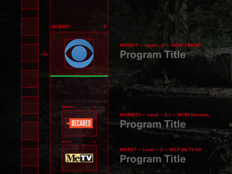
As you can see below (on the left column), there were many issues and edge-cases to identify and form standard solutions to. Missing logos, non-existent logos, regional vs national variations, east/west coast distinctions, and countless others.
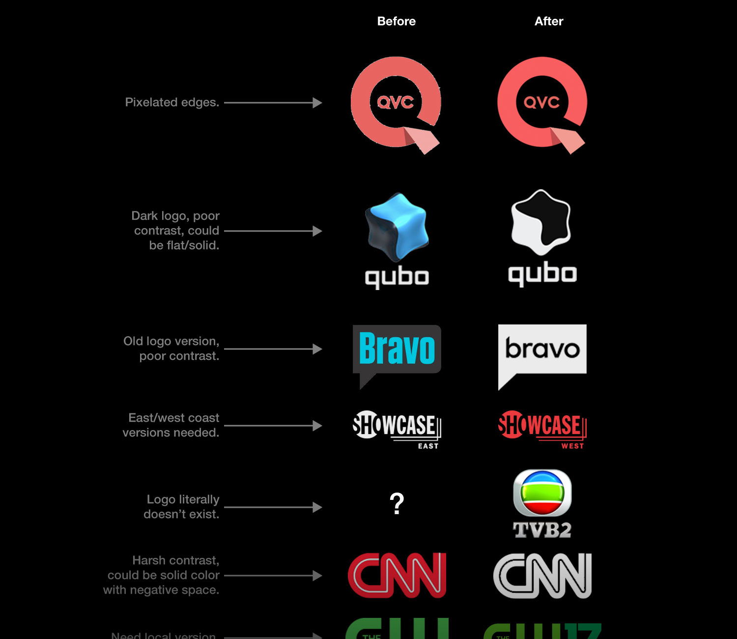
At scale, this process required thoughtful decisions early on. One of the toughest decisions was around using solid-colored logos (all white, or all black) versus using the true logos for each channel (which could be flat/solid-colored, full of colors, or even 3D). While I understood the benefits of bleaching all of the logos on our platform, this would require breaking the guidelines of countless brands and thousands of hours on our end to convert/create bleached assets for tricky/complex logos.
Companies pick specific colors for their logos and spend millions of dollars developing their brands. Imposing a rule that we have to change their logo to be all-white or all-black just for our platform is an unreasonable request. It would just take making an exception for one content partner to make the effort inconsistent. Instead, I made the decision to use the logos in their intended forms, and started to focus on other tough decisions.
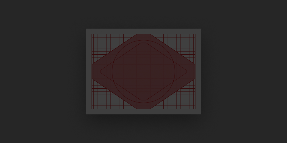
Another challenge was achieving quality with scalability. We hired a junior designer to assist with artwork across the platform, and I trained him using a system I created to produce these assets at scale. First, I designed the grid system above using a hexagon in order to keep logos all within the same general size. The production services we used had assets at different sizes. Some files were cropped, some included bounding boxes, and some lacked transparency. Plugging these into our interface resulted in visual chaos.
My process leveraged as many automated steps/scripts as possible, and above all else, was replicable. If we gave two designers the same set of 50 logos to produce, they should both quickly arrive at virtually identical assets by following simple guidelines. By sizing logos to fit within the hexagon-based grid, all assets will feel equally weighted. We refined the grids and guidelines as we identified edge-cases.
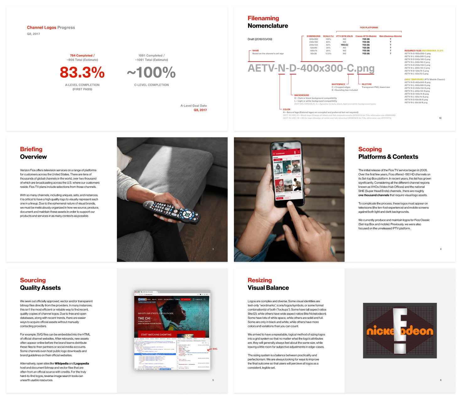
In the beginning, we targeted an MVP lineup of over 120 channels based on a region we were launching our product in. I built a foundation, and trained a junior designer to produce the rest of the channel logos in the next quarter. In order to hit an urgent deadline, I road mapped the process into two stages.
The first stage was C-grade logos that used lots of scripts and automation, and I achieved this within weeks for a significant improvement in our logo set. The second stage was the A-grade logos which took 2 months for the junior designer and I to complete. Once we completely this massive overhaul of over 2,000 pixel-perfect assets, we ingested them into our apps, and only needed to provide light maintenance moving forward.
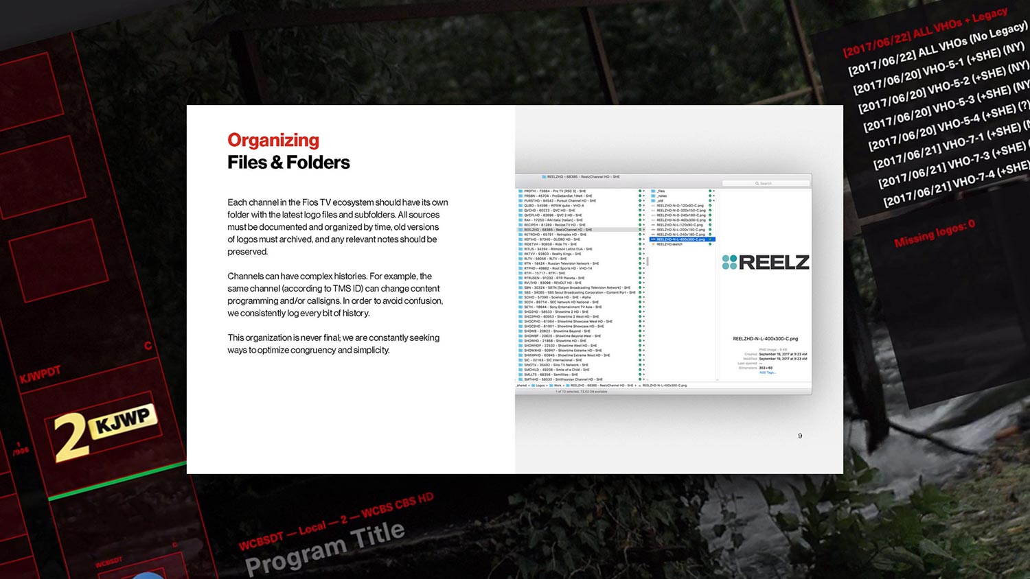
We also kept time-stamped records of each channel's logo history on a Trello board. This was critical in helping us stay clear and organized as the television industry is constantly merging channels, closing down channels, and rebranding. Our detailed records helped us resolve complex changes in no time.
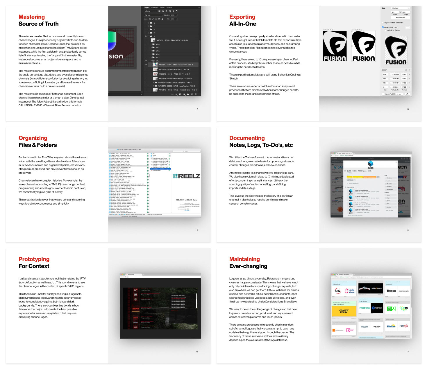
Above, you can see some snippets of the living deck I used to spread awareness to about our logo database to all Fios teams and stakeholders. It told our product's history, explained our process, and made it easy to get them onboarded with our pristine collection.
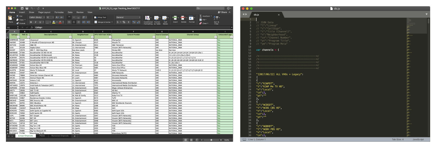
In order to maintain the database of channel logos and see the accurate channel lineups across all 21 VHO regions, I built a JavaScript-and-JSON-powered emulation experience of our set-top box platform.
Each channel has a unique ID known as its "CallSign," and I was able to convert our master spreadsheet from excel data into JSON format. Since we had named all of our assets with these unique CallSigns, I was able to build an HTML prototype/tool that could point to a directories of assets, and show any of the 21 lineups exactly as they would appear in our platform. I also built in tools to identify missing logos, invert the interface and logos to a white background, and much more. This tool was also responsive so that we could share it out to other teams for reviews, and they could view the 1080p experience on any screen.
This tool was also valuable for creating large sets of channel logos (like Music Choice who had licensed us to use 50+ channels) so that we could iterate on them while seeing them in-context, in the emulated interface. We used this tool to create sets for HBO, Showtime, MTV, tens of serialized sports channels, and many others. The ability to produce the logos, preview them in-context (without ingesting), and share them as videos made acquiring sign-off from content partners as easy as pie.
While this project wasn't always glamorous, I (1) solved a problem that existed for years in just a few months, (2) established low-maintenance process to keep it fresh, and (3) trained a junior designer to learn new software and become a systems thinker.

Theory11 Zodiac
Q3 2017
Zodiac is a seemingly impossible magic trick sold on the market that secretly uses technology to allow the performer to predict one randomly selected word out of millions from a stack of books with an even more impossible twist at the end. This effect has been performed for millions of spectators from online video, television specials, and in multiple recurring live-stage shows in New York and Los Angeles.
Note: In order to showcase my work, I have to share some details about one of the two methods used to create this effect. I left out some details, but I do need to talk about how the effect works in order to explain the work that I did. Do not share the secrets of this effect outside of reviewing my portfolio.
Client:
Theory11
Type:
Freelance
Duration:
1 month, part-time
Platform:
Responsive Web App
My Position:
Lead Designer
Stakeholder:
Jonathan Bayme (CEO)
Creative Director:
Dan White
Developer:
Mark Garity
Key Metrics:
Shortest possible data entry time, total units sold, and public reviews
Status:
Had a success product launch, used by thousands, seen by millions
The magic community is small, and as a hobbyist myself, I have been active and visible on a number of websites and forums over the years. One day I got a request from Jonathan Bayme from Theory11 to lead the design for a new trick they had been forming that would require an app. He gave me the quick history on the effect; two magic creators had separately come up with similar ideas using totally different methods. Theory11 was looking to take the best nuggets from both methods, and take them to the next level.
View on Theory11View TrailerView Full Performance
How can we invisibly use a phone to find any word, from any line, from any page, from any book, in just a few seconds? Plus with a wild twist!
The information I was given was that there was a collection of public domain, classic books that were to soon be OCR-scanned and converted into a database that places each word, from each line, from each page, from each book in-order and perfectly aligned with a common ISBN edition of these books. We had to use public domain books since we can legally replicate them and store them in a database without issue.
The magician will ask a spectator to select one book from a stack of books, and before the spectator opens that book, they are asked to name out loud a page number, a line number, and a word number on that line. The magician will have a secret hollow book (a notepad with a hole cut out of the pages where a phone can be hidden), and they will mimic writing a prediction on a piece of paper from the notepad while they are secretly using an app on their phone to quickly find the exact word that the spectator named.
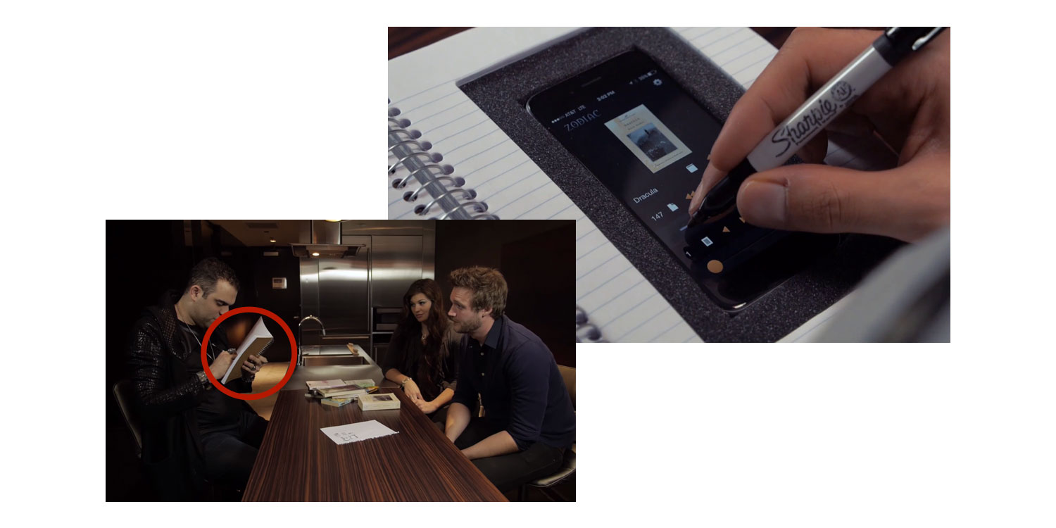
The twist is that next to the word (in the UI) is the location of the spectator's word in a dictionary (which was also OCR-scanned), and the magician can either reveal the word, or the dictionary location of the word which is exponentially more impossible seeming.
I owned what happens on that phone experience.
Once the magician gets the information they need, they can act as if they are changing their mind about their prediction, flip to a fresh, full page of the notepad, and write down either the word or the dictionary location of the word. They rip that page out, close the notebook, and all they have to do is build up the finale of the effect.
For the dictionary reveal, the magician would write down something like 51-2-13 as the prediction. They would hand the spectator the dictionary, and ask them to open to page 51, look at column 2, and go down to line 13; it will match there randomly selected word. Absolutely astonishing.
Before I started wireframing or mapping out the requirements, I made a case for why we should go with a responsive web app rather than native apps. A responsive app would be easier to maintain while this was going to be tested for a while by a small handful of magicians to check for OCR scanning mistakes and identify edge-cases (which it turns out there were many do to the nature of language and words being so fluid). Additionally, there wouldn't be any gatekeepers for updates, the app would be device/OS agnostic, and it could even work on tablets hiding inside of large easel notepads. The only trade-off was that a web app may not work offline, whereas a native app could store the databases locally.
Once that decision was made, I started to explore interaction models and consider what would make this as easy as possible to use while the magician is hiding in plain sight.
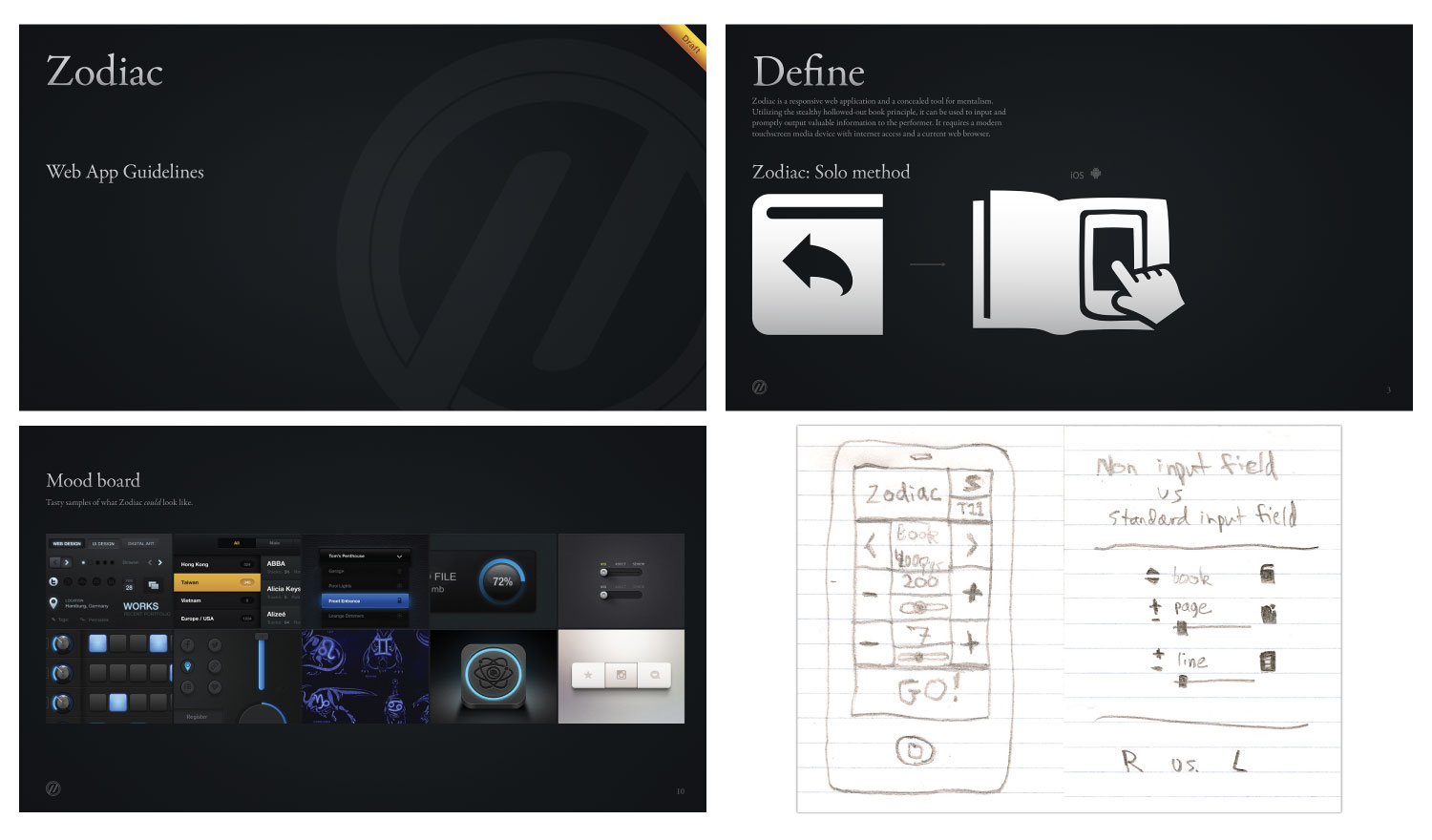
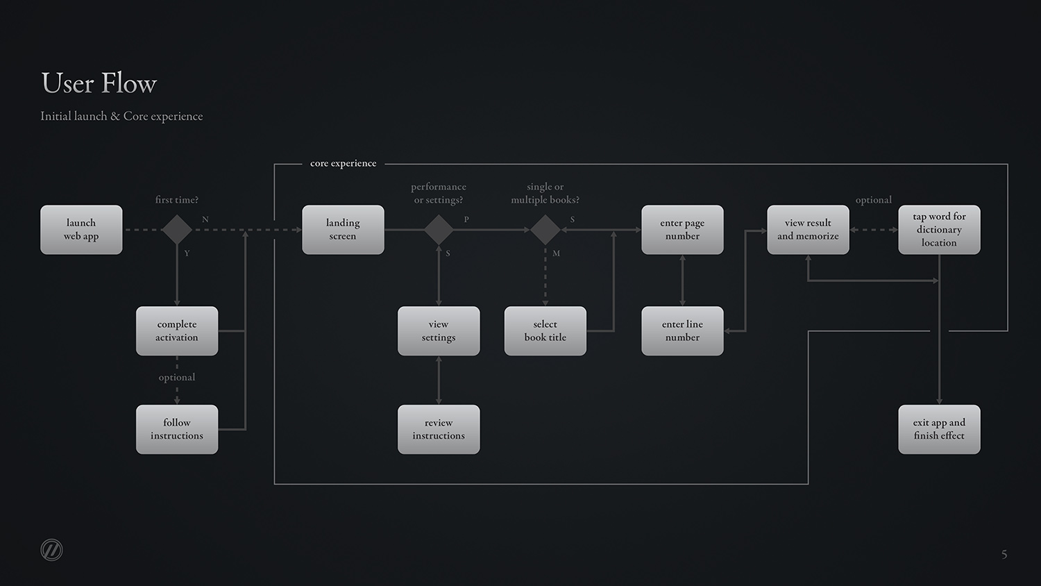
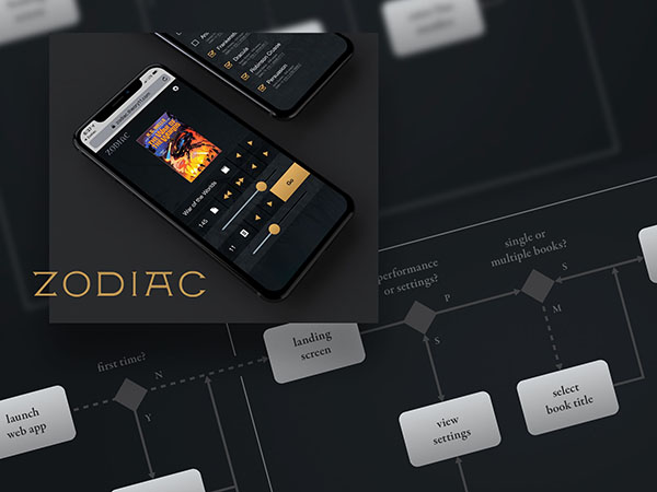
I started with rough sketches and ideas for how to input the necessary information to get the output as efficiently as possible. I also explored darker interfaces to prevent phones from glowing out of the magician's notepad, which could ruin the entire effect. I also mapped out the information architecture, defined MVP user journeys, and provided as answers to questions as I could. For example, because this is a paid-for effect, we needed to make sure to block this web app from the public behind a sign-in process.
Additionally, this effect uses 10 public-domain books. We didn't want to require each magician who uses this effect to have all 10 books. I made sure to design a settings page that lets the performer choose via a checklist which books they own, and we included Amazon links to the exact ISBN editions of the books under each checklist item.

The most important flow to design for was the input/entry of the book, page and line, along with the navigable book-page view that would follow. I built the motion prototype above to demonstrate how this can be accomplished in as few steps as possible, with big buttons and hit-spaces that someone holding a pen could control reliably with their pinky finger.
Following a thumbs up from the team, and a "brilliantly well done" from Jonathan, I built the responsive front-end of this web app. This was initially just a JavaScript prototype, but it was robust enough for the developer Mark to simply build on top of it, and my front-end code was shipped in the final product.
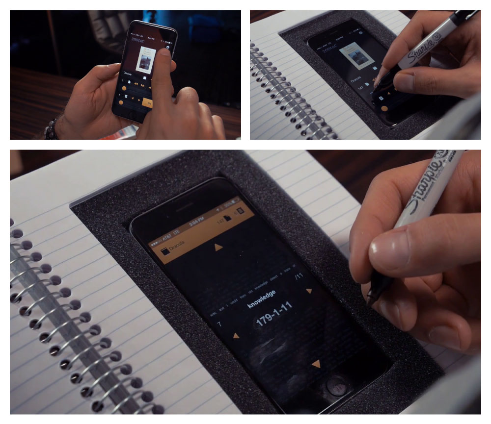
We allowed a small handful of magicians to exclusively beta-test this app and the OCR-scans. We received useful feedback, improved the experience, and then opened up the beta to a wider audience. Some of the feedback was that the animations made the app feel slow, especially on older phones. We removed them for a perceptually speedier experience. We also added in book cover images into the input screen for quick visual recognition than just showing the name of the book in text. Below, you can hear Jonathan describe how satisfyingly simple the app is to use.
Before the launch of this product on the magic market in Q3 of 2017, the Zodiac effect had already made a massive impact. It was performed by David Copperfield for Oprah on television, by Spidey for Penn and Teller on their hit series "Fool Us", and it has been performed in multiple live-stage shows in New York and Los Angeles. Most notably, this has been one of the final effects performed by Dan White at his recurring stage show at the NoMad hotel in New York City. Dan's shows sell out in less than 10 seconds as he regularly performs for celebrities and on Jimmy Fallon.
Zodiac has been seen by millions of spectators and counting!
“The greatest book test ever created.”
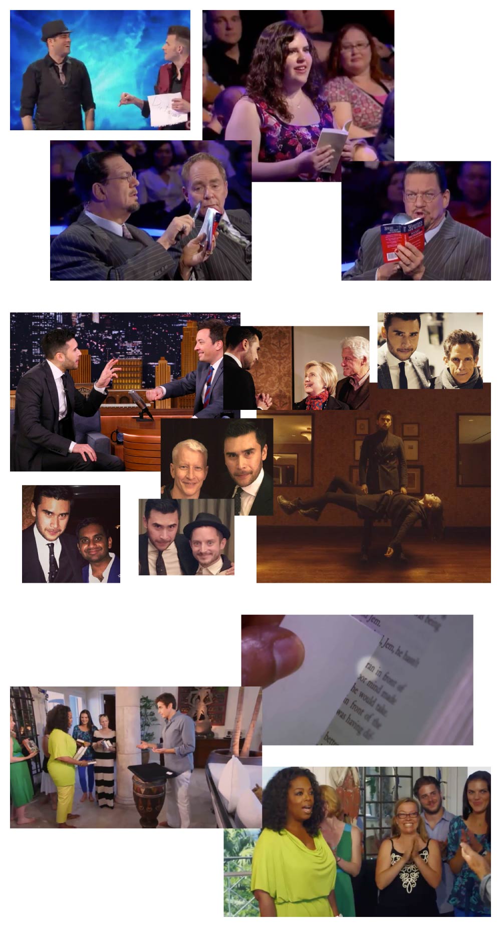
Below you can watch the final product trailer that was produced by Theory11 for the release of Zodiac onto the magic market. You can also view the performance by Joel Meyers and Spidey on Penn & Teller: Fool Us! (3 million views and counting).
I was fortunate enough to travel to New York City in late 2017, and see Dan White perform this effect live at the NoMad hotel to a sold-out audience and meet him afterwards. It was an incredible feeling to know how much use this app gets on a weekly basis, and how it spreads wonder and delight. Sadly, I missed the Clintons being audience guests by a few weeks!
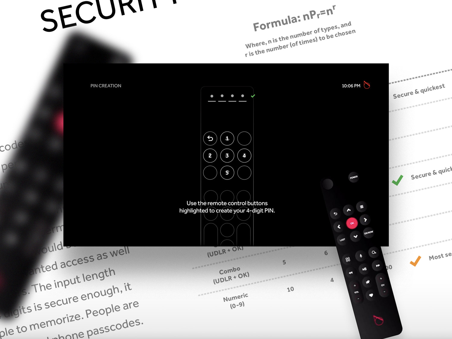
Verizon Fios Pin Codes
2015-2016
As Senior UX Designer, I owned Program Information on the set-top box platform and our mobile apps. An important feature that was grouped under my Program Info responsibilities was the VOD (video on demand) purchase flow. Our platform offered a range of content packages as well as premium programs that could be paid for. Since set-top boxes are often shared by families or roommates, we needed a way to provide a secure payment method that only an account owner could permit. This became known as the Pin Code system.
Duration:
1 month, part-time
Mediums:
TV + Remote
Key Metrics:
Shortest possible code entry, and successful entries system-wide
Status:
Shipped and used by thousands of trial consumers for over a year
I introduced a novel solution to the problem of how to make purchases on shared devices in a fast, secure, and invisible way using our existing remotes and design thinking.
At the time, we had several thousand beta users living with our OTT/IPTV platform in their homes. These trial consumers already had our set-top box and a remote control. I saw an opportunity to design a low-friction purchase flow using only the existing hardware.
At first, we looked at using our platform’s standard keyboards that had already been built for our search and out-of-box experiences. It was basic; using the DPAD (Up, down, left, right and okay buttons) to navigate an on-screen keyboard (alpha, numeric, and mixed).
Each box was capable of having multiple profiles on it with their own watch history, favorites, and recommendations. Each profile could have a separate credit card attached to it, requiring each purchase to be authenticated by the profile owner.
I considered the obvious solution of creating a pin code for each profile (that would be setup upon creation), and when making purchases or changing a profile’s settings, the platform would ask for their code. However, I identified a few critical security issues with this method. First of all, anyone in the room can see what they are entering on the TV and learn their pin code just by watching. Secondly, it can be tedious to enter a password using a TV remote control. Entering a 4-digit code could require clicking DPAD buttons over 30 times or more if any mistakes are made. While this would be quick to engineer, it would be slow to use, and unsafe for our customers.
You can see numeric keyboard method below. Its slow, and unsafe. By looking at the screen alone, you can tell the pin code is 4531.
I introduced the idea of a combination code to the team and our SVP Dave. What if we could remap our remote’s DPAD buttons to numbers instead? Could we make these pin codes be memorized like video game combos? Instead of “168215”, wouldn’t “Up, Down, Down, Left” be way faster?
Leadership agreed there was potential in this idea. I quickly built a prototype above to previsualize what the experience could look like.
We soon realized that there were far more advantages than disadvantages with this method, and we built a case for why we should use this solution. Below, full purchase flow using the faster, remapped combo method instead.
I collaborated with hardware and engineering teams to confirm that we could technically remap the remote buttons. Everyone I showed this to supported the idea, and we even explored options for using other buttons outside of the DPAD so that we could have 10 characters instead of just 5. Not all of the button could be remapped anyways, so we agreed that the 5 digits in the DPAD were substantial. I also wanted to make sure to reserve the back button for deleting characters and exiting out of the entire experience.
Not only is this method faster, it is also invisible, it gets faster with muscle memory, and it can be done without having to look at the remote.
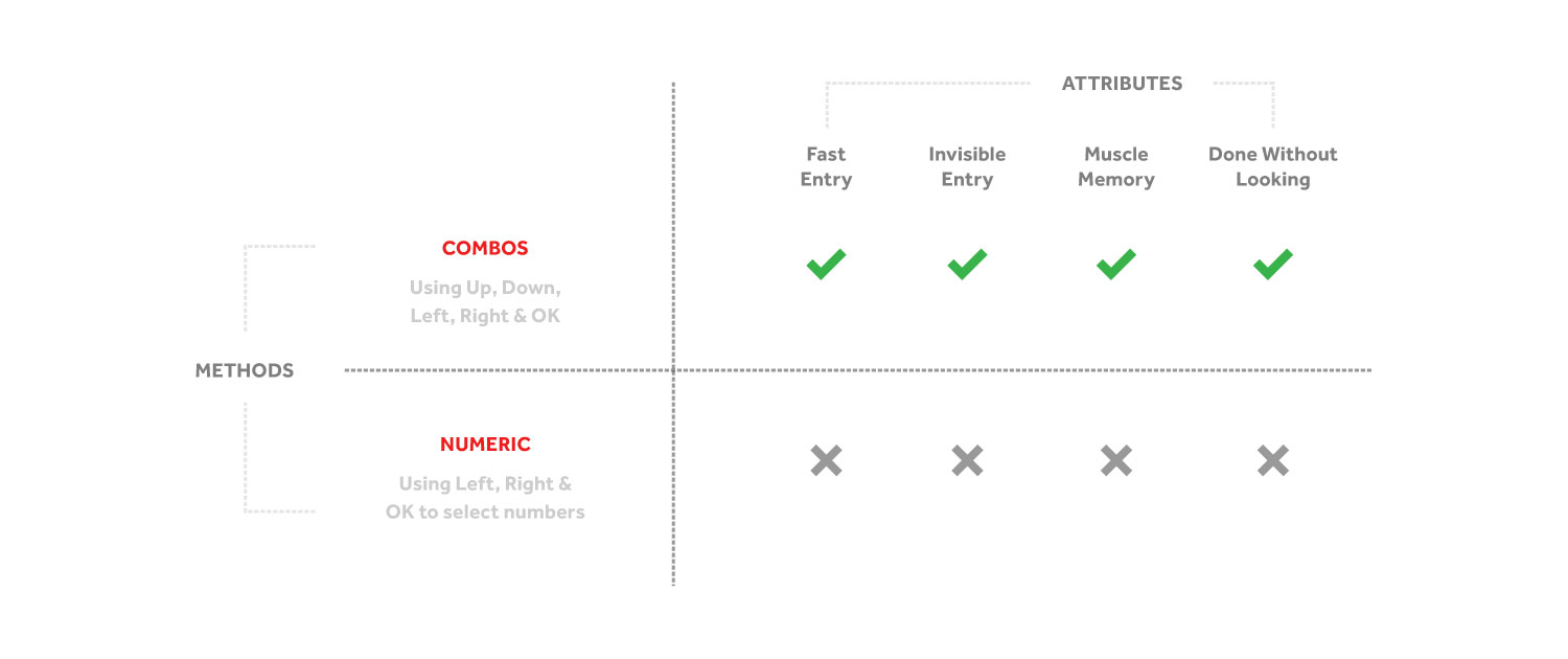
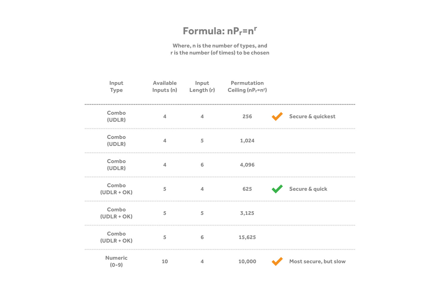
Security was built in to this design. I met with an engineer to find an appropriate pin code length that we could pitch, as well a fallback plans for when someone attempts to brute force pins in order to make a purchase on someone else's profile.
Below, you can see what happens when attempting to manually brute force pin codes. After the third attempt, the account is locked and it must be reset by the account owner.
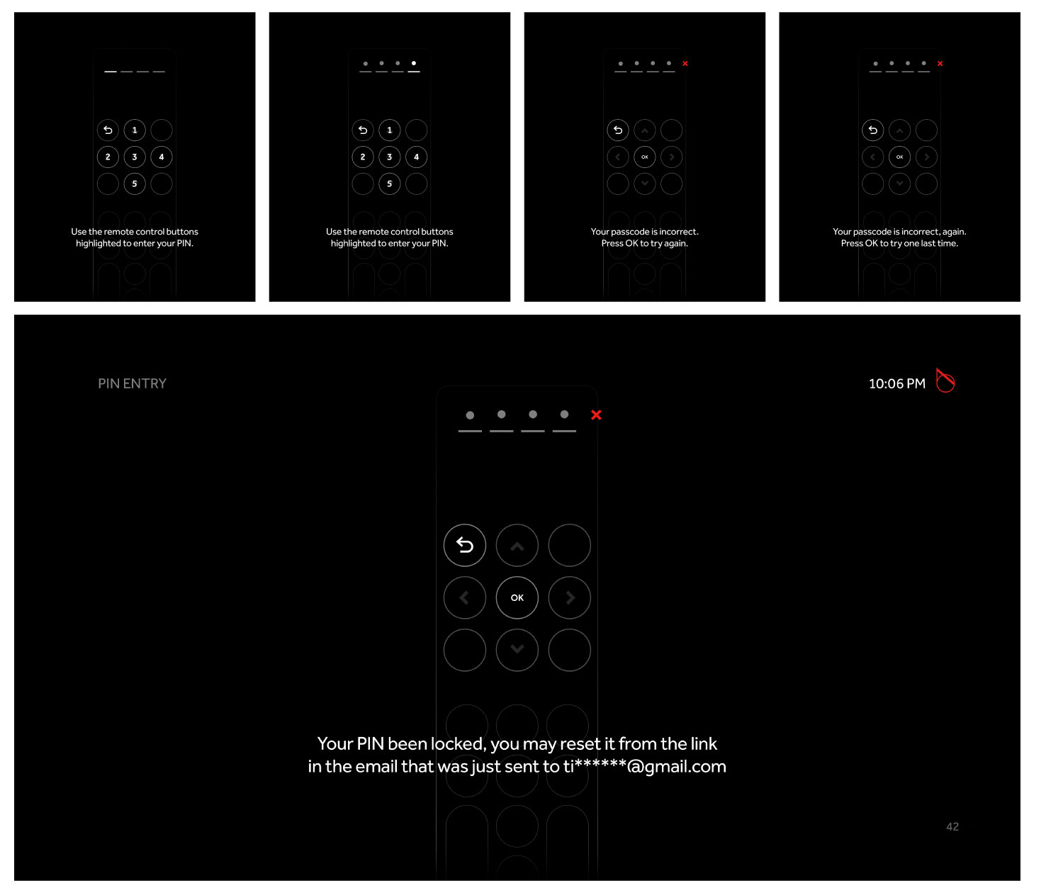
I presented the polished concept to our Director of Product and Senior Vice President. After laying out clear examples of the advantages, we got the go-ahead to spec and build it. We had to work through a few kinks, make some tough decisions (like where we should map the numbers on the DPAD), and update the out-of-box experience. After blasting through those challenges, this feature shipped and was used for nearly a year until our hardware team redesigned all of our boxes and remotes.
Participants who were familiar with combo-codes from video games understood the idea immediately, while others took a moment to grasp it. To make this easier for all users, we required that they enter their pin code twice during onboarding and profile creation flows, ensuring that they will successfully enter their codes two times up front, building pattern memory. This effectively merged pin code creation and learning into one short process.
Verizon Fios Interaction Model
2015-2016
I shared responsibility over the core interaction model for our set-top box (STB) product as well as our mobile companion apps with a Creative Director and Head of Product. This included defining the top-level navigations, remote control interactions, back-stacking guidelines, information architecture, and driving alignment in mobile apps.
Duration:
Multiple sprints over 1 year
Mediums:
TV + Remote, Mobile (Tablets + Phones)
Key Metric:
Percentage of users who intuit focus at a glance (with no context)
Status:
Shipped over a dozen UX leaps
Our STB product shipped with a minimal remote control using a DPAD (Up, Down, Left, Right, and OK) with Back and Home buttons as the primary means of navigation. The design vision was simple; video constantly playing with a translucent interface on top of it for an immersive experience.
I documented the evolving order and permutations of our top-level navigations, produced pixel-perfect mockups for senior leadership and engineers, ran multiple alignment sessions with cross-functional teams, and crafted hi-fidelity interactive prototypes to bring together our thinking in a form that did heavy lifting for our engineers and would be demoed to key stakeholders.
My rapid prototypes became highly in-demand by leadership as they were cheap to produce, they felt real, and engineers would have clear specs concerning animation and easing since they were already refined in code.
One of my prototypes completely reimagined vertical and horizontal browsing.
Focus Prototype
2016
1.5 week project
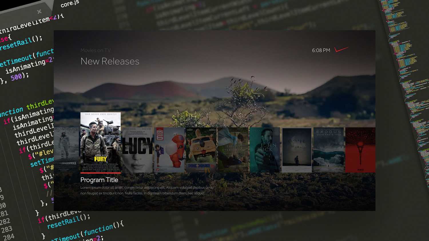
Above you can see how the DPAD remote control is used to navigate through the interface while always keeping a single element in focus. Below, you can see a taste how this prototype was constructed, and how the thumbnails used a transparent, black layer behind each instance to create a high-contrast interface with artwork that still feels translucent.
The biggest challenge with our interface had to do with providing proper contrast between the background video and the interface in the foreground while also keeping a single, clear focal point at all times. Ten-foot interfaces should always give users an obvious indication of what is currently in focus (except during playback).
At the time, our internal and external design teams produced static designs and motion comps that relied on ideal videos/stills and artwork to make the contrast sufficient without being too dark. I recognized this problem and found a solution that worked with real videos and real artwork on our consumer platforms. The easy solution was to add a dark gradient layer in-between the video and the interface; but that always left the experience feeling so dark and gloomy. I wanted to prove there was a better layering approach.
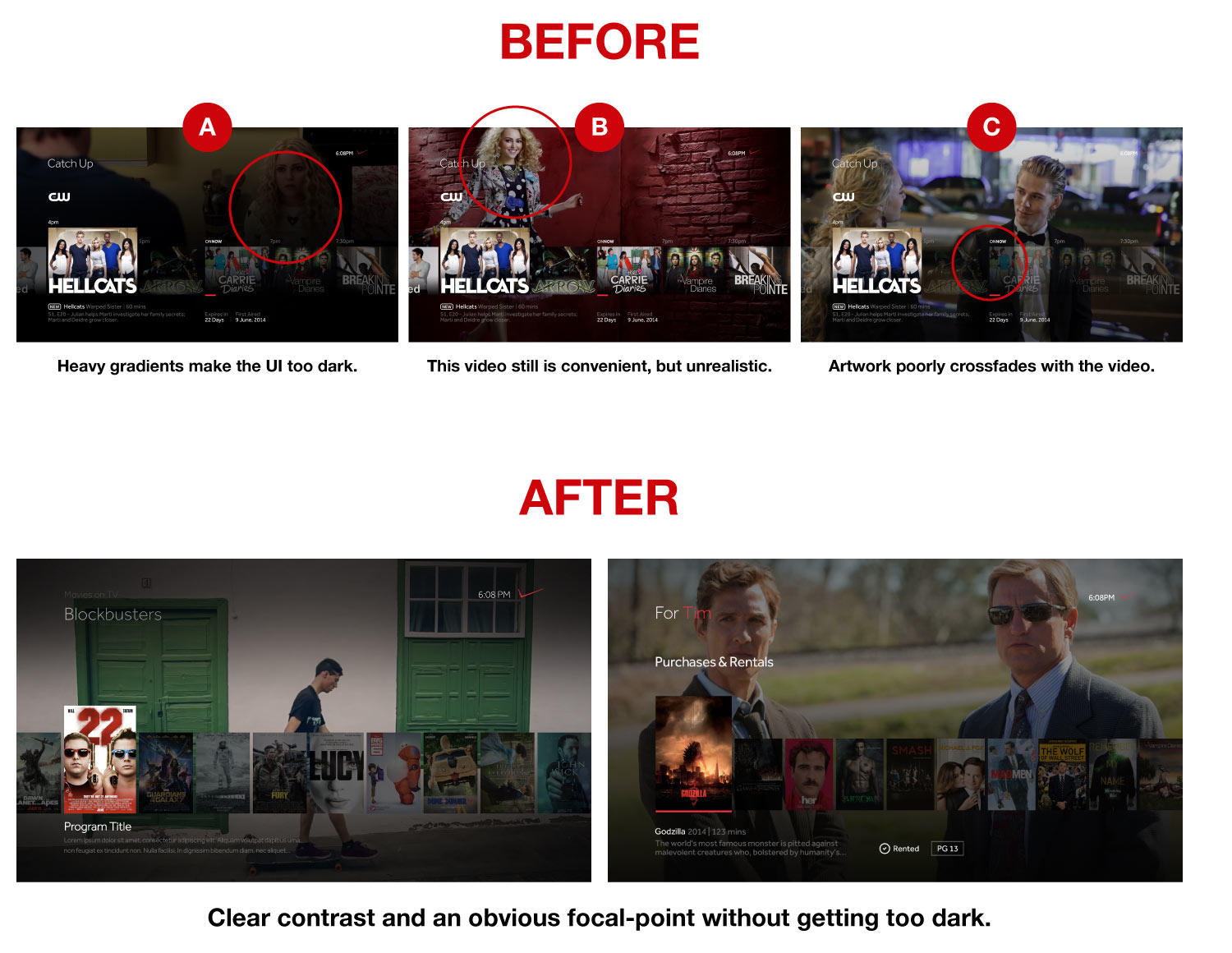
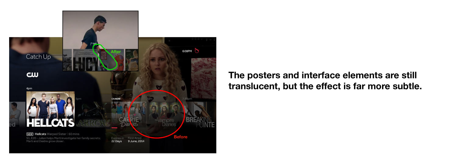
Above, you can see the types of solutions that were being used to offer enough contrast to our interface while maintaining an explicit focal point. Either (A) the gradient layer was too dark, (B) the artwork was idealistic, or (C) the out-of-focus thumbnails were transparent to make the in-focus thumbnail stand out.
I studied these challenges and discovered an opportunity to solve all of them in a way that was technically feasible.
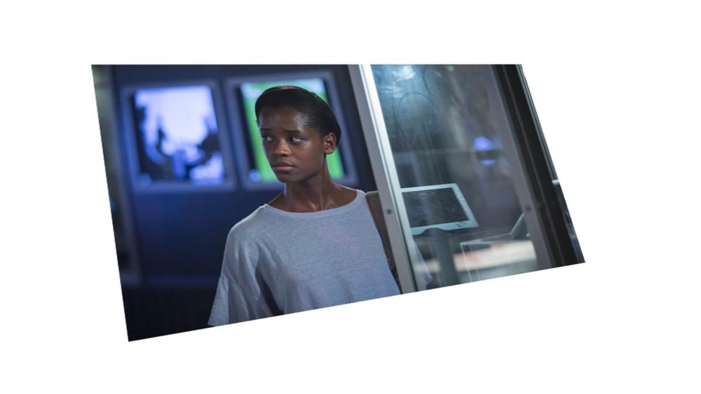
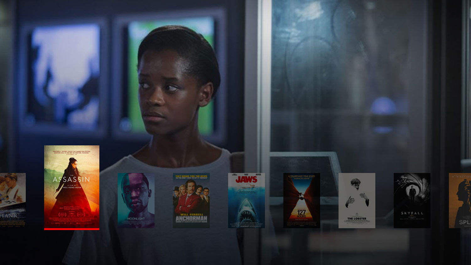
Our platform was originally built in HTML, CSS and JavaScript (dating back to ~2013 at Intel), but we had recently shifted over to C++ instead for more control over the platform’s performance. While this shift introduced a mix of tradeoffs, our front-end toolkit was reduced from all of the free CSS capabilities down to almost nothing, meaning that complex components needed to be rebuilt from scratch in native code.
For our design team, this introduced some visual constraints to our core interaction model. We could no longer rely on frosting/blurring elements of our interface and video player to soften our dark UI.
Instead, I proposed the solution above as it was a direct way of maintaining high contrast with a clear focus in the core navigation. Our Creative Director championed this effort and it shipped in the first dogfood version of our re-engineered, native (C++) product the next quarter. It was also adopted by the Fios Classic design team who was working on the legacy version of Fios TV since the technique was simple enough to use on older hardware.
Verizon Fios & Intel OnCue Apps
Phones & Tablets, iOS & Android
2014-2016
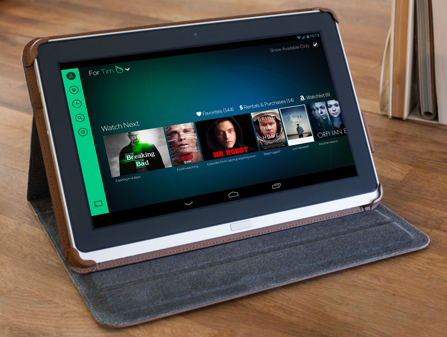
While the mobile interaction models were fundamentally different (touch-screens vs remote), we kept our companion apps consistent where it was useful. I worked on the visual design and top-level navigation both our iOS and Android Phone + Tablet applications.
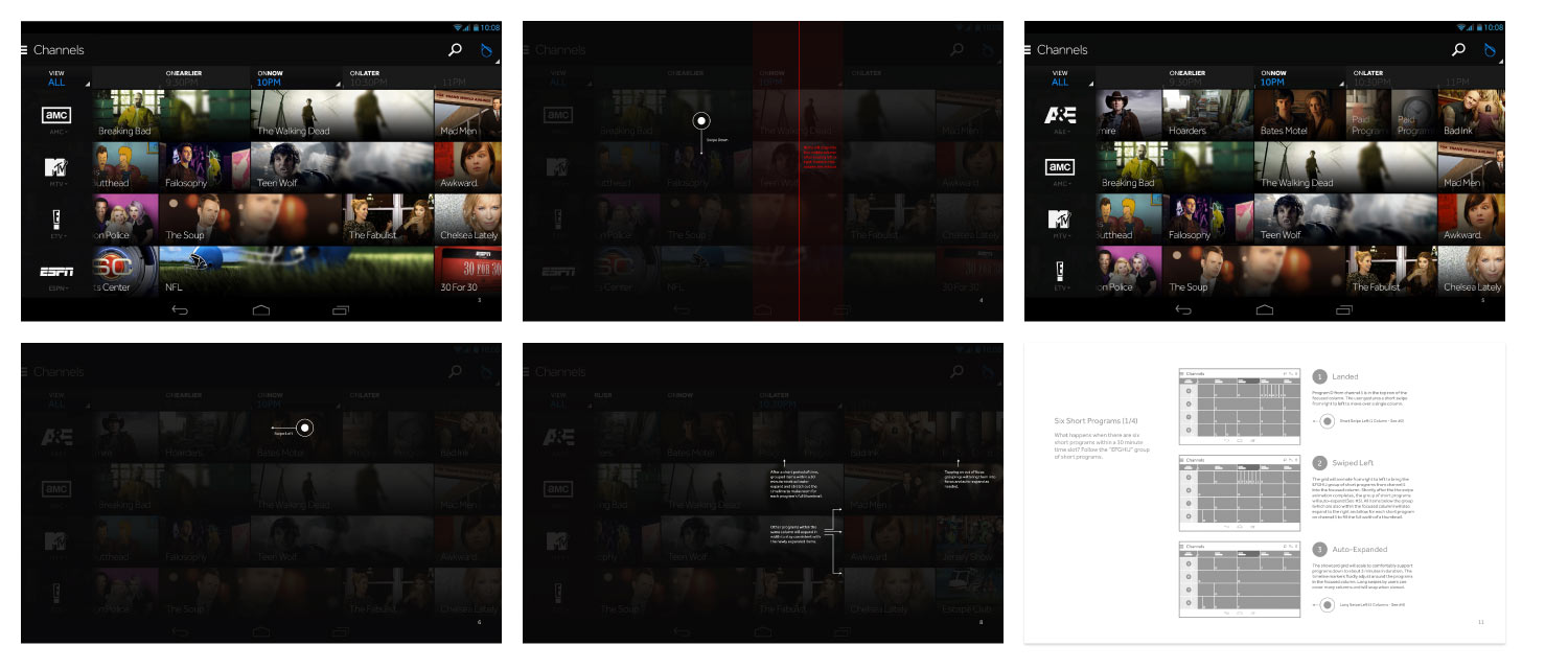
Below, you can see a motion prototype I built of the MVP Channel Browser. This was an exploration of how to show program artwork similar to how it appears on our STB interface. While these explorations were unique, I decided to move away from using images in the tablet browser on mobile screens as explorations always ended up dark and blurry.
I created the prototype above to explore the core navigation of the channel browser. Below, you can see the specs I co-created with our front-end engineer for this model.
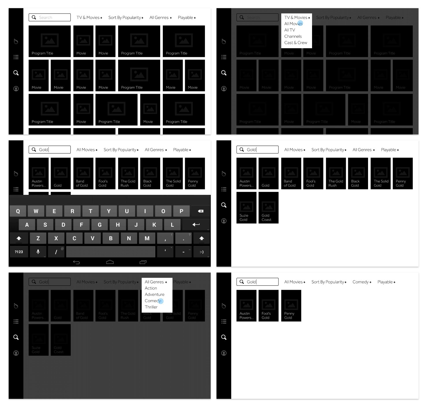
One of the key differences between the STB and mobile/tablet experiences was how search worked. On the TV, we had an advanced voice search technology that was predominant. On mobile, we found that search worked better if we mixed it with discovery like Instagram and Pinterest were exploring at the time.
Instead of trying to keep our mobile search consistent with our tablet, we turned it into a catalogue that can be easily refined down to what a user is looking for. I delivered the first rounds of wireframes before handing this off to our mobile designer and worked in collaboration to keep it aligned.
When we first defined the requirements for our mobile apps, they were just meant to be companions to our primary ten-foot product with limited functionality. As our product family matured into 2015, our content deals gave us a new opportunity to extend the capabilities of our mobile offerings by allowing some content to stream directly onto the devices. Verizon secured a unique, exclusive content contract with the NFL that allowed us to target a brand-new demographic of consumers.
In a quick discovery kick-off with our Head of Product, I led the first rounds of mobile designs with an emphasis on sports and NFL. This started the conversation around whether or not to pivot our product in this direction, or spin it off into something separate.
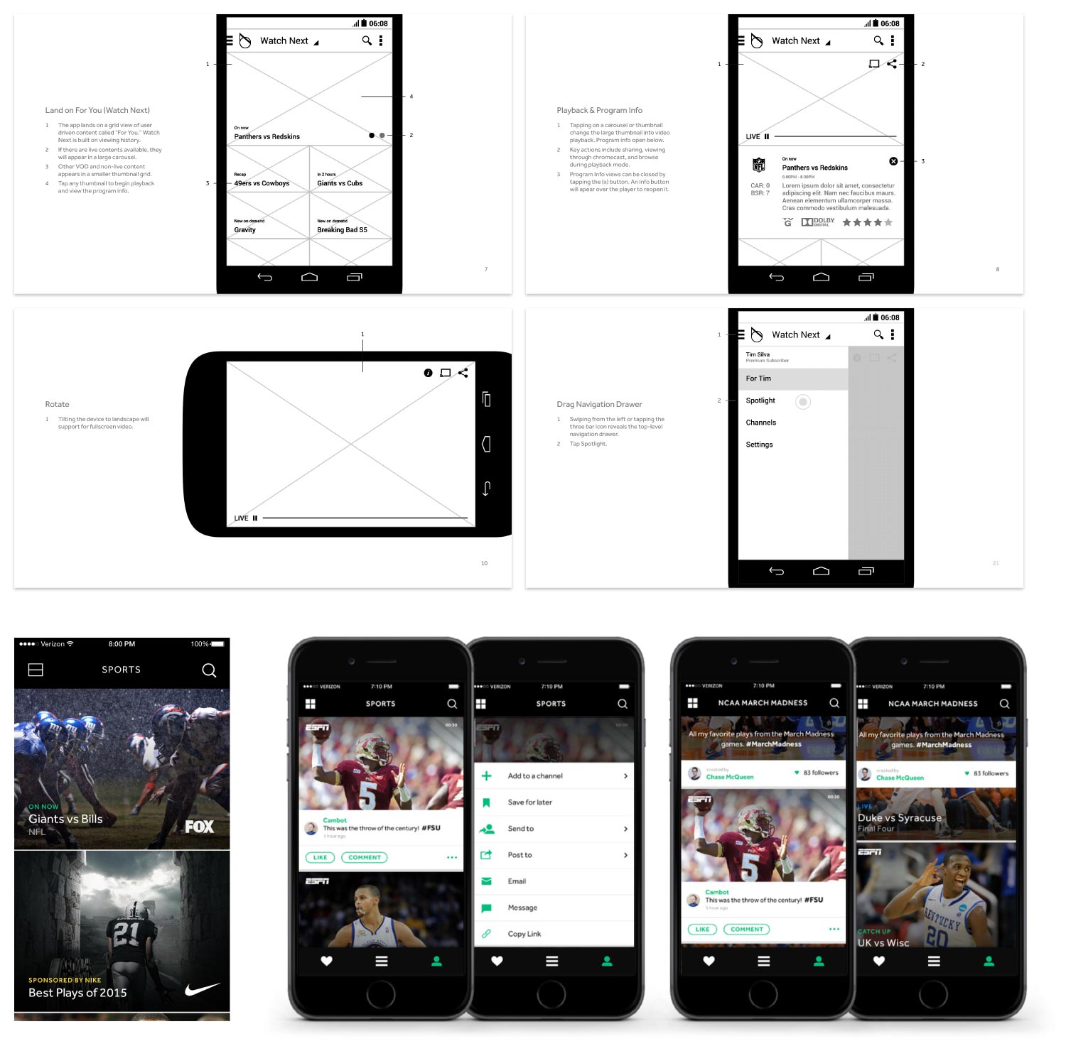
At a later stage, these early explorations (wireframes, design comps, and pitch decks) were used as a starting point by another team that went on to form the go90 product. I opted to stay focused on our broader TV product instead.
After this re-focus on the Fios STB and mobile offering, I led the next information architecture alignment that stepped back from being sports-focused.
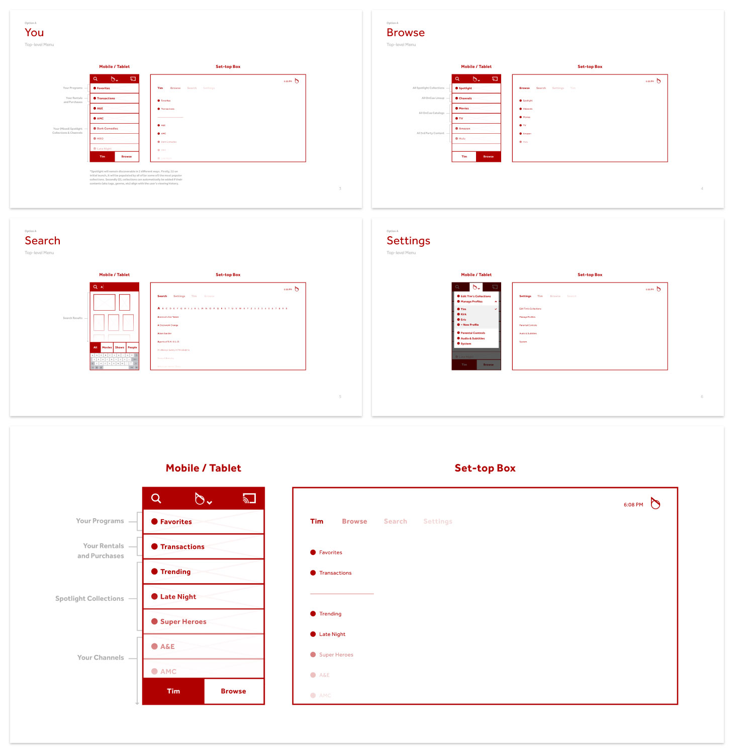
After the sports-focused product split off into something else, we had work to do in aligning all three device types; TVs, tablets, and phones. Above, you can see some of the options I proposed for how to align our STB and mobile architectures. These were presented to our Senior Vice President, and we moved forward with my recommendation.

Program Info (Verizon Fios & Intel's OnCue)
2013-2016
Program Information was a critical view in the OnCue (by Intel) and Verizon Fios offerings. Every piece of content on our platform had a Program Info screen, including films, series, episodes, one-off specials, sporting events, paid programming, and more.
Content was found in every corner of the experience on our set-top box platform and mobile apps. It’s on the landing screens, in the curated catalogues, in search results, etc. When programs were visible or in-focus, users could either begin playback, or get more info.
Duration:
Multiple sprints over 2 years
Mediums:
TV + Remote
Key Metric:
Clearly defined meta-data permutations and rules
Status:
Shipped multiple features, established source of truth
I built guidelines which scaled to support hundreds of thousands of programs on our set-top box platform.
Each unique program type had different menus, meta-data, and artwork to display. Sometimes this data was high-quality and complete, while other times it was poor-quality, incomplete, or even missing. I had to intimately known the data we had to work with, audit it frequently to spot edge-cases, and define the grids and layouts for each view-type.
At Intel (when the product was called OnCue), my contributions to Program Info were to define and document the information architecture in our source of truth doc, and produce guidelines for the platform artwork. Over time, I absorbed responsibilities including interaction design, grids, animations, creating rules for the different view-types, and maintaining alignment with mobile apps.
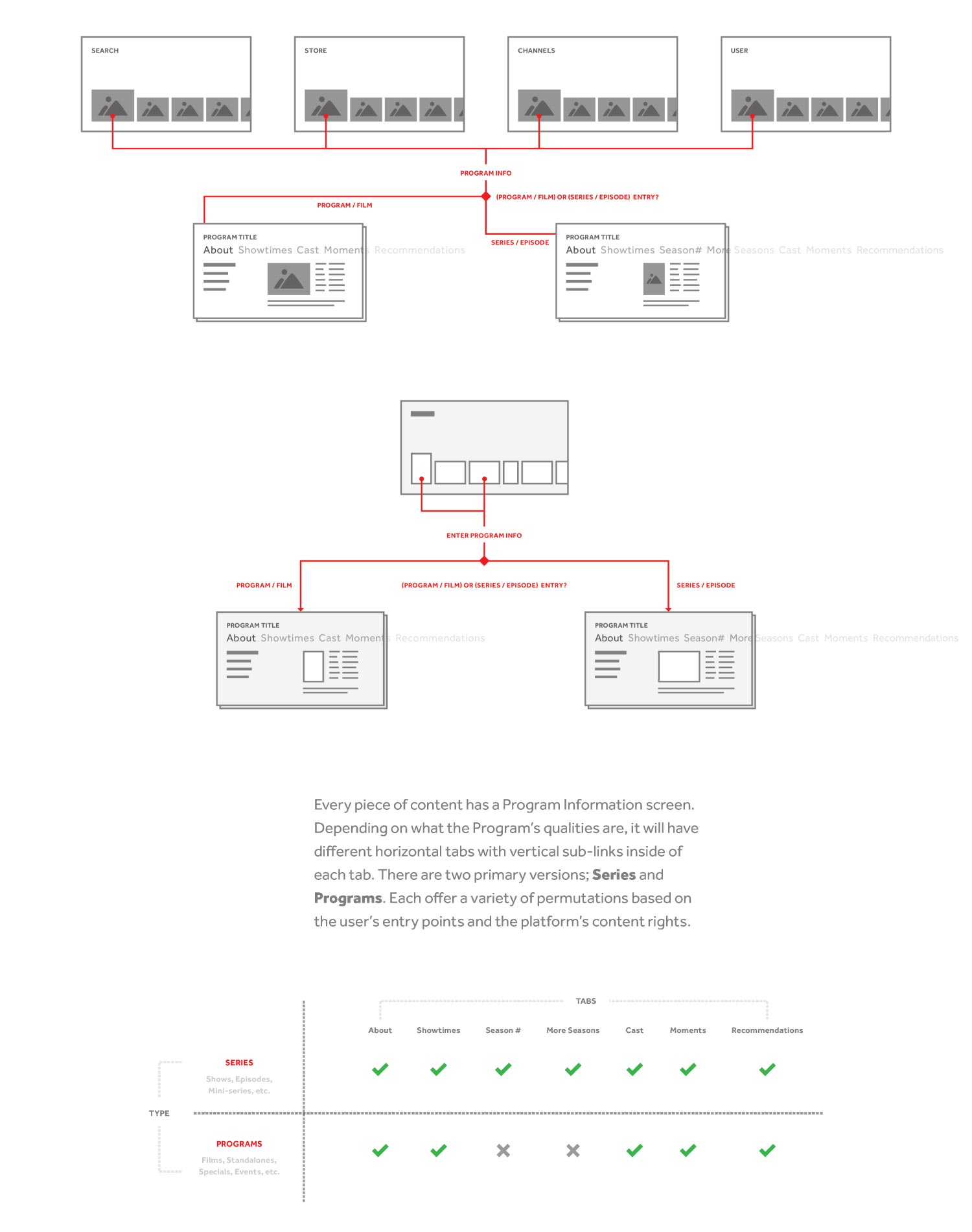
Above, you can see architectural diagrams visualizing entry paths and view types. While there were many view types, I broke them down into two groups, programs and series. Each category has its own distinct rules and meta-data that needed to be displayed. Below you can see several samples of meta-data templates and comps built using my structure.
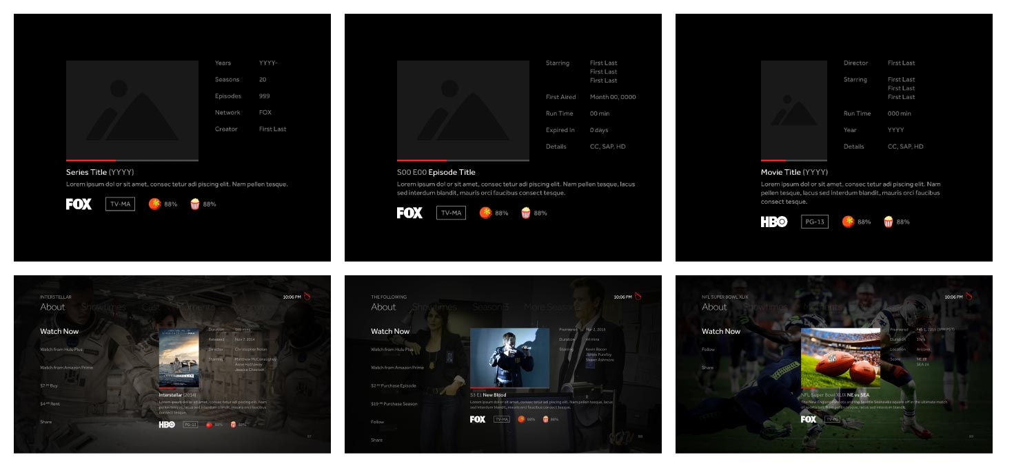
I owned these guidelines through several evolutions of our interface and constantly pushed to needle to find more efficient ways to display the most important information and features within Program Info. These features included setting reminders, completing VOD purchase flows, and social sharing functions for Facebook and Twitter.
Below, you can see the Program Info navigation in action. It uses links on vertical and horizontal axes. The horizontal list across the top contains sections, while the vertical lists within each section contains actions. Bringing these actions into focus will update the meta-data table on the mid-right region.
Below is an early exploration of the VOD purchase flow within Program Info. See the "Pin Codes" project for the later evolution I owned and shipped.
Platform Artwork
Program Info was a visually compelling view that featured cinematic artwork from the programs and content partners. I collaborated with our Creative Director to define a unique visual language that would marry the artwork to the interface in such a way that was stunning, and sustainable from a production perspective. First, we produced a series of curated images to discover the ideal baseline of quality.
Duration:
Multiple sprints over 2 quarters
Key Metric:
Define style guide and sample set for production artists
Using my extensive photomanipulation skills, I modified artwork from content-providers to demonstrate what could be possible.
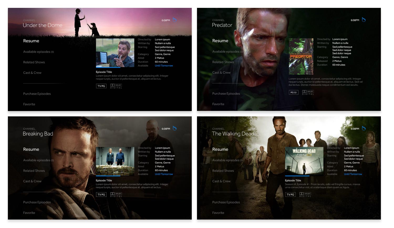
I was on a team of three who produced the first of these for our dogfood "Family and Friends" product release. We targeted some of the most watched series and featured programs, testing if this production process was worth the return. Of course, it was well received by our trial users.
From there, I helped to interview and form a crew of in-house production artists. We hired a small team, showed them our visual samples and guidelines, and then I provided feedback and direction on their deliverables to keep them within the guard rails of the vision.
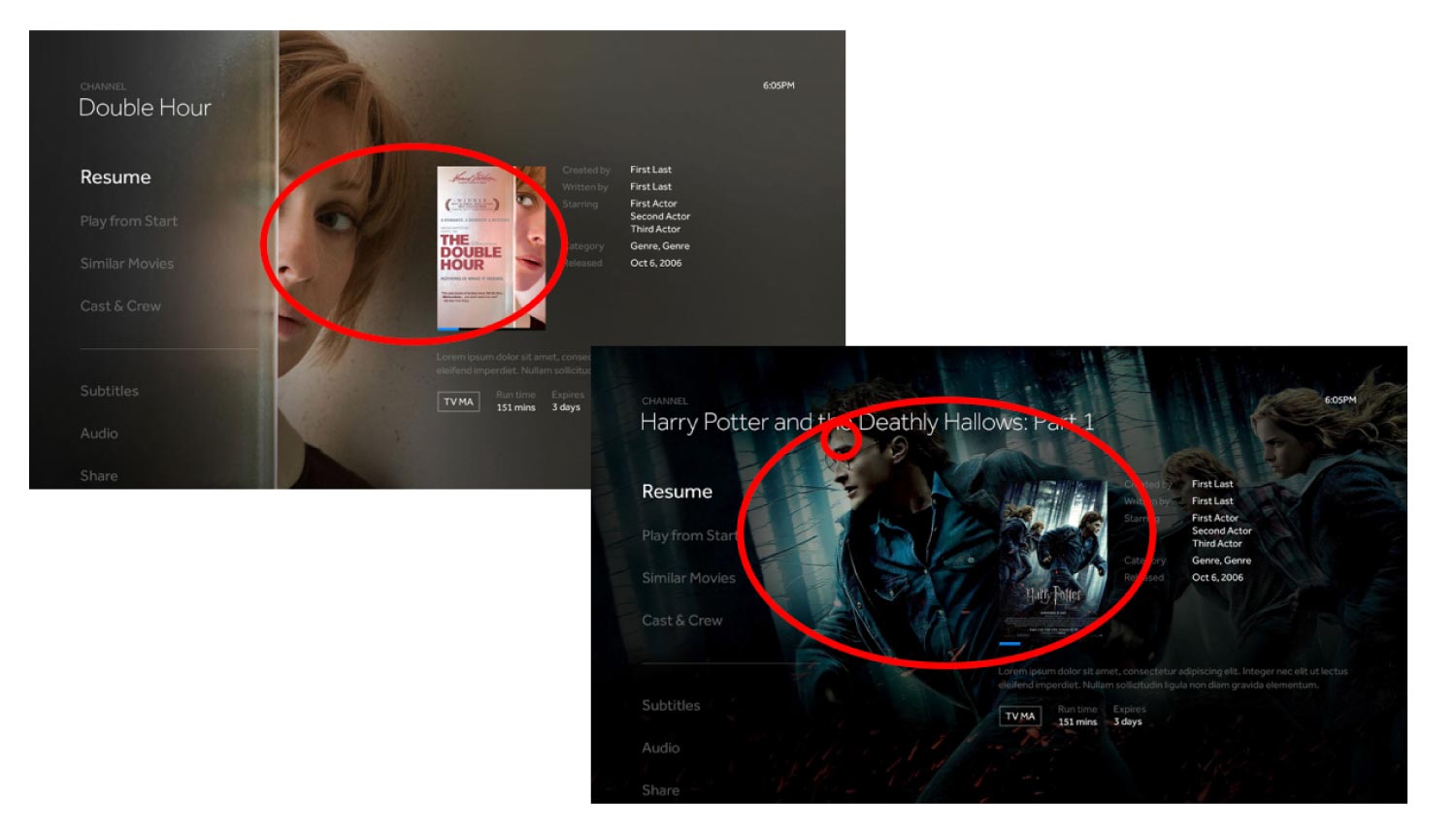
I also identified common patterns to avoid, such as (1) using background artwork that matches the poster/thumbnail asset, and (2) modifying the artwork too drastically to where it causes issues. For example, one of the backgrounds flipped an image of Harry Potter on its vertical axis for compositional reasons, and it led to the character's scar being on the wrong side of his forehead. While we did give the artists some creative liberty, we had to make sure that modifications were subtle and respectful to the content.
Over the next year, our team of production artists crafted thousands of these top-quality assets for our platform. They covered the most important pieces of content from over time, and then placed most of their focus on new titles that had the most visibility and impact.
